The Maps
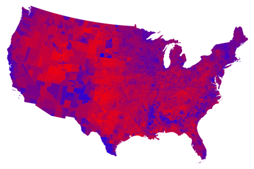
The presidential race is over, and now we can get to the best part of electing a president: data visualization, particularly maps. Every four years, Mark Newman of the University of Michigan makes a set of maps and cartograms detailing the election results. They are available here. My favorite of his is the map on how counties nationwide voted, applying percentages to red and blue to show how Republican or Democratic leaning the county was: