Like a phoenix rising from the ashes, webOS lives.

From the bits I’ve seen of LG’s new smart TV plans, I’m loving how they’re repurposing webOS. It’s rare to see refreshing interfaces on tvs (and set top boxes).
I also agree with Dieter Bohn’s assessment:

Earlier I called webOS on smart TVs “a smaller ambition for a bigger screen” and after seeing how webOS works now, that assessment still stands. LG hasn’t solved any of the truly thorny problems in the living room. But executing well on a smaller ambition is still to be commended
I was rooting for webOS back when HP was using it on their Pre phones, and I’m still a fan.

Categories:

Human Experience

Tags:

Charms, Quivers & Parades

I don’t know what cascading chemical awesomeness is going down in my brain when it detects and rewards me for the act of building, but I’m certain that the hormonal cocktail is the end result of millions of years of evolution. Part of the reason we’re at the top of the food chain is that we are chemically rewarded when we are industrious – it is evolutionarily advantageous to be productive.
—taken from The Builder’s High by Michael Lopp
I suggest reading Lopp’s full post from the link above. If you dig it, read The Icarus Deception by Seth Godin too.
I’m not just rehashing Lopp’s post, spewing out bullshit lip service.
No, I’m eating my own dog food and getting high building my own things. Last week I launched a Kickstarter project, Charms, Quivers & Parades. It’s a children’s book and poster series featuring the weird & funny names of animal groups presented through colorful compositions of illustration and type.
It feels great designing something for me, not a client.
book_rendered_B1.jpg
iPad_landscape_a.jpg
iPad_landscape_b.jpg
Animal_poster_printed.jpg
poster_a_peacock.jpg
poster_a_zebra.jpg
poster_a_jellyfish.jpg

Categories:

Materials

Tags:

Designing for Android

[Update, 6 Jan 2014: This entry has been picked up on Reddit and some other sites, so I feel I should elaborate more on some of my quips with Android. Additions have been noted below.]

I started familiarizing myself with Android design guidelines last month (for an update to a mobile app at my work). Prior to that I only had experience designing for iOS.

Overall I’m not impressed with anything about Android. The iconography lacks sophistication, the typography is derivative and there’s an overall lack of cohesion to the experience of the operating system. Android clearly feels like a system built and designed by engineers, not designers.

My perspective comes from using the Samsung Galaxy S3 and reading Google’s own Design Guidelines website.

It comes as somewhat of a relief that some of my favorite apps look/feel/work almost as good on Android as they do on iOS (Instapaper and Dropbox come to mind). The problem is, even when apps are great, the OS they live in feels clunky and poorly designed. It’s like driving a Porsche on horrible road in a rundown town.

Then we come to designing for Android.

For Apple’s iOS, this is the state of fragmentation across the various device types (via iDownload):

Android-fragmentation-iOS-screen-sizes.png

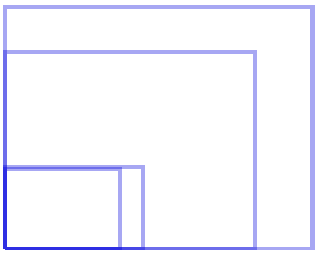
And here is Android’s clusterfuck fragmentation:

Android-fragmentation-Android-screen-sizes.png

Update: When you have as many screen resolutions and dimensions as Android has, it becomes impractical to design for every one of them. What you end up doing then is picking a subset of resolutions and dimensions and designing for those. To use another car analogy, instead of designing perfectly tuned wheels for a few cars, you design a few that perform decently on a lot of cars. Better yet—it’s like designing 4 shirt sizes for people ranging from people who are 5′ 6″, 145 lbs to people who are 6′ 5″, 220 lbs. When use averages in design, you’re watering things down for common denominators. What we have with Android is an operating system that wants to have it’s cake (or whatever pastry is current) and eat it too. They want “open” with beautiful, strict design guidelines. The problem is, you can’t have both (maybe you can? I’d love to be proven wrong). Design still doesn’t seem to be as high a priority as it could be, even on Kit Kat (which is the best designed version of Android thus far, in my opinion).

To drive home how Google lacks taste and sophistication, you need to look no further that Google’s page for Kit Kit, featuring a cheesy cross-promotion with the Kit Kat candy bar. I appreciate the sense of humor they’ve woven into the nomenclature of the OS versions, but where’s the showcase for the actual operating system?

Whether you step back and look at the entire ecosystem of Android or closely examine to the user interface, iconography and typography, it’s just not fun to use, beautiful to look at or enjoyable to design for.

Categories:

Technology

Tags:

Goodbye, Cameras

Craig Mod says goodbye to cameras in his New Yorker piece, and reflects on his love of film photography:

In late 2004, after graduating college, I scrounged together enough cash to buy my first real digital camera: the Nikon D70, which was almost identical to the 8008 except that, when the shutter opened, light hit an array of sensors rather than film. Even though that difference seemed small, the purchase made me nervous. I had developed hundreds, if not thousands, of rolls of black-and-white film in my badly ventilated, chemical-filled university apartment. Would I miss watching ghostly images appear from the silver halide salts, the sting of acetic acid on my hands and in my nostrils?

I stopped using film almost immediately. The benefits were too undeniable: results were immediately visible on the camera’s rear screen, and I could snap thousands of photos on a trip without worrying about fragile rolls of film, which were always an X-ray machine away from erasure. But the D70 was unromantic. It didn’t have the strangely alluring mechanical rawness of the 500C, while the shift to digital imaging disrupted the compartmentalized, meditative processes that had punctuated photography for the previous hundred and fifty years: shooting, developing, and printing. As anyone working in a creative field knows, the perspective gained by spending time away from work is invaluable. Before digital (and outside of Polaroids), photography was filled with such forced perspective. No matter how quickly you worked, it was common for hours–if not days, weeks, or longer–to pass between seeing the image through the viewfinder and reviewing it in the darkroom. Digital technology scrunches these slow, drawn-out processes together.
via Drewbot

Categories:

Photography

Tags: