Sorry UI designers, you’re not Paul Rand.
The first implementation of our internal Show & Tell reminds me of Dribbble. For that matter, it reminds me of a good portion of online communities. They require little to no thoughtful input. It’s more common than not that a single click or tap is all you need to do to show your support for a photo, status update, or design snippet, even though what’s really behind that interaction is, and should be far more complicated.
Dribbble absolutely favors presentation over critical thought and in that way it works more like pornography than graphic design. An image of slider controls or buttons without context is like picture of a set of tits (or a dick, hey, I’m equal opportunity)—in both cases context doesn’t matter. What matters is only how good they look.
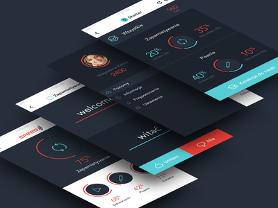
Image taken from Michal Parulski
My favorite error I see made over and over again on Dribbble (and many portfolios) is when people skew their mobile app designs away from the viewer (see above). Now the actual user interface doesn’t even matter, the pixel porno designer wants you to appreciate how well he/she designed a composiiton of an interface.
Update: I should note, I’m not against porn. Porn is awesome and if you want some great graphic design porn, I suggest FFFFOUND.