Weekly Exhaust Ep. 7: We’re Going to Hit Peak Pixel Very Soon
This week Michael and Bryan discuss car alarms, avoiding tourists in New York, the bull$h!t term “authentic digital design”, Bryan’s continued distaste for iOS 7, the relationship of effort to making art and why copyright laws suck.
Weekly Exhaust, Episode 7
Oh…It’s Not Just Me. That’s a Relief.
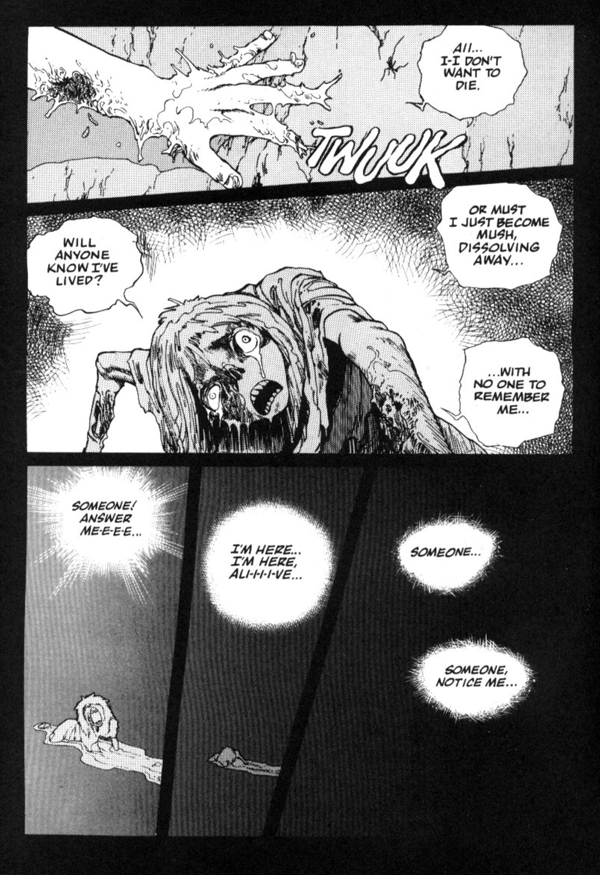
—from Battle Angel Alita, by Yukito Kishiro
School’s Out for the Summer

Royalties
Given the surge of multimillion-dollar auction records boasted by Christie’s and Sotheby’s on an almost monthly basis, how do the auction houses justify lobbying against a bill that might pay artists for their works? When Art F City asked a Christie’s spokeswoman, she insinuated that successful artists simply don’t need more money: “European studies have shown that resale royalty schemes provide support to less than 5% of working artists, and the artists receiving royalties tend to be those commanding the highest prices on the primary market.”
Sure, for most artists, large secondary markets are a best case scenario. But only a multibillion-dollar-a-year industry would force us to re-examine a kindergartener’s understanding of ethics. Whether artists are successful or unsuccessful, making millions or pennies, they deserve to share in the money their work generates. “The A.R.T. Act won’t benefit every artist, unfortunately, but this is not an anti-poverty program,” Rep. Jerrold Nadler (D-N.Y.), sponsor of the failed 2011 Equity for Visual Artists Act, told me over the phone. “This is a fairness and equity program. Just because we can’t bring in everybody doesn’t mean we should bring in nobody.”
—Whitney Kimball, Shouldn’t Artists Benefit When Their Paintings Auction for Millions?
The Post-Scarcity Economy
I just finished reading a great essay by Rick Webb on the post-scarcity economy of the future.
What happens when capitalism is so efficient that us humans are no longer needed to keep the money machine running?
Webb digs in:
The key here, to me, is to start thinking about how economics would work when we decouple labor from reward. Does that make a system inherently communist? I don’t think it does. People work. They get paid. It is market driven, and not centrally planned. In reality,the market already basically dictates this, for who can claim that a Wall Street banker works more than a teacher? The only thing we really need to do is take this to a logical extreme: that people can still get paid doing zero work. This fear seems to be at the heart of most people who say that Europe is communist: if we give people so much welfare, some of them might stop working! Quelle Horreur!
It seems to me that with the rise of machines and robotics, advances in mining technology, energy technology (both fracking and green energy technologies), the obesity epidemic in the US, etc., that there are plenty of reasons to believe that we may be at the beginnings of a post scarcity economy. We have a surplus, no doubt. Of course, we still have legions of people in the world that are starving, and even people still here at home. But we actually have the capacity to feed them, to feed everyone, even now, even if we don’t have the will. It’s not a matter of scarcity; it’s a matter of the organization of labor and capital.
I lost some interest in the middle during all the Star Trek talk, but if all you read are the first and last sections of his essay, you’ll be good (I read through all 20 minutes of it).
As my fellow Exhauster Bryan noted, this is the kind of thing that makes the GOP shit their pants.
divided

—Me, I said this. Maybe it’s time the Supreme Court rethought handing down its decisions a week before we’re supposed to be celebrating as one nation.
Observer of Bad Design
The redesign of Design Observer is truly a missed opportunity.
As with anything design-related, the problems are all in little details.
Here’s a list of problems that caught my eye (top to bottom, left to right):
– Is the black tray at the top necessary for 2 measly links? Seems a bit much.
– The scrolling news marquee at the top is abruptly cropped about halfway across the width the the site, why?
– Sometimes ads are necessary, but does MailChimp have to take up that much room at the top? Christ.
– The lefthand navigation. What is that, 6-point type? Again, why?
– Rolling over blog posts on the homepage reveals a blog post summary. No animation, just a jerky jump-out.
– Why are the ‘Creative Opportunities’ in white text against a light grey background? I can read them, but it’s approaching the edge of readability.
– Because the header is over 250 pixels tall, the scrollable area for the mere three articles is extremely small.
– Even though the website is over 1,000 pixels wide, it feels extremely stuffy and cramped because of all the poor design decisions made. The stacked logo feels cramped, the lefthand navigation feels cramped, the height of the header makes everything below it feel cramped.
– Most disappointing is the lack of sophistication to the typography
I could go on and critique the rest of the site, but you get the idea.
Clearly Design Observer is comprised of some heavyweights in the world of graphic design but traditional graphic design is very different than web design.
It reminds me of when Michael Jordan tried his hand at minor league baseball. Sure, he did ok, but it was anything close to his achievements in basketball.
There’s No Such Thing As ‘Authentically Digital Design’
The Verge takes a look into the thinking behind the ‘material’ design philosophy for Android:
What is software made of?
The answer came from a design exploration, when Jon Wiley, principal designer for search, and his colleague Nicholas Jitkoff were looking at the now-ubiquitous cards that Google started using in Google Now. They looked at those sliding cards and wondered: when you swiped one away, what was underneath?
“It sounds like such an innocent question,” Duarte says, “and yet it was such a powerful spark.” It led the team to come up with a new way of thinking about the software elements we use and (virtually) touch every day. Instead of just talking about pixels on a screen or abstract layers, the team imagined that these cards and the surfaces they slid around on were actually real, tangible objects.
Software imitating tangible objects. This doesn’t sound like “authentically” digital design does it?
Or does it?
I thought Microsoft was leading the way into the future of software design with Windows Phone and their flat approach. Right? Right?
The answer is: it doesn’t fucking matter. Oh and if anyone tries to use the term “authentically digital design”, punch them in the face and explain to them that term does not exist. Also, to be clear—flat design is not a philosophy, it’s an aesthetic. Like the decision to wear Italian leather dress shoes every day or Chucks (disclosure: I wear Chucks every day).
The answer to Google’s sharp work for their Material Design is that it is both authentically digital AND skeuomorphic. Heresy! Oh no he dih-ent!
Operating systems, mobile applications, ATM screens and every other piece of software with a user interface was made so that human beings could interact with them. Computers, on the other hand, operate using zeros and ones. Everything else we humans build on top of those zeros and ones is made for us to communicate with them.
Software and user interfaces can be neither authentically or inauthentically digital. Software either well-designed or poorly designed.
Peace Out, Windows Phone.
The latest Kantar Worldpanel numbers for smartphone market share may not be surprising, but they are grim indeed for Microsoft. In the heart of the Windows empire in the United States, Windows Phone’s market share dropped from 4.7% to 3.6% between May 2013 and May 2014. In Germany, the decline was from 6.2% to 5.9%. In Brazil, the share remained flat at 5.5%. In China, Windows Phone saw a collapse from 3% to o.6%.
—Tero Kuittinen, Windows Phone market share: Crash and burn
Imagination Compact

—Theseus, A Midsummer Night’s Dream