Jaded and Cynical
As I get older I catch myself having more and more jaded and cynical reactions to things around me. It’s just what happens to certain people when they get older. This doesn’t make being jaded and cynical a good thing. Case-in-point: Co.Design’s headline and review for Cooklyn’s identity system:
Is This The Most Brooklyn Branding Ever? Aruliden’s Visual Identity For The New Restaurant Cooklyn Is Almost So Trendy It Hurts.
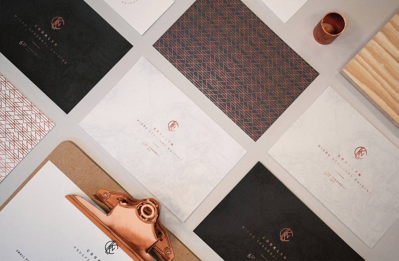
Perhaps nothing captures brand Brooklyn more completely than aruliden’s communication design for Cooklyn (that name!), with thick stationary watermarked by an old-timey map, copper accents, and a logo reminiscent of a cattle brand. The business cards are embossed with an elegant art deco copper overlay on one side and historical cartography on the other side. The minimalist logo features the sans serif letters CKLN clustered together as if they’re attached to the business end of a branding iron. Even the clipboards on display have precious copper accents. Aruliden arranges every component of the visual identity together with wooden blocks and cylindrical copper paperweights that look like they fell out of a general store from 1889. It’s the kind of pure, artisanal wood-and-metal-and-marble aesthetic that pairs well with a thick slab of bacon and tufts of ironic facial hair.
Lazy and corny name aside (Cooklyn, really?)—what beautiful gold foil, watermarks and typography. Those trendy assholes at aruliden created a top notch identity system, how lame! Shame on you!
If beautiful design systems like this are what we think warrant negative reviews, we have problems. There’s more businesses than not that would be lucky to have an identity system this thought out.
Update: Over at Designer News, Matt Legrand reminds me of Co.Design’s track record of click-bait-bullshit articles.