Apple Consistency
The other day BGR posted this animated GIF of Apple’s website from the late ’90s (based on my digging on archive.org, I’d say 1998):
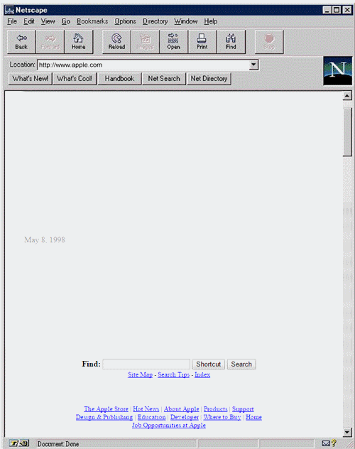
This is what they said (my emphasis):
Apple has come a long way since the dark days of the mid-’90s, when it very nearly went bankrupt. And if you want to see just how far Apple has come, then you need look no further than this awesome GIF posted on OpenUniversity.edu that has preserved Apple’s website exactly as it looked in 1997. As you’ll see below, the company’s main page has undergone a pretty drastic overhaul in the past 18 years, and it’s all been for the better. Yes, screen resolution has changed. Yes, browsers have gotten better.
Yes, Apple’s productions have evolved.
But has their website “undergone a drastic overhaul”? Not from what I see. I see a website structure that’s pretty consistent with today’s Apple.com in 2015:
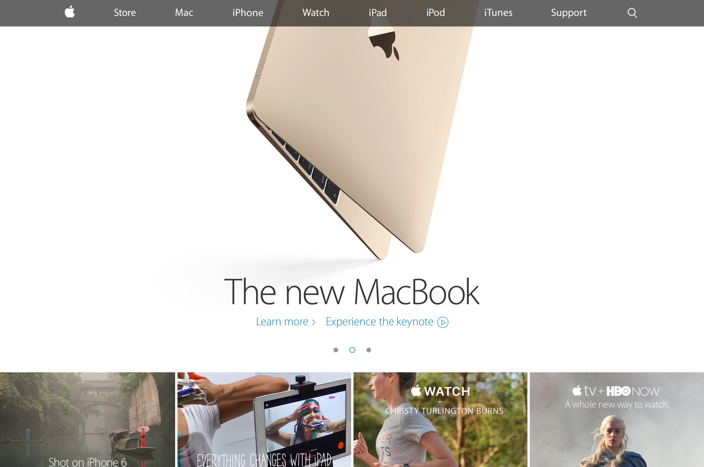
Ok, there’s 4 modules under the main carousel, not three. So sorry.