Uber’s New Identity
Eli Schiff on Uber’s new identiy:
The iconic U icon is not something trivial to be discarded on a whim. When used as a sticker on the outside of an Uber vehicle, it needs to be totally visible in all lighting conditions. Unlike a marked taxi cab where there is a sense of safety, getting into a stranger’s car requires users to have some sort of overtly legible marking that indicates security. This oversight is a massive failure that affects Uber’s customers. But it also affects the drivers. If a passenger cannot find the car, that is lost gas, money and time for the driver.
For Amin, none of this mattered. When asked why the Uber U on the icon was abstracted, he made the following argument:
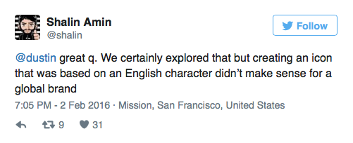
This should be a wake up call to all international companies: ignore that English is the lingua franca of the world. Accordingly, banish all references to the Roman alphabet in your branding.
The problems with the logo for The Metropolitan Museum of Art pale in comparison to the problems with Uber’s logo.
I love how Uber CEO Travis Kalanick got involved. This reminds me of when Marisa Mayer helped fuck up Yahoo’s iconic logo.
Sigh