Shiny Logos

Until recently, there was a tendency to add as much glossy sheen to logos and graphics as possible, particularly in the technology sector. Perhaps designers and clients hoped that these tech-y stylings would help bring viewers into the world of the screen, as if through a modern-day equivalent of trompe l’oeil. Examples of this gimmickry are everywhere, from UPS’s ill-advised 2003 logo update to countless smartphone app icons.

To designers and clients perpetuating this style, I would say: the horizon highlight is no longer mandatory! We are not looking into the future with our icons. The future is here.

Steven Heller

Categories:

Branding

Tags:

Heed to Backgrounds

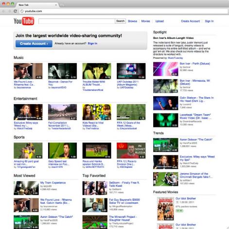
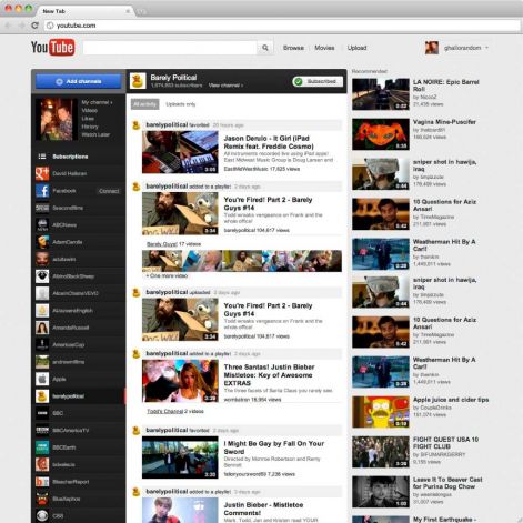
oldyt.jpg
The old YouTube
newyt.jpg
The new YouTube
YouTube launched it’s new design for all users on Thursday afternoon. The reviews are in, and the majority of sites commenting on the changes have chosen to focus entirely on the new features, ignoring the new look and feel. I don’t know how I feel about this. Design is an important part of my life, yet I understand that it’s a peripheral concern for most people. It’s a function over form nation we live in, which makes sense, considering good design is something that has to be learned to be appreciated. That doesn’t mean it’s right.
When I checked out the new design on YouTube, what struck me first was not the increased number of features or Google’s attempts at increasing social networking presence and integrating channels. Rather, it was the numerous little ways the design could be tweaked to make it vastly better. A margin here, a font there, another margin over there, a color here. I’m a developer, not a designer, but even I could recognize the litany of freshman design mistakes the folks over at YouTube made. I could run through a complete list of the issues I found, but instead I’m going to focus on one area of website design that doesn’t get as much consideration as it should, and is also where I feel the new YouTube site is lacking. Specifically, background color.
Before writing this, I did a search on Google for “background color is important.” Most of the links on the first page had to do with CSS, that is, real background colors, not the idea that choosing the right color is important. One link had the promising headline, “Importance of Colors in Web Site Design.” From 2008, the article focuses on the various moods a color could put the user in, and what color choices say about the company that deploys them. It’s some real hippie shit. Besides recommending that designers stick to web-safe colors (HA!), one of the highlights reads, “red : Red is the most emotionally vivid color and may cause a [sic] faster breathing. It symbolizes energy, action, confidence and passion.”
Changing the wording of the search query doesn’t improve things, either. Clearly, background color is something that has gotten short shrift when it comes to design theory.
On YouTube, the change in background color, from white to a very light grey, struck me as bizarre. The old design was never all that good, either, but it was immediately recognizable. YouTube had a look. A cluttered, unwieldy look (worse now), but one a user had burned into their brain. After seeing the new design, I realized that a big part of that was due to the stark white of the background. As important as the little tv screen in the logo, the white of the background had come to be a part of YouTube’s brand.
It’s odd to think that a background color on a web page could be considered within a brand’s color palette, but think about it just a little bit and it begins to make total sense. In print, the majority of the time designers work with, and readers are exposed to, white paper. It becomes something we expect, something we ignore, something we take for granted. On the web, however, a background color can be changed without going through the expense of using a special paper stock or even covering the page with ink. It’s as simple as changing a few characters in the style sheet. As such, there’s a lot more variety out there on the web when it comes to the surface upon which the content lives.
YouTube’s white, then, was just as important to the site’s look and feel as is ESPN’s red to grey gradient, or facebook’s blue header, or Daring Fireball’s dark grey, etc. Change any of those, and the sites would feel a little alien. In some cases drastically different, even without rearranging all the pieces on the screen.
Categories:

Branding

Tags:

Think Quarterly

Seems I missed Google’s new journal, Think Quarterly, when it launched at the beginning of 2011.
From their About page:

When the world is full of noise, you need a little moment of silence – a space to reflect. Google’s Think Quarterly is breathing space in a busy world. It’s a place to take time out and consider what’s happening and why it matters.

The discussion about business ideas that you’ve always wanted to have, a conversation between equals designed to get everybody thinking, sharing and innovating.

The previous two issues where Data and Innovation. The newest is on People.
The typography and layouts are beautiful and the articles seem sharp.

Categories:

Branding

Tags:

People don’t poke anymore.

Ellis Hamburger over at Business Insider says Facebook is losing it’s identity because they’re hiding the ‘Poke’ button.
This is bullshit.
Facebook isn’t losing it’s identity, it’s growing up. It’s no longer the site requiring a college email address to sign up for. It’s a multi-billion dollar company.
You don’t see me driving across lawns or joining hacky sack circles like I did in high school. Doesn’t mean I’m losing my identity.
Moving on……

Categories:

Branding

Tags:

Explorations

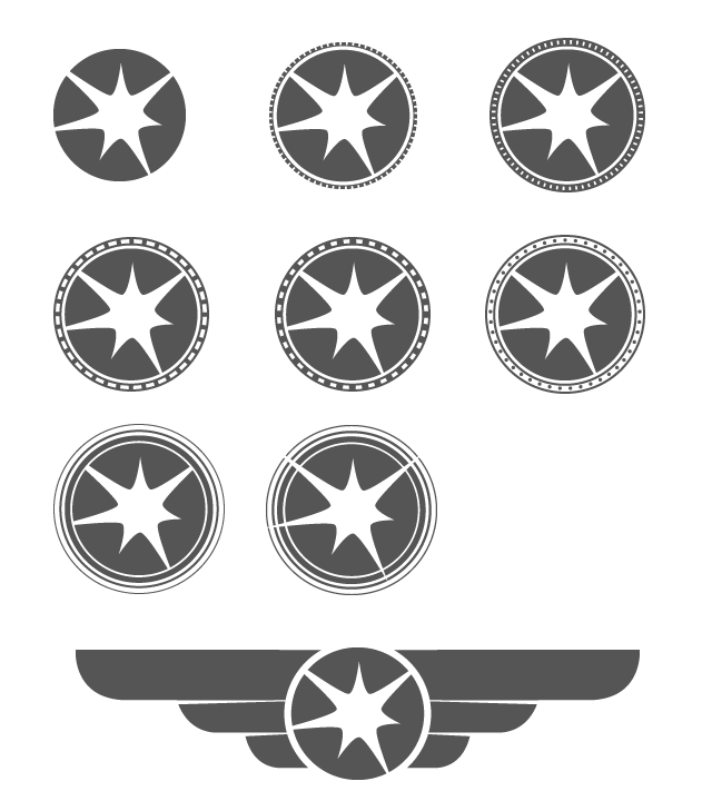
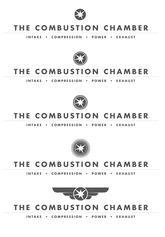
The new Chamber will be going up (relatively) soon, so’ve decided to take a fresh look at my logo, while also preserving the core.
My gut says the simplest version will win out, but I’ve been having fun playing with flourishes circumscribing the explosion.
Some of the words in my head: bushings, velocity joint, structural layers, heat sinks, hood ornament.
logos_TCC.gif
logo_explorations_TCC.gif

Categories:

Branding

Tags:

Rip-offs

Slate: The Highest Form of Flattery

When most people think about the effect of counterfeits on legitimate brands–and when brands themselves litigate against counterfeiters–they focus on the “business stealing” effect: Every fake Prada handbag represents a lost sale for Prada. But a dirty little secret is that Prada rip-offs can also function as free advertising for real Prada handbags–partly by signaling the brand’s popularity, but, less obviously, by creating what MIT marketing professor Renee Richardson Gosline has described as a “gateway” product. For her doctoral thesis, Gosline immersed herself in the counterfeit “purse parties” of upper-middle-class moms. She found that her subjects formed attachments to their phony Vuittons and came to crave the real thing when, inevitably, they found the stitches falling apart on their cheap knockoffs. Within a couple of years, more than half of the women–many of whom had never fancied themselves consumers of $1,300 purses–abandoned their counterfeits for authentic items.

Categories:

Branding

Tags:

people, feelings, stories, and things

Paul Bennett at Bloomberg BusinessWeek keeps it real with his plee to brand and marketing gurus to drop the bullshit jardon:

The hardest thing that marketers and brand managers have to do right now is simplify. Marketing and branding need to get back to first principles — people, feelings, stories, and things. Tangible things. Not weird words. And for all of us agencies out there, we need to feel more confident that actually the best thing we can do is to tell it simply, both to the organization we’re working for and ultimately to the consumer.

Thanks Jory

Categories:

Advertising, Branding

Tags:

it’s a pretty good logo

black-flag-logo.gif

The name was suggested by Ginn’s brother, artist Raymond Pettibon, who also designed the band’s logo: a stylized black flag represented as four black bars. Pettibon stated “If a white flag means surrender, a black flag represents anarchy.” Their new name was reminiscent of the anarchist symbol, the insect spray of the same name, and of the British heavy metal group Black Sabbath, one of Ginn’s favorite bands. Ginn suggested that he was “comfortable with all the implications of the name.” The band spray painted the simple, striking logo all over Los Angeles, gaining attention from potential supporters, and thoroughly irritating police. Pettibon also created much of their cover artwork.

via Wikipedia

Tags:

and by taking control, Google confuses

Adam Richardson over at frog design talks about Why Google had to take control of Android with Nexus One.
I agree with Adam, that this move by Google to make it’s own phone is its attempt to ‘do Android the right way’. But is Google going to make any progress with the Nexus One? I’m not convinced they will.
For one thing, the Nexus One doesn’t sound like it’s much different than any other Android phones on the market (Boy Genius Report, NYTimes, WSJ, TechCrunch). Secondly, I don’t see how Google producing their own phone is going to stop fragmentation of the Android market.
Adam concludes:

The lackluster success of the early Android phones has surely made Google realize that they need to take a much stronger role in order to bring all the pieces of the experience together. The catch-as-catch can approach they’ve had to far just isn’t going to cut it. Fragmentation is a death knell for a product like this at this stage of maturity. Google needs to lead the charge with an integrated platform until the experience gap is fully closed.

Ironically, it seems possible that the better Google’s Nexus One gets the more fragmented the Android platform could become as partners such as Motorola and Samsung continue to improve their ‘flavors’ of Android.
Google wants to have their cake and eat it too. They want to be like Linux, open source and customizable and simultaneously like Apple, closed and consistent across devices.
Google, honey-baby, you can’t have both.

Tags:

the one sheet, having some fun

I’m going into my second year with Roundarch and with the end of 2009 comes our annual reviews.
When managers conduct our annual reviews, they project our ‘one sheet’ on the wall for all the other managers to see. The point is to be creative, whether you’re a designer or not. I wrote about my first one sheet last year.
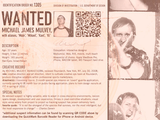
This year I decided to base it on the oldey timey WANTED posters, but update it and make it a more edgy and add some technological flourishes like the QR code (which actually works if you download a QR Code reader app for your iPhone, Blackberry or Android unit).
mmulvey_onesheet_2009_sm.jpg
Designers like to consider themselves badasses when in reality the only thing they usually push around are pixels.
Guilty as charged.

Categories:

Advertising, Branding, Film

Tags: