“That ergonomy is not a new discovery.”
I always enjoy listening to Jony Ive talk.
I always enjoy listening to Jony Ive talk.
Eli Schiff has an interesting multi-part series on the “Fall of the Designer”.
Here’s a bit from Part 3, Conformist Responsive Design and the shift away from shiny, roundy, textural UI elements and towards ‘flat’ design:
Similar to web design, application design is becoming homogenized. Where before, apps like Tapbots’ Tweetbot were worlds unto themselves, with robotic sounds and futuristic cartoon aesthetics, today the only remnant of that past is robotic sound effects, devoid of any rationale as to why they sound the way they do.
Paul Haddad of Tapbots seemed to laud the shift, explaining in 2013 that he and his team “talked about making the Mac version a little bit more…plain” too. This hesitation might have invited our skepticism about their approval of flat design. But in the following years, Tapbots announced proudly their newly flattened Tweetbot 2.0 for OS X.
Tapbots is not alone in castrating Calcbot and their Twitter client Tweetbot. The Iconfactory’s Twitteriffic and Twitter’s proprietary iOS app in earlier days all attracted dedicated followings based on expressive designs which each exposed unique feature sets. But with their new flat interfaces, they struggle to differentiate their brands. Even with custom glyphs, animation and functionality, at a 10 foot view, it is difficult to tell one of these flat UIs from the next.
Did these developers suddenly have an epiphany and conclude that their former designs were ugly and overwrought? Or was it instead an imposed, though convenient, ideological shift by operating system designers?
I respect the time and thought Schiff has put into this series on design, and I think the answer to this last question is simple: fashion. UI design, like clothing, goes through different different phases and trends. Thats’ really it.
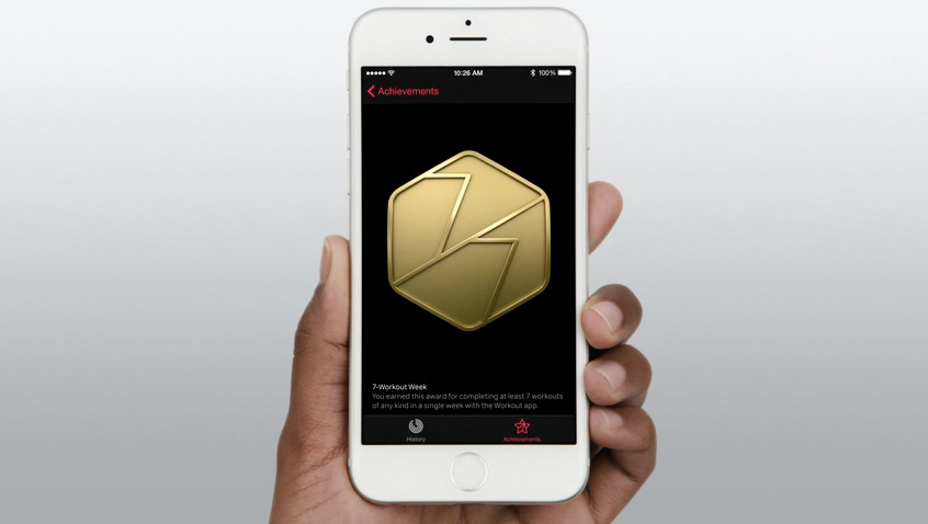
If you’re afraid skeuomorphism is gone forever, fret not. All you need to do is look at the achievement badges in the new Apple Watch exercise app:
There are gaudy ways of using depth and shading in UI design and there are tasteful ways of using depth and shading just like there tasteful and gaudy ways of using chrome and paint on a car.
I think what we’re seeing, as Schiff has pointed out is not so much flat design as lazy, flat design.
It’s pedantic, sure. Isn’t 1.16180 close enough? Yes, it probably would be, if there were anything to scientifically support the notion that the golden ratio had any bearing on why we find certain objects like the Parthenon or the Mona Lisa aesthetically pleasing.
But there isn’t. Devlin says the idea that the golden ratio has any relationship to aesthetics at all comes primarily from two people, one of whom was misquoted, and the other of whom was just making shit up.
—John Brownlee, Co.Design
I agree with the author. The golden rectangle is not some silver bullet for design.
I’m guilty of using the golden ratio into my work:
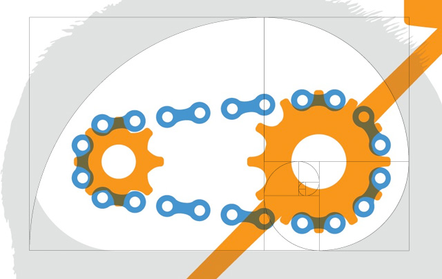

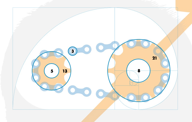
To my defense, though, I use it pretty damn well.
This has more to do with working within a design “system” with constraints than blindly looking to the golden rectangle for a solution.
When you squint your eyes and tilt your head, don’t a lot of these products look awfully, well, similar? Don’t they look pretty but, at times, a little dull?
When it becomes necessary for virtually every business to signal they value design by adopting an up-to-date style, it becomes a commodity, a box to be ticked. That fresh look quickly becomes a cliché. This descent towards aesthetic monoculture was helped by the ease with which this particular style can be cheaply imitated: stick a blurred photo in the background, lay some centered Helvetica Neue on top and you’re already halfway there!
What other opportunities might we be missing out on? The internet and its surrounding technologies are the driving cultural forces of our generation. Taken individually all of these designs are quite beautiful. But who wants to live in a world with only one type of beauty?
—Has Visual Design Fallen Flat?, Emmet Connolly
Great points all around in this piece.
What is the solution?
We could argue platforms like Squarespace have contributed to this homogonization and commodification of design, but at the same time, they’re enabled people and small businesses to create nice looking sites with an extremely easy-to-use content management system. In an alternate universe where Squarespace didn’t exist these would likely be horrendous HTML sites built in Dreamweaver or mobile-incompatible Flash sites from 2005.
The sad truth for a lot of designers (I’ve had a career as a designer for 15 years) is that many clients don’t need a custom-made website. An off-the-shelf solution from Squarespace, Virb, Weebly or Wix is more than adequate for many people. A custom website will not impact most businesses more than a one made with one of the previously mentioned services. This fact might hurt some egos, but the sooner designers come to terms with this, the better off they’ll be.
An even scarier and sadder truth is one people in the creative field like to think doesn’t apply to them: that robots and artificial intelligence will never replace them. Spoiler: this is already happening. My only advice is the words of Charles Darwin, and my daily mantra: “It is not the strongest nor the most intelligent species that survives, but the one most adaptable to change.”
Your value as a designer is in your ability to solve problems for clients. Most of the time this manifests itself in visual solutions, but as designers we have to learn that we can and should be able add value in other ways (again, follow the above mantra).
I upgraded my machine to OS X Yosemite the other day, and while Apple is very excited about the new design, there are some things I do not like. For one, I find the default colors of the text bubbles in messages to be too bright, nor would green and blue be the colors I would choose. Unlike past versions of OS X, there is no longer any ability to choose a color I would like from the app’s preferences. Apple has their reasons for removing choice from the way users experience their operating system, but personally, I don’t care what those reasons are. I’m just not happy that they took away a feature I liked, and the offense is compounded by what I feel is a poor color choice.
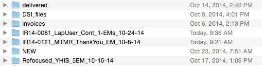
I also feel that the new folder icons are a downgrade from previous versions. Once again, I find the colors to be too bright. But, there is a way to change the folder icons to something less stressful to a user’s retinas. A programmer by the name of Yuki Yamashina has posted a how-to on github. From start to finish, the process only takes a couple of minutes, and a user can change the icons into whatever they want. As for me, I desaturated my folder icons to more closely resemble the icons from previous versions of OS X, and I couldn’t be happier (see below). Thanks, Yuki!