This feels weird.

Windows_Phone_&_on_iPhone.jpg
Microsoft has built a Windows Phone 7 simulator in HTML5. It lets you get a feel for it on iPhones and Android phones.
I tried it out, and yes, it would be better if the iOS chrome went away to give you the full experience, but it’s still pretty cool.
I don’t find myself saying this often, but Microsoft did a nice job with WP7.

Categories:

Human Experience

Tags:

The Kindle Fire

Marco Arment tried out the Kindle Fire and loves it:

I expected the Kindle Fire to be a compelling iPad alternative, but I can’t call it delightful, fun, or pleasant to use. Quite the opposite, actually: using the Fire is frustrating and unpleasant, and it feels like work.

For most people, every other computer in their life feels like work, and they don’t need another one.

It’s not an iPad competitor or alternative. It’s not the same kind of device at all. And, whatever it is, it’s a bad version of it.

That’s probably all you need to know about the Kindle Fire. Below is a detailed account of the issues I ran into, but I won’t take offense if you’re burnt out on long Kindle Fire reviews and stop here.

One of my coworkers happened to bring his new Fire in to the office yesterday and I got to do a little test drive and I came to a similar conclusion as Marco. The device is just meh. It’s ok. It does the job. There’s nothing delightful about the device. Aside from smooth scrolling on the content ‘carousel’ on the main screen, everything else on the device is choppy.
The Kindle Fire is mediocre in every aspect, from Human Experience to motion and transitions.
As with the HP Touchpad, I was hoping for a real contender to the iPad. But like the Touchpad, the execution is poor.

Categories:

Human Experience

Tags:

Effective as a piece of Art.

John Gruber on spec-based reviews:

Spec-based reviews of computers and gadgets are inherently flawed, a relic of an era that’s already gone. Movie reviews are about what the movie is like to watch. Is it enjoyable, is it entertaining, does it look and sound good? Imagine a movie review based on specs, where you gave points for how long it was, whether the photography is in focus, deduct points for continuity errors in the story, and then out comes a number like “7.5/10”, with little to no mention about, you know, whether the movie was effective as a piece of art.

Spec-based reviews are only important to are the companies building them and geeks. Once you have the fundamentals, like battery life and memory/disk space you enter a realm where the average consumer doesn’t give a shit.
Dual core, quad core, megahertz, open platform/closed platform. Bah!
Just show me how great the experience is.

Categories:

Human Experience

Tags:

Pictures Under Glass

Bret Victor, former human-interface inventor at Apple, intelligently rants about the future of interaction design. Inspired, in part, by Microsoft’s wonderfully banal concept video that’s been making the the rounds on the web this past few months:

As it happens, designing Future Interfaces For The Future used to be my line of work. I had the opportunity to design with real working prototypes, not green screens and After Effects, so there certainly are some interactions in the video which I’m a little skeptical of, given that I’ve actually tried them and the animators presumably haven’t. But that’s not my problem with the video.

My problem is the opposite, really — this vision, from an interaction perspective, is not visionary. It’s a timid increment from the status quo, and the status quo, from an interaction perspective, is actually rather terrible.

via @stevenbjohnson

Categories:

Human Experience

Tags:

One Step Closer

ipodshuffle1.jpg
I originally wrote this piece back in 2009. With Apple recently introducing Siri, it is interesting to go back and read what I wrote:

The posting of specific product launches or reviews of these products is not something that deserves a spot on this site–we’ll leave that to the engagets of the world. So it is with some apprehension that I make a post specifically focusing on the new iPod Shuffle and what it represents not only to Apple, but to people in general. After all–it’s the people that end up using these products.
Apple announced its new iPod Shuffle with less media spectacle and usual hoopla that follows much of its product line. It has been a pattern that I have started to notice, and that is the fact that there seems to be a lot more to the products that receive less attention. There always seems to be a lot of things that go missed by the mainstream reviewers, and less thought into these patterns that keep appearing. There is more to this phone–oops, I mean iPod–than meets the eye.
This new iPod Shuffle is a culmination of many technologies that have been championed by Apple over the years. One of the key elements that is missing from this new device is a physical interface contained on the unit. This has now been placed on the headphone cord and now makes it very easy to control, using various clicking combinations. The other bit of technology to accompany this addition is the use of voiceover to alert people as to the name of track and artist that is playing in their headphones–this was something that was lacking in previous models of the iPod Shuffle. With all this said, there is a reason for it, and it’s not just to sell more units. This is one step closer to the perfect interface and the perfect phone–oops, I mean iPod.
This iPod demonstrates a device that is not only less intrusive to use, but it is a device that is completely accessible to visually impaired people. The use of the headphone controls along with the voice feedback on the device, make it something that opens up the doors to people who could not enjoy the full experience of the screen-based iPod. These people can now navigate tracks and receive feedback as to what content is playing, giving them an experience in a mainstream music device that has not been achieved before.
This furthers Apple’s quest for the perfect interface, the interface that doesn’t have somebody bound to the use of a screen, but can offer an experience that is just as enjoyable–or maybe even more enjoyable. Only time will tell, but I think this represents a movement into a realm never seen before.
For those of you that know me–you know that I have always talked about how I would like to see somebody put a screen-less phone to market. There have been attempts by some companies to do it, but nothing that has produced good results. I think Apple has an opportunity to do it, and to actually pull it off.
The addition of the voiceover technology makes me think about voice coming from the other direction. I don’t mean the lousy attempts by other companies to integrate voice commands into their devices, I mean a system that actually works. A system that would allow people to place calls through the use of their voice, along with being able to go through their address book and place calls. We may not be able to get rid of the phone keypad, but just imagine a phone/iPod that was contained in a pair of headphones. It may not be that far off.
Thanks for listening and keep on heeding.

Categories:

Human Experience

Tags:

It Should Know

When I come across links I want to comment on and post to this site, sometimes I’ll email them to myself from my iPhone. It’s not the most elegant process, but it’s simple and it works.
The problem comes when I open said link on my laptop.
This is what I see.
I was listening to an episode of The Talk Show with John Gruber and Dan Benjamin earlier this year and Gruber made a great suggestion. He said in the same way a regular webpage knows to serve you the mobile-optimized version when you’re on your phone, the opposite should also be true – when you open a mobile-optimized version of a web page on your desktop computer, it should know to redirect you to the regular version.

Categories:

Human Experience

Tags:

Quantity & Quality – Mutually Exclusive

Over at Fotune, Philip Elmer-DeWitt tells us iOS’s Internet market share hits a record 54.65%.
He writes:

You would think that with nearly 50% of the global market for smartphones that Google’s (GOOG) Android would also dominate the Web.

So how does the competition stack up?

Android, with 16.26%, is still trailing Java ME’s 18.52%. Nokia’s (NOK) discontinued Symbian, at 6.12%, is fading fast and Research in Motion’s (RIMM) is holding steady at a negligible 3.29%.

Elmer-DeWitt points out the fact that Apple has an advantage with iPhones and iPads and iPod Touches. This is true, but I think there’s another piece to this equation.
If you’ve opened a Best Buy flyer/insert in the last year, you’ll usually see a 2-page spread of Android phones. They range from $199 to $99 to free with no recognizable differences to the average, non-techie user.
Now with over 50% of the phone share, Android is clearly kicking ass in raw numbers, but if you happen to have used some of the phones in the in range featured at Best Buy, you’ll know some of them offer horrible Human Experiences.
Chuggy, choppy, buggy, crashy.
So my theory on why Android has over 50% market share but only 16.26% Internet market share is: People are getting suckered into buying these Android phones (“hey, they look slick like the iPhone”), not understanding there’s a huge difference in quality between models. Then they start to use their phone, only to realize it sucks. People don’t like their Android phones, so they stop using them.
I was in the car with a good friend of mine recently and I handed him my iPhone 4 to help me navigate to our other friend’s house. He started flicking around the Google Map, and said “Oh my god, this interface is so smooth.” He happened to have an Android phone on the lower end of the quality spectrum and was only now coming to understand what he had bought.
Quality and quantity are mutually exclusive characteristics.

Categories:

Human Experience

Tags:

Trucks and motorcycles are both vehicles, but not every motorcycle is a truck.

As I’ve been listening to people from Microsoft in the news over the last couple months I’ve noticed a recurring theme – they like playing games with semantics. Sometimes I think they get cutesy but sometimes I think what they say aligns with their business philosophy.
The first time I noticed this was when Steve Jobs described us as being in the ‘post-PC era’ at the D8 Conference in 2010:

When we were an agrarian nation, all cars were trucks, because that’s what you needed on the farm. But as vehicles started to be used in the urban centers, cars got more popular. Innovations like automatic transmission and power steering and things that you didn’t care about in a truck as much started to become paramount in cars.

PCs are going to be like trucks. They’re still going to be around, they’re still going to have a lot of value, but they’re going to be used by one out of X people.

I think that we’re embarked on that. Is [the next step] the iPad? Who knows? Will it happen next year or five years from now or seven years from now? Who knows? But I think we’re headed in that direction.

The next day at the conference, Ballmer responded:

I think people are going to be using PCs in a greater and greater numbers for many years to come. I think PCs are going to continue to shift in form factor. PCs will look different next year, the year after, the year after that… I think the PC as we know it will continue to morph form factor… Windows machines are not going to be ‘trucks.’ They will continue to be the mass popularizer of a variety of things that people want to do with information… I think there’s a fundamental difference between small-enough-to-be-in-your-pocket and not-small-enough-to-be-in-your-pocket. There will be some distinct differences in usage patterns between those two devices.

So here we have Ballmer getting all philosophical. What is a PC? What is PC-ness? If we were to remap Jobs’ truck analogy for Ballmer, Ballmer would have probably said everything is a truck. Scooters? They’re just trucks without the flatbed and only 2 tires. Sedans? Sedans are trucks that are lower to the ground and have a trunk instead of a flatbed.
Fast-forward to Microsoft’s BUILD Conference that happened last week and we can see that Microsoft’s leadership is truly aiming for a PC experience everywhere with Windows 8. If you want to work within the Metro UI, go for it, but if you need that nasty, overly-complicated experience of the ‘traditional’ Windows, you can always jump back to it.
According to Steven Sinofsky, you never have to compromise:

Why not just start over from scratch? Why not just remove all of the desktop features and only ship the Metro experience? Why not “convert” everything to Metro? The arguments for a “clean slate” are well known, both for and against. We chose to take the approach of building a design without compromise. A design that truly affords you the best of the two worlds we see today. Our perspective rests on the foundation of the open PC architecture that has proven flexible and adaptable over many significant changes in hardware capabilities and software paradigms. This is the flexibility that has served as a cornerstone through transitions in user interface, connectivity, programming models, and hardware capabilities (to name a few).

And this leads me to the other big area I see Microsoft getting creative with semantics – their use of the word compromise.
A compromise is something created to appease people with opposing views on a topic. Each side has given up certain demands in order to come to an agreement. In my mind, when you compromise each side usually end up with something less than ideal.
John Gruber wrote a great post in response to this ‘compromise’ a few weeks ago:

Like I wrote yesterday, Microsoft and Apple are going in two very different directions, especially when you compare iOS to Windows 8. Apple has embraced compromise. The compromises in iOS are, for many people in many contexts, what makes the iPad better than a Mac. The compromises enforce simplicity and obviousness in design, and at a technical level they lead to iOS’s excellent battery life.

Now I don’t disagree with Gruber’s core argument, again I disagree on the use of ‘compromise’. If Apple’s goal is to create the best tablet experience in the world, compromises can’t be made, because compromising implies negotiating down from some ideal vision. If desktop-level applications aren’t needed or appropriate for a tablet, then not supporting them is not compromising.
Giving a motorcycle two wheels instead of four doesn’t mean you’re compromising. What you’re doing is giving a motorcycle the thing that makes it great.
Microsoft wants to have it’s cake and eat it too by creating the Metro UI while holding on to the Windows (desktop) legacy UI. It’s appeasing both sides of Windows. It’s like driving a truck around with with a scooter attached to the side like an escape pod. Microsoft is compromising.
I think the big reason for this all-in-one approach to Windows 8 lies both in Microsoft’s dependance on the Windows/Office franchise for the bulk of their revenue as well as their late entrance into the tablet race. It’s too late to capitalize on the newness of the tablet market (they’re 2 years late already) and they’re afraid to put all their chips in on a Metro-only mobile UI. What they do have is the largest install base for PCs so they’re backpedaling into the tablet market by way of the desktop PC.
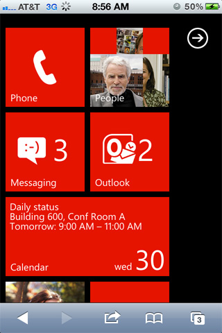
Notice during the demos at the BUILD conference, how it’s been a macro focus at the Metro UI on all devices, rather than a micro focus at just one form factor, the tablet. I think Microsoft feels that a Windows tablet can’t stand strong on it’s own, because, by extension, Windows Phone has not been able to stand strong on it’s own.
Apple can do the iPad without their desktop business because it has an ecosystem grown from the iPhone. Conversely, as Windows Phone hasn’t really taken off, their biggest ecosystem is on the desktop. So we end up in fun game of semantics where “everything is PC” and you can have “Windows everywhere” and compromising on your operating system becomes not compomising.
But let’s be clear – not everything is PC, just as not every motorcycle is an automobile.
And when you’re making concessions on the mobile side and desktop side when developing your next operating system, you’re comprimising. You’re not not compromising.

Categories:

Human Experience

Tags:

You had me at incoherent.

This Is My Next on Windows 8:

If we’re going to be totally honest though, we’d describe Windows 8 right now as incoherent and contradictory. Touch response in the Metro UI is stellar, Contracts sound seriously useful, and snapping apps can make you more productive on a tablet, but whenever you want to get down and dirty with a traditional program, it’s back to the traditional desktop interface. There are two Control Panels, two versions of IE, and core apps are nowhere to be found (i.e. Mail, a camera app, etc.) Meanwhile, if you want to do anything with the desktop interface (save things you’ve actually planted on your desktop) you’ll probably find yourself thrown back to Metro since the traditional Start menu is gone. The whole Human Experience feels schizophrenic, with users having to jump back and forth between the two paradigms, each of which seem like they might be better off on their own.

Incoherent, contradictory, schizophrenic. You didn’t let me down, Microsoft.
Well done.

Categories:

Human Experience

Tags:

A Big, Fat Unicorn

So Ben Brooks imagines an alternate universe for Microsoft:

What if Microsoft bought HP’s PC division to start producing their own hardware: the higher quality PC?

So you’re imaging Microsoft turning into Apple.

Microsoft has begun building Microsoft stores, they would have a nice, existing, retail presence. They have deals with all major retailers. They likely have more brand trust than any current PC maker.

Ok, sure. I agree these retail stores could come in handy if they ever figured out how to make money from them.

In this scenario Microsoft wouldn’t become another me-too PC maker — they would be setting the standard. The standard for: price, quality, design, and speed.

Quality, design, speed. Microsoft. Right.

This is not out of the realm of possibility — though it would be a risky move.

That’s exactly what this scenario is – out of the realm of possibility. What Mister Brooks is proposing implies a complete change in business strategy for Microsoft. Microsoft started with the mission statement: “a computer on every desk and in every home”. From day one they’ve always been about quantity over quality.
Maybe I’m wrong. I’d love to be proven so. Windows Phone was so refreshing when it came out and I was genuinely excited to see another strong contender enter the mobile OS arena, but then they started showing their plans for Windows 8, where some aspects would be in a traditional-Windows UI and other aspects would be in their new Metro UI. Nope. Still the same old Microsoft. Trying to be everything to everyone. Decent at some things, great at nothing.
This is also the company who recently got all excited about their revamped Windows Explorer.

Categories:

Human Experience

Tags:

Eye Opener

This post by Nick Farina (via Daring Fireball) was a huge eye-opener for me on Android. He breaks down all the differences between Android and iOS, from dev environment to debugging to UI design tools, but the section on Animation was what slapped me in the face.
How Android deals with interactions (emphasis added):

If you pressed the Down key, you would expect the “Homepage” entry to be selected instead of “Go to.” So you press the Down key. This causes an “invalidate,” meaning, “please repaint the screen.” So the screen is cleared, then:

  • The OS redraws the status bar at the top
  • The WebView redraws the Google.com website
  • The Menu draws its translucent black background and border
  • All the menu text is drawn
  • The blue gradient highlight is drawn over “Homepage.”

This all happens very quickly, and you only ever see the final result, so it looks like just a few pixels have changed, but in fact the whole screen must be reconsidered and redrawn.

If this sounds familiar, it’s because this is the basic method used in GDI, the rendering system introduced with Microsoft Windows 1.0. That sounds damning, but really most GUIs operated this way.

Wow.
Let’s see how iOS handles things:

When you’re using an iPhone, you’re playing a hardware-accelerated 3D game. You know, the kind of 3D where everything is made out of hundreds of little triangles.

When you flick through your list of friends in the Contacts app, you’re causing those triangles to move around. And there’s a “camera,” just like a 3D shooter, but the camera is fixed above the Contacts app’s virtual surface and so it appears 2D.

Which is a long way of saying that everything on iOS is drawn using OpenGL. This is why animation on iOS is so hopelessly fast. You may have noticed that -drawRect is not called for each frame of an animation. It’s called once, then you draw your lines and circles and text onto an OpenGL surface (which you didn’t even realize), then Core Animation moves these surfaces around like pulling on the strings of a marionette. All the final compositing for each frame is done in hardware by the GPU.

So when things just never feel quite as smooth as on iOS, there’s a reason. I wonder how much of this is relevant to webOS? Based on the chugginess of the UI in my few weeks of testing the TouchPad, I wouldn’t be surprised if it was.
As Nick mentions, Android began pre-iPhone. Horace Dediu of Asymco argues Google created Android as a defensive move to protect their existing revenue streams. They weren’t thinking about the future. The opposite was the case for Apple, they created the iPhone (and iOS) to create a new revenue stream. It was yet another chance to define what the future of mobile computing should look like.

Categories:

Human Experience

Tags: