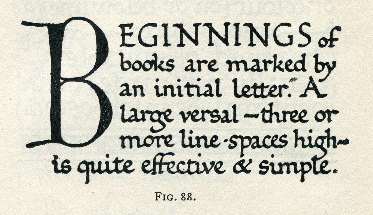
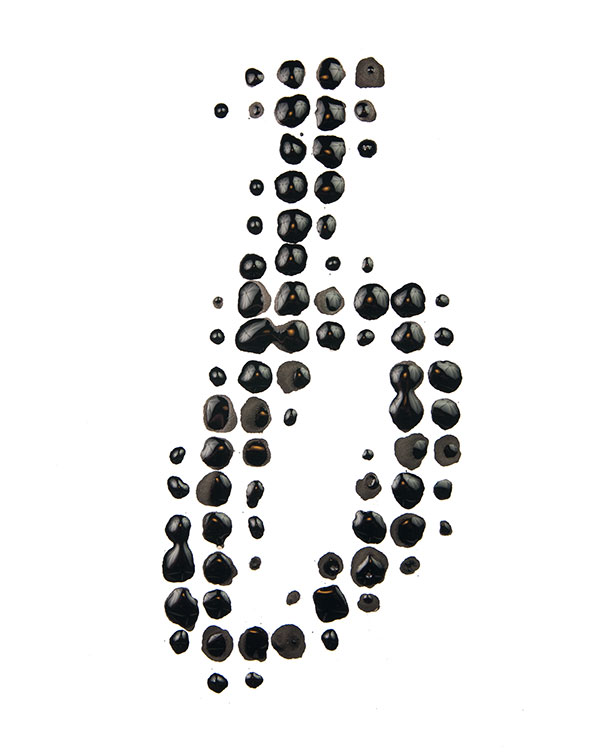
“…preserve character identity under duress”

Emphasis added:

According to a designer who used to work with Frere-Jones, his eye is so sharp that he can look at a printout of a letterform and tell if it’s one pixel off, the same way Ted Williams was said to be able to hold a baseball bat and tell if it was a half-ounce too heavy. He often approaches typography from strange and playful angles; in college, he drew an experimental font called Cat’s Cradle, “which nested and tangled each letter into its neighbor, like shopping carts nested together in front of a supermarket,” he says. “The goal was to preserve character identity under duress.”
—Jason Fagone, New York Magazine
I love that, “preserve character identity under duress.”
Aren’t we all trying to do that in one way or another?

Categories:

Typography

Tags:

Ill-vetica

Apple’s desktop and mobile operating systems have been gradually converging for some time. So it was inevitable that one typographic palette would displace the other. With OS X 10.10, Mac desktops will sport Helvetica everywhere. But I had really hoped it would be the other way around, with the iPhone taking a lesson from the desktop, and adopt Lucida Grande. Check the lock screen on your iPhone. You’ll see Helvetica there, a half-inch tall or larger, and it looks good. Problem is, there aren’t many other places where it looks as good.
—Tobias Frere-Jones, Co.Design
I’m disappointed Apple is doubling down on Helvetica Neue.
Make no mistake: Helvetica is a classic, like the E-Type Jaguar. It’s a beautiful typeface, but just as many more (dare I say most) cars today handle better than the E-Type, there’s many more readable, contemporary typefaces for tablets, phones and laptops than Helvetica Neue.
This was a missed opportunity for OS X and iOS.

Categories:

Typography

Tags:

Self-Sabotage

Ian King & Dina Bass reporting for Bloomberg on Microsoft being a day late and dollar short with whatever they’re trying to do:

Microsoft Corp. (MSFT) has sold about 1.5 million Surface devices, people with knowledge of the company’s sales said, a slow start in its bid to crack the fast-growing tablet market to make up for slumping personal-computer demand.
First Microsoft pisses off their vendors by coming out with what they consider the “ideal” (to add extra cheese to those air quotes, imagine Steve Ballmer making them) form factor for a Windows 8 tablet.
Then, their “ideal” fails to gain traction, making vendors think twice about even making their own.
Way to shoot yourself in the face, Ballmer.
Seriously though, what’s the incentive to make a Windows 8 tablet at this point?

Categories:

Typography

Tags:

Exclusively and Unapologetically

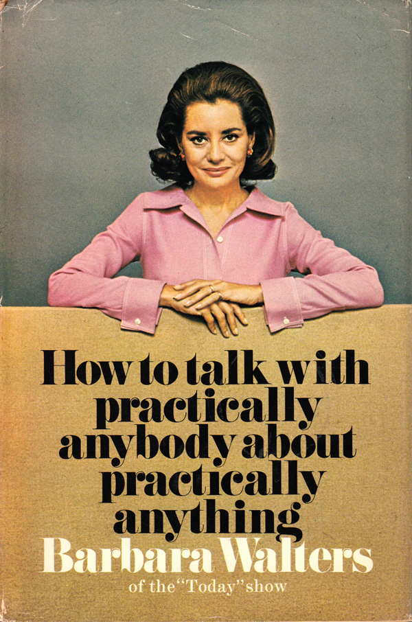
At Stemmings, Matt Chase on his mother and Comic Sans:

My mother, in addition to being my apparent number one fan, is also an educator of children. This means several things, but chiefly: 1) she has an endurance typically found only in Olympic athletes and 2) she uses Comic Sans exclusively and unapologetically. Sometimes in red, sometimes in blue, it’s there–all over her classroom and often in the e-mails she sends my sister and I. And while it’s true that our phone chats don’t often comprise the typographical considerations of my day-to-day work process, the use of this typeface is a notable point of contention. “Why, mom, why,” I used to wonder. Is it buried deep in the teacher DNA? Part of some iron-clad contract? A perverse joke lauded in the teacher’s lounge, legendarily discussed by professors sipping coffee from mugs reading “I Love Helvetica” emblazoned in a fluorescent swath of Comic Sans mockery?

Finally, I just asked.
Categories:

Typography

Tags:

The Order

Nice Wikipedia find by Drew Breunig on the topic of quotation marks in relation to periods and commas:

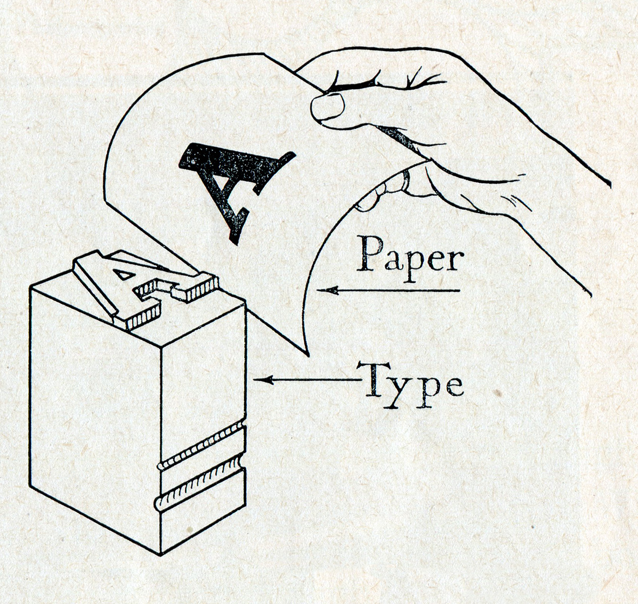
Before the advent of mechanical type, the order of quotation marks with periods and commas was not given much consideration. The printing press required that the easily damaged smallest pieces of type for the comma and period be protected behind the more robust quotation marks. The typesetter’s rule was standard in early 19th century Britain, and the U.S. style still adheres to this older tradition both in everyday use and in non-technical formal writing.

The older I get, the more interesting and useful I find history.

Categories:

Typography

Tags: