Dammit, Apple. You’re Supposed to Be the Ones With Good UI Design.
The grand appeal of using an e-reader is the ability to own a large library of books without adding to the colossal weight of one’s possessions. Ever since I moved away from print books I’ve been able to remove hundreds of pounds of clutter from my apartment and from my life. Storing books digitally has improved my quality of life. That being said, the various e-readers that are out there have an obligation to provide a good user experience, and they do that through design.
In the past I’ve taken Amazon to task for user interface design that I felt was subpar. Since it’s introduction, Kindle for the iPad has gone through numerous updates to its UI, and while still not perfect, it provides a fine balance of text and whitespace. The only reason I don’t use the app regularly is because Kindle doesn’t have continuous scrolling. Enter iBooks, the e-reader app from Apple.
Apple prides itself on the quality of its design. One can see it from the look and feel of Apple’s signature hardware, to the way fonts render in OSX, and everything in between. Which makes this so inexplicable:
That is a screenshot of a page in iBooks, with continuous scroll turned on, after an update to iOS 10. The margins to the right and left are too small, leaving the text crowded to the edge of the screen. When using one of the new model iPad Pros, the text is less than an inch from the edge of the device. The width of the text also interferes with the eye’s ability to flow from one line to the next. What happened to all that whitespace that designers value so much? It used to be there. This is a screenshot of the same text taken in iBooks from an iPad running iOS 9:
The second screenshot shows a much better use of margins. I know there are charlatans out there who prefer text to be much closer to the edge, but they’re wrong. Luckily, a solution that satisfies most users should not be that difficult for Apple to implement. The Kindle app already has a margin selector in the same menu where a user adjusts fonts and background colors. The settings in iBooks does not. As of right now, the experience in iBooks on the iPad has been degraded by the decision to close the margins. Were Apple to add a margin selector, it would be a vast improvement to the app.
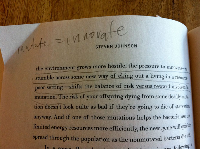 Some might look disapprovingly at image above, with all those crude lines and chicken scratch writing, but for me, being able to underline chunks of text, scribble notes and circle words I want to look up later opens up a deeper level of comprehension into the book I’m reading. Of course this method can be adapted with an e-reader by simply pairing it with a physical notebook, but it’s a little more effort and not well-spent effort. I’m not a psychologist but something about physically interacting with a book takes reading beyond simple consumption. It becomes a form of creation. By the time you reach the end of your book you’re not left with the same pages you started with. No, no … these are my pages now. Sure, the author is making his points, but I’m deciding which ones are important. Once I’ve read through and made sufficient notes I can begin the fun game of flipping back and reading over the passages I marked up.
 This might seem like a minor point, but the fact that I can’t easily flip between pages on a Kindle is a huge frustration. No, this doesn’t mean I’m not able to remember what I’ve read, but sometimes I want to reread passages. Great books, like great movies, are meant to be read over and over (unless you’re satisfied watching a Kubrick movie once). I’m completely confident this technological limitation of e-books will be resolved but until then, my thumbs rule.