colors circles can help
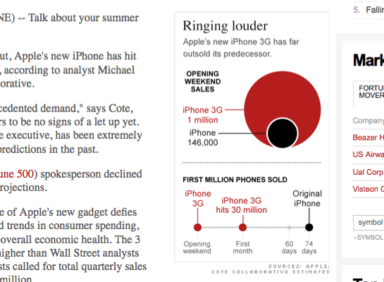
I like seeing examples (however small) of data visualization helping out in the understanding of an article.
While this article is very easy to understand, the diagram distills is excellently and simply.

screengrab from Fortune: Analyst: 3 million iPhones sold in first month