vernacular design
I’m surprised how many designers (web or otherwise) that don’t know the term vernacular design. Considering how much vernacular design is out there, I can guess a lot of people don’t know that they’re even engaging in it.
Vernacular design refers to a style, not to a methodology. A common example would be the vintage/retro style this site uses. I love old car manuals, diagrams and typographic styles from the 1950’s & 1960’s. I could use a similar style on any site if I chose to – what gives the style meaning is underlying metaphor from my studio – The Combustion Chamber, and the extension of this ‘brand’ into this blog, Daily Exhaust.
Many designers don’t reach out at all in order to marry a vernacular design style with a concept, they just do it because it looks good and many can make a good living designing by style and not by meaning derived from the content of the project. This doesn’t make it right.
Which brings me to a great example of vernacular design I found today – Field Notes.
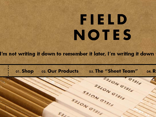
This site is beautiful in and of itself (both the design and the HTML code).
…but once we dig deeper, we find a wonderful concept to support this stylistic approach:
INSPIRED BY the vanishing subgenre of agricultural memo books, ornate pocket ledgers and the simple, unassuming beauty of a well-crafted grocery list, the Draplin Design Company, Portland, Oregon in conjunction with Coudal Partners of Chicago, Illinois bring you “FIELD NOTES” in hopes of offering, “An honest memo book, worth fillin’ up with GOOD INFORMATION
Every project has a concept – find it and exploit it.
It’s only going to make your work stronger.