Data Visualization for ME
A big part of my job at Roundarch is working with and visualizing data and taking it beyond bars and pies. I don’t have much experience with data viz and as much as I appreciate and work with data visualizations, I haven’t found my ‘entry point’ into it yet.
Then I came across Nicholas Felton’s portfolio and I found my in.
Felton has done what I’ve always recommended to people who don’t have enough work in their portfolios – make stuff up.
He’s created annual reports of himself for 2007, 2006 and 2005.
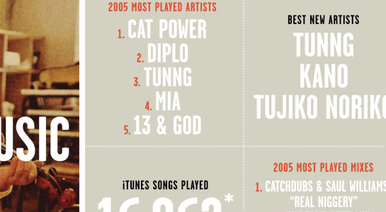
Top tracks in iTunes listened to, miles traveled (and how far that is from the moon), digital photos taken, photos per country, books read, food eaten – the sum of Felton’s parts.
Brilliant idea.
His work has inspired me to not only visualize data in my own life, but how to do it for client work, how to find new connections with existing data.
Doing something something new with something old – this is the essence of innovation.
Once you ‘get it’, the world starts to look like visualizations, like Neo in the Matrix (but in a much more interesting way, no so numbery and greeny).
update: Victor tipped me off to this post at Cool Hunting, Andrew Kuo: No Lifeguard on Duty