Project Cascade
Despite rocky intiatives like it’s new paywall, it’s good to see there’s interesting work happening at the New York Times:
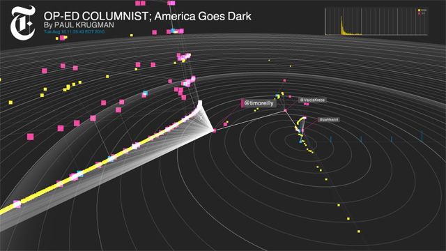
For the past several months, the R&D Lab has been working, quietly, on a time-based representation of how the Times’ news content is being shared in Twitter’s social space. Its name: Project Cascade. Superficially, it’s a data visualization, but it’s actually a tool that could, ever so slightly, change the way we think about online engagement.
It’s the product of a collaboration among Mark Hansen, the UCLA stats professor who spent a spring 2010 sabbatical working at the Times as what Zimbalist calls the paper’s “futurist-in-residence” — that casual title alone offers evidence of the scope of the R&D Lab’s ambition — along with Jer Thorp (data artist in residence) and Jake Porway (data scientist). And it has, despite its pragmatic uses, a firmly artistic attitude: Hansen, along with the artist Ben Rubin, designed the “Moveable Type” screen installation in the Times’ lobby, and Thorp, whose work we’ve written about previously, has converted data from the Times’ API into visualizations that are both revealing and stunning.
The team had access to a trove of usage data for Times stories, and wanted to figure out a way to see and understand the life those stories adopt once they leave the newsroom’s confines and go out into the world. The tool, which focuses on Twitter and uses information from the Bit.ly URL shortener, is their solution. “What it attempts to do,” Zimbalist says, “is dimensionalize and make really physical and tangible the way that news is shared.”
via FishbowlNY