Charts Are Awesome
Ezra Klein over at the Washington Post has compiled a slideshow of charts made by economists that illustrate the economic woes facing the country. These charts are ugly as hell, from a strictly aesthetic standpoint, but they are beautiful in the concise way they present information. Unfortunately, the content of the information is quite frightening. Below is a selection from the original posting.
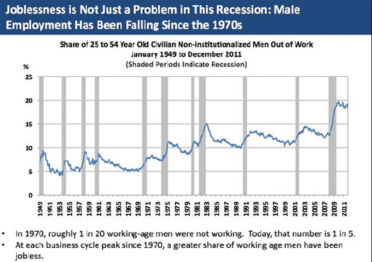
This chart illustrates the changing nature of work for men in the United States. As women continue to enter and equalize the workforce, competition for jobs becomes stiffer. In addition, men have been steadily performing worse in schools and colleges for decades, leaving many ill-prepared and ill-trained for steady employment.
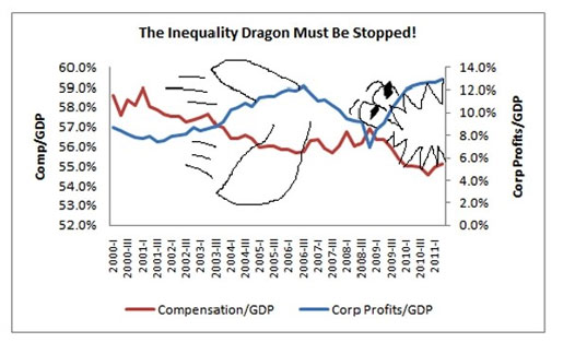
The author of this chart put in a little gallows humor to emphasize the growing disparity between corporate profits and compensation to those that generate the profits. This is a powerful chart in that it brings to mind a fundamental flaw in our economy. As it now operates, the American economy is a powerful engine of revenue creation, but not job creation. In fact, in many instances, obliterating jobs can generate more profits than adding jobs. This is an economy caught in the throes of entropy, and a question must be asked: What is the point of economic growth if the majority of Americans see no benefit from said growth, or even find themselves slipping backwards?
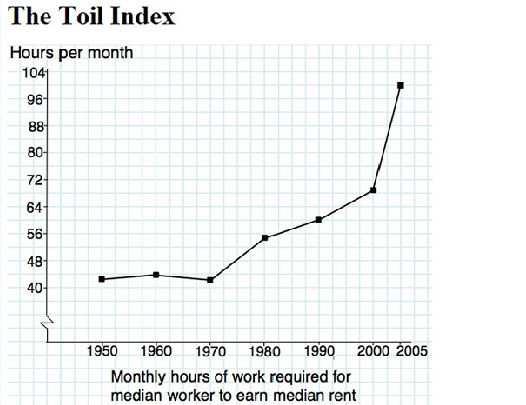
Finally, this chart has a great title. “The Toil Index.” This shows the ever-increasing amount of hours an American has to work in a month to be able to afford rent. From just over 40 hours a month in 1950 to over a hundred this past decade, it’s heartbreaking to see just how much of our labor goes to an essential need of human existence. The reality of our economy is that we are still far better off than our ancestors, but the promise of a better life has taken a huge hit.
So, these charts are ugly, beautiful, frightening, and fascinating.