Voting Viz
A little note on The New York Times’ coverage of the U.S. Presidential Election from this past week.
First: I love that they took down their paywall until it was over. I think that was a thoughtful gesture by an organization wanting an informed public.
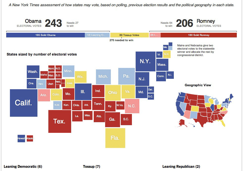
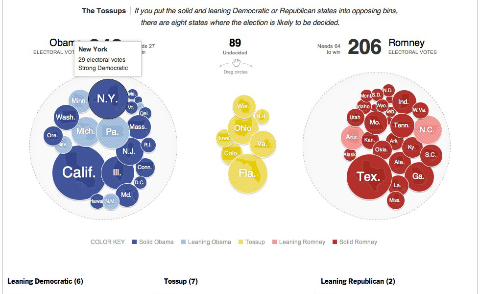
Second: They continue to bust out solid data visualizations.
Sometimes a visualization (when done right) can communication things words cannot, or at least communication things more concisely.
Below are some screenshots I took the night of the election.

