Not a Bad Shakeup
I hate iOS Safari. It has nothing to do with me being a web developer. I just find the performance of the browser to be substandard compared to a desktop browser. That’s to be expected considering the machine sitting atop my desk has somewhere in the neighborhood of 15 times the processing power of my iPad, but every time iOS Safari struggles to play an animated gif or fails to load a simple js slideshow, I get a little frustrated. It would be one thing if iOS Safari couldn’t handle heavy lifting, but it regularly balks at tasks that browsers on desktops mastered a decade ago.
Trying another browser is no guarantee of better performance, either. The same performance issues hinder Chrome for iOS, as well. Once again, it’s all about the hardware.
Anyway, the point is, I’m not happy with browsing in iOS, and so am open to new browser apps that purport to offer an improved experience. That’s why I was excited to try out Coast, the new browser for iOS developed by Opera. There’s been a lot of fanfare in the tech press since its release a couple days back, and it’s well deserved.
Coast, being still subject to the hardware limitations of iOS devices, doesn’t offer much in the way of performance improvements, at least from what I’ve seen in the past couple days I’ve had to play around with it. But that’s not what makes Coast an improvement over every browser I’ve used on a mobile device, regardless of the operating system.
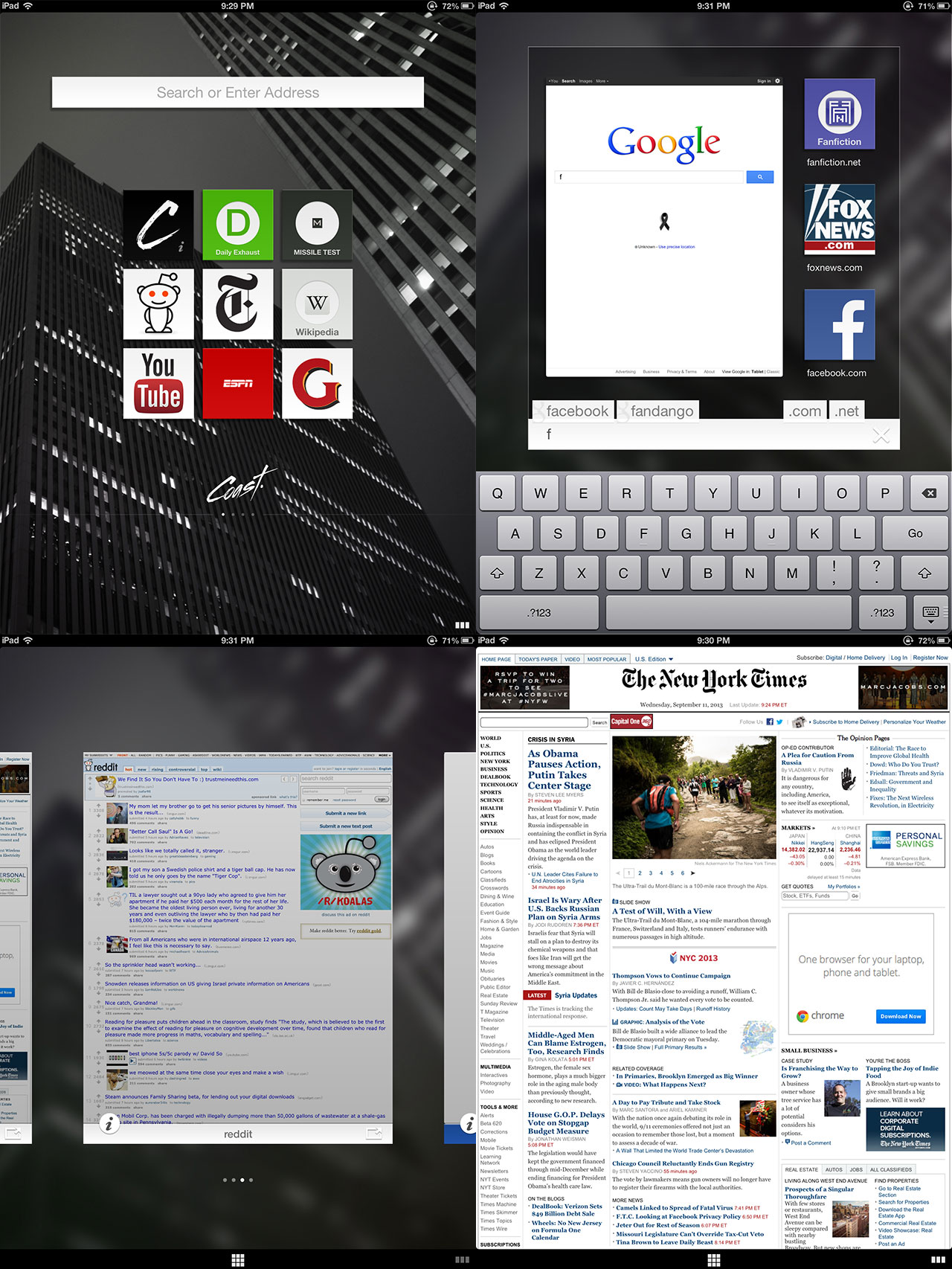
Coast’s strength is in its interface. It’s, well, minimalist. That word is easily overused in technology, but minimalism is a worthy goal for app development, especially in environments such as mobile where real estate is limited. Opera achieved this goal in part by doing away with the URL bar, a feature that has been ubiquitous in browsers. Imagine that, a browser with no URL bar.
What a user gets instead is a home screen, not unlike the home screens of phones and tablets anywhere. Instead of apps, the home screen in Coast has websites. A user can add and remove icons for any web page they see fit. For pages not represented by an icon, there’s an integrated URL/search bar prominently placed on the home screen to aid the user. While in a website, a small nav bar at the bottom allows the user to return to the homes screen or swipe through history. There are no tabs, just many, many past pages waiting for the user in the history.
So, the URL bar hasn’t completely disappeared, it’s just moved. One clunky feature of this interface is that, in the current build, you have to jump out of a website to the home screen in order to enter a new address. I can’t speak for the developers, but they left a lot of real estate in that bottom nav bar, and an icon that pops up a field would be nice. Yep, it’s a neat idea to get rid of the URL bar, but the reality seems to be more challenging.
The interface isn’t completely intuitive (it took me a good five minutes to figure out how to close a web page), but once a user gets the hang of it, it becomes natural. Once I got used to it, I began to like Coast enough that it’s now my default browser.
The point of Coast seems to be to introduce the smoothness of apps into a browser. In that, it’s hindered only by the fact that websites are not apps, and websites are what Coast is presenting to the user. However, Coast is a wonderful start at shaking up the way a browser is supposed to work. Once those rules can be shown to be arbitrary and unnecessarily restrictive, the web can only get better.