Android UI Design Improvements
Based on some of the feedback I’ve received on my mini-rant about the poor state and Android UI & UX design, there is definitely a contingency of people out there who feel everything is great in Android land.
Luckily, there’s also people who acknowledge the work that needs to be done to improve Android’s design.
These headlines caught my eye today:
BGR: Leaked photos may reveal Samsung’s gorgeous new Android interface
To be clear, the screenshots in the link above are interesting looking, but the font choice is far from great. It resembles Gill Sans, a typeface known for it’s problems, not the least of which is how bad it looks in title case (it should only be used in all caps).
And this one, also from BGR:
BGR: Is Android’s iPhone finally here?
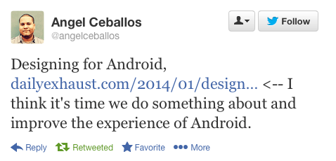
As well as these tweets:

If you’re wondering, yes, I do have thoughts on problems with iOS 7 I plan on publishing as well.
There’s no interface on the planet that’s above criticism.