Having A Fitts
I’ve been bruising up Android real nice lately, pointing out the things Google still isn’t getting right with the operating system, but today I have to turn my attention to Apple.
Yesterday, iClarified posted pictures of the iOS 7 beta release, which Apple just seeded to developers.
Here’s a before-and-after:
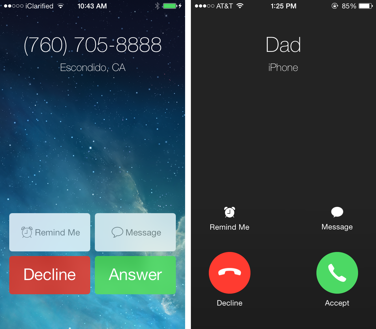
Why have Apple’s UI designers gotten into the bad habit of making the sizes of hit areas on buttons smaller?
This is the same problem we have with the iOS 7 music app I wrote about in November.
I’ll repeat myself for the millionth time: when you make hit areas on user interfaces smaller, they’re harder to click/tap on. I didn’t conceive of this. Paul Fitts did. This is excusable if you’re cramped for space, but the places where Apple is choosing to be stingy with screen real estate just doesn’t make sense.
There’s plenty of room for nice, big beautiful buttons. Use it.
This is a beta release, so let’s hope Apple reverts to the current button style.