Flat Design Isn’t the Problem
Gabby Manotoc on the new Netflix logo and the rise of the flat design trend:
This flat design is in trend with many logo redesigns. Its approach is an attempt on minimalism. The Helvetica-esque typeface disregards the personality of Netflix. The company doesn’t need to be a wayfinding system; its users want it to be fun. Cinema is a form of entertainment that contains boundless levels of energy. The old logotype was reminiscent of the old Blockbuster signs–which was incredibly appropriate considering the service the company provides. The new approach is not only sterile, but it appears to have no rhyme or reason behind it.
I find it interested that at the same time as we’re seeing a surge in flat visual treatments on everything—logos, mobile user interfaces, web sites—we’re also seeing a surge in copying the old, naive type treatments from 100+ years ago. Talented designers like Jon Contino, who imprefectly draw their work out by hand, are more popular than ever (a Contino logo pairs well with a ring made from a coin from Etsy).
It’s also important to note that the fact that the new Netflix logo is flat isn’t the problem. The problem with the Netflix logo is that it isn’t better than the original. It’s not telling a story.
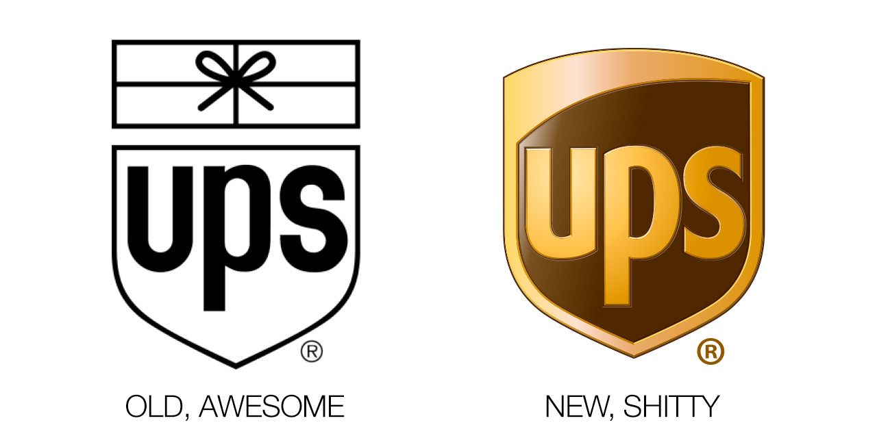
The same goes for the not-flat UPS logo:
The question we need to ask ourselves isn’t whether a logo is flat or not, but whether it’s good or it’s shit.
