Tip of the Day: How to Kern
Yesterday I gave away my kerning secret on Twitter and it seemed to resonant with a few people so I thought I’d share it here.
(if you had a proper graphic design education, this isn’t a secret)
How to kern a word:
1) From the beginning of the word, look at the first three letters; cover the remaining letters if needed (as you become a kerning Jedi, you won’t need the blinders)
2) Do these first three letters look evenly spaced from each other? If not, expand or contract the spacing between the letter (s) in question
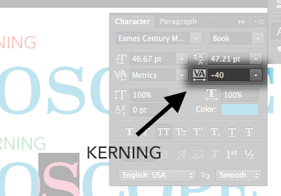
The controls in Photoshop, Illustrator and InDesign are very similar:

3) Now move to the next letter to the right and the 2 letters following it. Repeat Step 2.
4) Continue this process until you finish kerning the word
Bonus tip: Round letters like ‘O’ and ‘B’ need the letters next to them more tightly kerned on the side(s) with round edges. This is to compensate for the illusion that letters with rounded edges are farther away than letters with flat/perpendicular edges.
