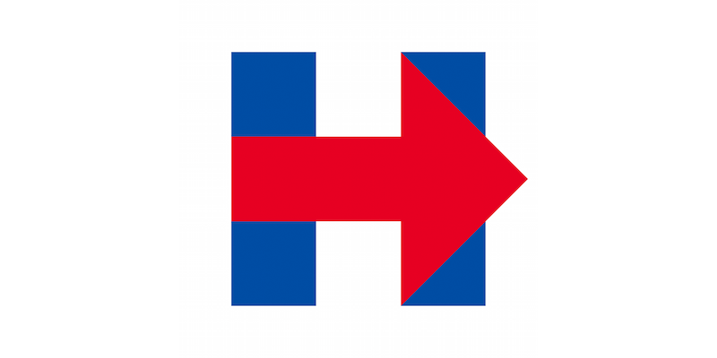
Hillary

Armin Vit on Hillary Clinton’s new campaign identity:
When considering the range of work for the Obama campaign — from Andy Keene’s logo (done as part of Sol Sender’s team), to Scott Thomas’ applications, to Shepard Fairey’s plagiarized poster — we see room for creativity within a managed system. But so far, for Hillary, all I’ve seen are missed opportunities. All the arrow applications are flat and simplistic. A pointing finger rather than a metaphor for progress. A visual tic rather than a passionate call for action.
Vit sees a missed opportunity to take cues from legendary graphic designer Lester Beall:
Which is a shame. Because within those two blue bars and red arrow lies a connection to a powerful and authentic visual language that comes from a pivotal moment in history: Depression America and the WPA.
In 1935, during the depths of the Great Depression, President Franklin Delano Roosevelt used the Emergency Relief Appropriation Act to create the Works Progress Administration, an ambitious agency which employed thousands of unemployed people for numerous infrastructure projects. One of these projects was the Rural Electrification Administration, whose charter was to bring electricity to rural areas that had yet to be wired.
At the time, only 10 percent of rural households had electricity. And while to us electricity is a basic need, in 1935 that concept needed some convincing. Enter Lester Beall, a well-respected New York graphic designer who received the commission to help promote the project.
Image is everything.