My thoughts on Safari 4 Beta

Safari launched Safari version 4 Beta on Tuesday. There’s some good things and bad things about it.
I won’t go through every facet of the update (you can find a list on Apple’s site). I’ll be focusing on the features that stand out to me the most.

Tabs

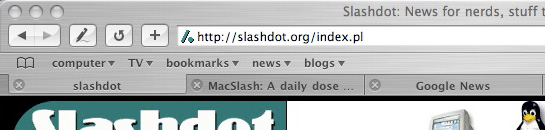
Tabs are the most obvious UI change in Safari. In version 3 and earlier, Safari had inverted tabs placed below the address (and bookmarks) bar.

before:
safari_tabs_before.jpg
Now, tabs are integrated into the top window bar and serve 2 functions:
– a draggable bar to move your application window around
– a group of individual tabs you can cycle through
after:
safari_tabs_after.jpg
the bad: Because the top bar is now serving a dual function, it’s harder to focus/select an individual tab. This is because Safari’s first response to an interaction (click/press) with the top bar is to treat it as an application window you can drag. If the interaction hierarchy were flipped, and tab selection was first priority, window dragging would prove to be nearly impossible.
While you can focus a tab by carefully clicking anywhere on the bar, it takes a few tries, unless you start to train yourself to move straight to the right corner of a tab, where you’ll see the ‘grip’ lines.
Bottom line, Fitt’s Law is being comprimised.
the good: On a positive note, about 20 pixels of vertical screen real estate is gained with the combined browser/tab bar. Economy of space is a great thing and it’s especially relevant on laptops.

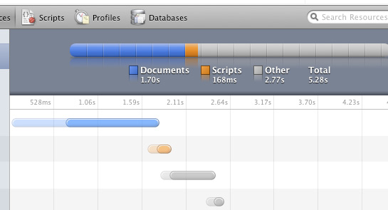
Web Inspector – Design Consistency & Data Visualizing

A great feature that I probably won’t be using very much is the Web Inspector. For developers out there that use programs like Firebug within Firefox, the Web Inspector will look very familiar. It allows you do to look behind the scenes of a given page and view the HTML and style sheets as well as see how quickly all the elements within a page load. Coupled with the Activity window, it’s a great way to debug websites.

Web_Inspector_elements.jpg
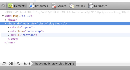
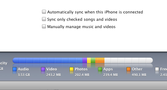
Like all things Apple, its not only how well the Web Inspector works that makes it great, but how well it’s visually designed. When I toggled from Elements view to Resources view, I was again pleasantly surprised to see that they had appropriated repurposed the iTunes Resource visualizations for the iPod and iPhone:
Web Inspector – Resources:
Web_Inspector_resources.jpg
iTunes – iPhone capacity:
itunes_capacity.jpg

RSS Feeds

I don’t get the option to choose what application/service I want to use to read feeds when I click on the RSS icon in the address bar. Firefox gives me the option to choose Google Reader.

What happened, Apple?!

Address Bar & AutoComplete

This is the clincher for me. Safari 4 Beta does not let you type in any part of the address, or title, of the site you want to go to. This has become an integral part of navigating the web for me and the best improvement from Firefox 2.

It’s a feature that’s easy to overlook until you don’t have it anymore, then you realize you can’t live without it.

Summary

Safari 4 is in many way’s a solid step up from from Safari 3. Nothing feels broken or incomplete, and it is dramatically faster (as reports have claimed). Along with the autocomplete issues, the lack of add-ons is the only other major drawback that’s keeping me from switching from Firefox 3. Adblocker, Delicious, Tabs Open Relative – sure I only have 3 add-ons, but they make a world of difference when browsing.

For the non-techie user, Safari is an excellent choice.
It’s like a Porsche without power windows and door locks – sure they’re drawbacks, but the car still drives like a dream.

Categories:

Technology

Tags:

Windows Mobile 6.5 FAIL

Editorial: Ten reasons why Windows Mobile 6.5 misses the mark
Great recap on why Windows Mobile 6.5 blows:

At a distant glance some of those updates seem pretty neat, but get up close to them. The swiping and scrolling gestures are awkward (as noted by Chris Ziegler in his hands-on), in fact, they seem to work almost opposite of what is truly intuitive and “finger friendly.” The honeycomb menu is a glorified grid, a sign that Microsoft has gone out of its way to avoid a grid — but they fail to see (or don’t care) that regular grids make a lot of sense. They essentially fixed something that wasn’t broken.

Categories:

Technology

Tags:

The elements of typographically correct email

This subject has been sitting in the combustion chamber for a while and I need to get it out on the nets.
Email applications need to allow for specifying line width for text. When they don’t, the amount of words/characters per line is dependent on the size of your message window. It shouldn’t be the responsibility of the user to have to adjust their email message window to the width for ideal readability. Computers, and by extension, their applications should reduce complexity, not add to it.
When email applications let line width run wild, it makes it much harder to read messages as your eye has a much farther distant to snap back to get to the beginning of the next line, increasing the likelihood of a reader losing their place.
From The Elements of Typographic Style as Applied to the Web (referencing the original EoTS):

Anything from 45 to 75 characters is widely regarded as a satisfactory length of line for a single-column page set in a serifed text face in a text size. The 66-character line (counting both letters and spaces) is widely regarded as ideal. For multiple column work, a better average is 40 to 50 characters.

While this statement was referring to printed text, the same principles apply to line width for the web. Everything is relative and when designing for the web and it’s up to the designer to determine the ideal type size combined with the ideal line width (this site uses a main content width of 545 pixels against a font size of 12 pixels).
Click on the two screen grabs below to compare readability (viewed in Entourage):
plain text with imposed line breaks
email_plain_text.gif
rich text with no line breaks
email_rich_text.gif
The only application on OS X I’m aware of that allows for changes in line width is Entourage. In Entourage, when you switch from rich text to plain text, it automatically resets the line width to 76 characters through the use of line breaks. In Apple’s native Mail.app, it does nothing to line width when toggling between rich & plain text.
I’m not sure what the solution to this is, since with Entourage’s method of imposing line breaks into the previously ‘plain’ text causes situations such as this on smaller screens, like my iPhone:
email_iPhone.gif
Those previously wonderful, strategic, 76-character long line breaks now look like shit on my 320-pixel wide iPhone screen.
The concept of liquidity of content is an important one when designing for the web and other digital content that lives in different environments and is interpreted by different applications. But too much liquidity means not enough structure.
…which means poor readability.
..which means poor communication.
What I suggest is that email applications (both local and web, like Gmail) impose a width on messages by default. If a user doesn’t like the default formatting, they should be able to adjust or remove it.

Categories:

Technology

Tags:

interview time

So my geeky ass was interviewed on Level3 Hosting’s Red Couch at this year’s Phizzpop competition in Chicago in which the company I work for, Roundarch, was one of the competing teams.

Ok, so I need more practice with my speaking skills (Pound a beer every time I say ‘ya know’).

Michael Mulvey on Level3 Hosting's Red Couch, Phizzpop Chicago Here’s the interview with me

(Window Media format, sorry) and here is the page of all the interviews, including my one with my boss, Jeff Maling.

Speak Visual

This is a perfect, coincidental continuation from the last post.
Speak Visual from NVIDIA. The ‘hide-away’ navigation on the spotlight page is smart and the transitions from section to section are also really smooth.
I will admit that I actually clicked on a banner ad to get to the microsite. Reason? There was a funny shot of a great digital artist, Joshua Davis.
think_visual.jpg

Categories:

Art, Technology

Tags:

What’s that, Professor X?

Hybrids that can fluidly cross the chasm between technology and the arts are the mutations in the academic system. Traditionally, universities create technology students or art students—but never mix the two sides of the equation in the same person. During the 1990’s the mutants that managed to defy the norm would either seek me out, or else I would reach out to find them myself.

Categories:

Technology

Tags:

v-moda vibe duo – broken again

Well, that’s it. Se acabo.
I’m now on my third replacement pair of v-moda Vibe Duo earbuds and they have successful busted. I no longer get sound from the right side. Wiggling the cord near the jack has revealed that there’s a short in the wire.
I’m going back to a nice, sturdy, and decent sounding pair of Sonys (for half the price of the v-moda pair too).
*see my original post on these earbuds to get the full story.

Categories:

Technology

Tags: