Improved Reading Experience? No.
Last week, Amazon updated it’s Kindle app for iOS. For the iPad, the new update is a case study in poor design. From the update blurb in the app store:
Improved reading experience on iPad: Smaller margins and a cleaner look help you focus on the author’s words.
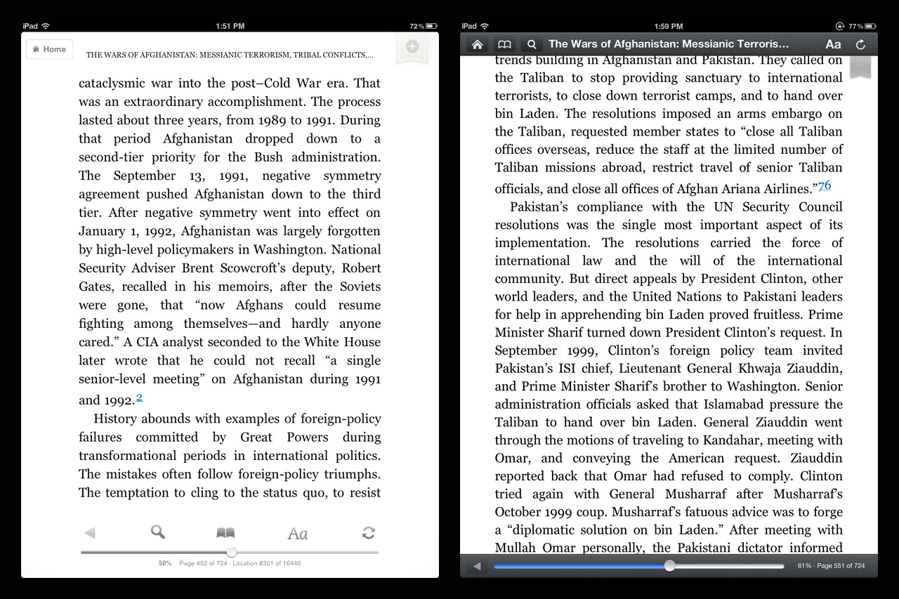
When I first saw this in the blurb, I was immediately suspicious. It’s hard to overstate the importance of healthy margins and whitespace in good design. Generally, it’s also one of the earlier casualties when good design meets project managers and clients who aren’t designers. But I updated the app anyway. Upon opening, I saw what had been a decent treatment of margins had been destroyed by the redesign:
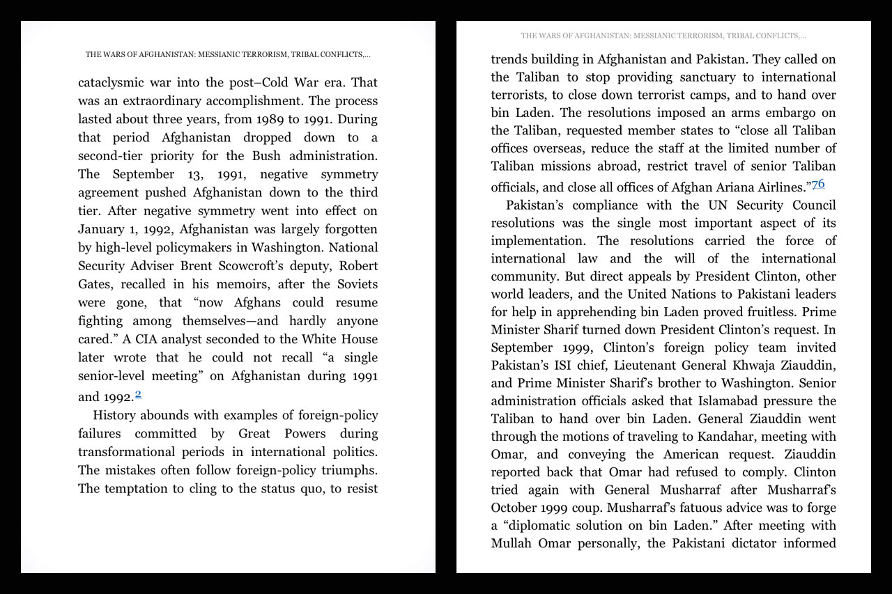
The image on the left is a screen capture from an iPad without the update installed (I’m a developer, I have more than one iPad. How first world of me.). The image on the right is with the update installed.
The smaller margins do indeed help a user focus on the words. In fact, that’s all a user can focus on. What Amazon has done is create a solid mass of text that has no breathing room. It’s claustrophobic. It’s stressed.
It’s like standing three feet in front of a brick wall and pretending you’re appreciating the architecture of a building.
The words are the most important aspect of a book. That’s intuitive. But, presentation is very important. Having ample margins helps the eye flow over the text and makes it easier to move from one line to the next while reading. Making the margins smaller in the app hinders the ease with which the eye can move over the page, making the book harder to read, not easier. Also, it’s just ugly.
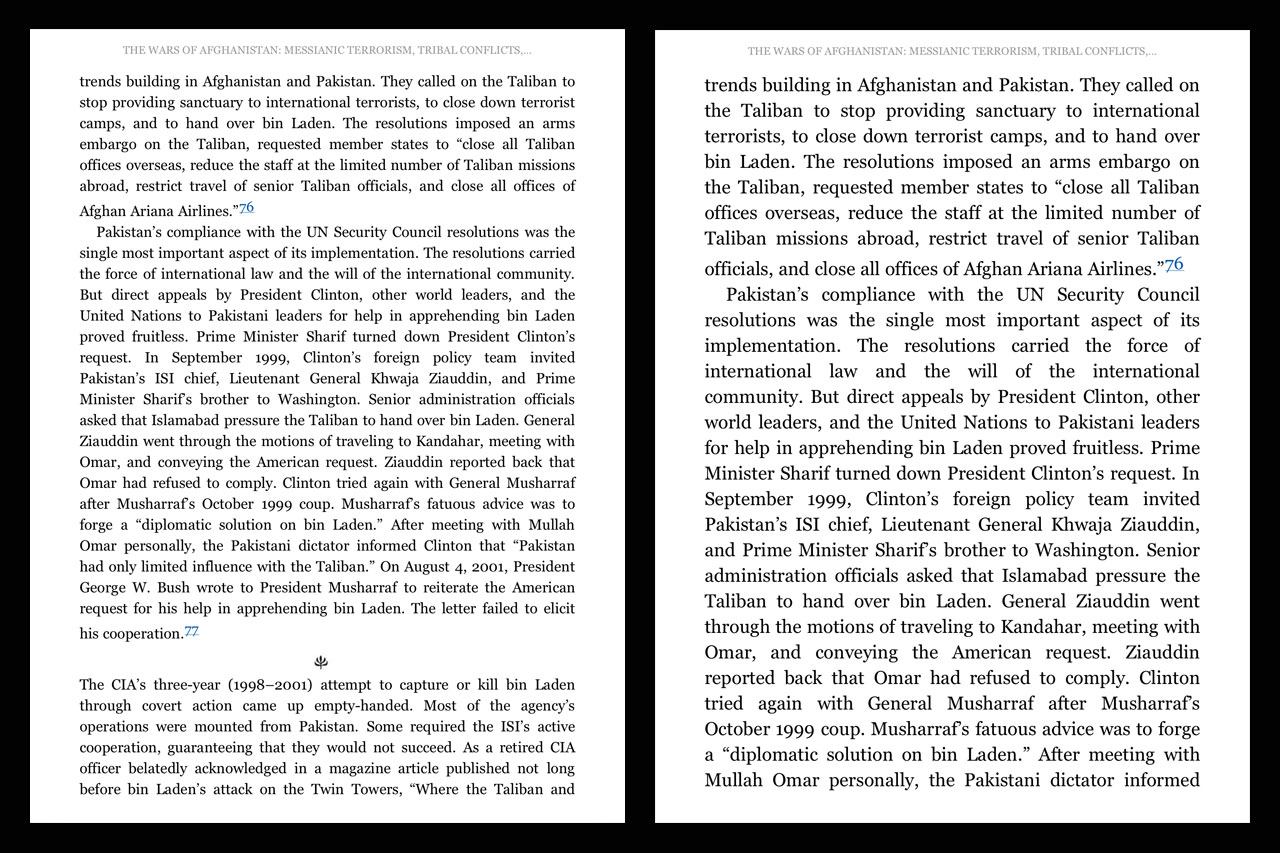
There is also a usability gap that was created with the update. Previously, the app’s toolbar overlays would not interfere with the text on the page. Some people like to read with the toolbar visible. I’m not among them, but I respect that. After the update, keeping the toolbar visible is no longer a workable option:
Also, the new toolbar design has none of the nuance of the previous version. It’s black, bold, and in a user’s face. Even if it didn’t cover up text, the look and feel of the new toolbar is a downgrade.
The Kindle app in the iPad has been a conundrum ever since I began to use the device, simply because the presentation has always been suspect. The options for reading have been limited in ways I could never understand.
First, there is only one font. This is an inexplicable omission. Currently, there are over fifty font families on the iPad. Limiting the user to only one makes little sense. In apps where content is coming from a single source, one font does make sense. The New York Times app has only one body font they use in their articles, but that font is part of their brand identity.
Not only that, The Times is the source for the vast majority of the content they feature. But with Kindle, most, if not all, content has been created by other sources. Just like you would never expect every book one buys from a brick and mortar store to have the same font, no user should expect that limitation to exist on their digital devices.
Secondly are the options for font size. In the Kindle app, there are six font sizes available, from laughably small to big enough for my grandmother to read without her glasses, with little variation in between. The above screen captures are using font size number 3.
Here is a side by side comparison of font size 2 and 3:
The difference between the two sizes is quite large. A little more variation would be welcome.
As it happens, there is no reason for Amazon to have a clunky, poorly designed reader app on the iPad. The first reader I ever installed on my iPad was Stanza, a free app originally developed by Lexcycle, a company subsequently purchased by Amazon in 2009. Stanza’s interface while reading is beautifully designed. The margins are good, the themes on the page are more varied, a user can choose any of the font families installed on the iPad, and the distance between font sizes is much more flexible:
Stanza provides a much more pleasant reading experience compared to the Kindle app. But, Amazon has chosen to kill Stanza, releasing a single update for the initial release of iOS 5 with no more forthcoming. Amazon has the means to make a reader app with good design. They have chosen not to.
It’s still early in the digital reader game. Publishers and typesetters have been working on design for centuries, while the Kindle has only been around for five years. Apart from design, there are problems with formatting and editing that still need to be improved to make readers better than a printed book. Right now, readers win on convenience, and not much else. Going backwards isn’t helping.