No Comparison
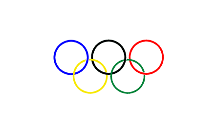
original Olympics logo:

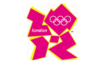
London 2012 Olympics logo:

Dropping a pile of shit into an ice cream cone would make for a memorable (albeit foul and inappropriate) logo for the Olympics. Just because it’s memorable and would provoke a lot of arguments doesn’t mean its good.
The bottom line is a logo’s responsibility is to distill a huge amount of information and ideas into ONE MARK that conveys the essence of a product, brand, company or event.
The London 2012 logo not only miscommunicates, but needs the original Olympics logo embedded INTO it in order to put it in context! I don’t call that a ‘design element’, I call that a crutch.
End of discussion.