iamlikingthissite
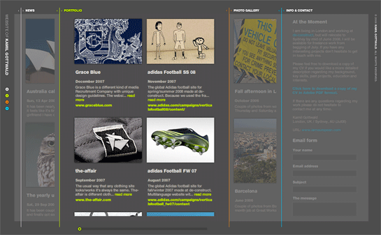
iameuropean.com – portfolio of Kamil Gottwald
iameuropean.com – portfolio of Kamil Gottwald
Here’s a nice little bit of news from October 2007 from Verizon Wireless CMO Mike Lanman regarding their LG Voyager:
“We think it’ll be the best phone … this year. It will kill the iPhone.”
Lanman gets a place right up there with Palm CEO Ed Colligan.
Ah schadenfreude, it goes down so smooth.
The Raconteurs, Consolers of the Lonely
#1 – The Sound
I just listened through the new Raconteurs album, Consolers of the Lonely. Some of the tracks I immediately dig, but many of em still have to soak in.
Sometimes songs have to marinate in your ears for a while before they taste good.
#2 – The Aesthetic
All the projects Jack White is involved in have a distinct, strong visual aesthetic. When I think of the White Stripes, I immediately have associated colors in my head – red, black and white.
The same holds true for The Ranconteurs. Before I picked up the album, I saw their playbill – it was a black and white shot of the group sitting down in a field. It looked like a Civil War era photo – stiff, awkward poses, scratches and dust. Below is a similar shot from their website.
<img alt=photo: The Raconteurs” src=”/images/raconteurs_group_shot.jpg” width=”545″ height=”547″ />
#3 – The Website
While not staying consistent with the aesthetic of their album and playbills, their website is also unique and quirky. It harkens back to the pre-Windows days of computers that I remember vividly. It also brings to mind email during my college years – can anyone say PINE?
Surprisingly, the keyboard navigation for the site is very intuitive, but for some reason they don’t allow you to use your keyboard to navigate the Photos section, which is very annoying once I’m in ‘keyboard mode’ with both hands. You have to use your mouse to click the photos. Why can’t I just ‘arrow’ over to them? Argh! Other than that quip, the site is great.
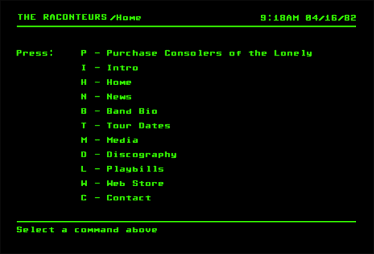
You can also buy and download the album straight from the site. Sweet.
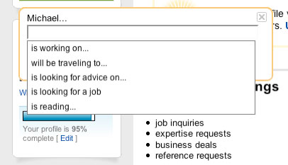
I’m not knocking LinkedIn for ‘adopting’ this feature from Facebook, I just think it’s interesting. And it makes sense.
The Originator (Facebook):
The Adopter (LinkedIn):
You’re hired to design a website for a new client.
Do you present one design or multiple options?
I’m of the one design persuasion. It’s counter productive to show multiple designs to client, which inevitably cedes design decision-making to them as they begin to take on the multiple designs like they’re at a salad bar.
“I’ll take the beveled edges from Design 1 …some gradient backgrounds from Design 4, and I love the purple text highlights from Design 37….”
Multiple designs also mean your vision isn’t clear (or your creative/art director’s isn’t). You’re essentially saying to your client, “Of all the designs up on the wall today, I have no real opinion on which is the strongest, so I’d like you to pick…”
As a designer, it is your responsibility to provide clarity, focus and vision to your client. Keeping the options to one design helps to ensure this. It doesn’t mean there won’t be changes, but it does ensure they everyone stays on course.
Some people choose to show variations on a theme. This is different and isn’t the same as showing multiple directions. Take heed if you decide on this approach because variations can easily mutate into different designs.
But hey, I’m just one dude. So I decided to ask a few of my colleagues what they thought:
Gianni D’Alerta, Owner, Lift Here
“I usually present 2 designs, but depends. I usually drop the first design and see the reaction …if they love it then I’m good. If not I’ll show one more design and have them them choose, or I’ll revise towards one direction.”
Jedd Flanscha, graphic designer
“The number of designs I show depends on the budget, but I usually show 2 designs. If I have the time, I like to show a few options – even if they’re variations of the same design.”
Jory Kruspe, Analogue
“I show one, but there are pitfalls because many times clients have had experience with other designers so they’re accustomed to seeing options. I think this stems from advertising – and design is not advertising.”
Victor Brunetti, Associate Creative Director, roundarch
“Always show two. Your recommendation for what the project should be and one
that tries to match the tone and manner of what you think the client is expecting. So effectively, 1 “boundary-pushing” and 1 “safe”. No more. No less.”
Len Wilson, Super Starr Interactive
“It depends. Never show a shitty comp. They always pick it. Always show 2-3 that are dope. I usually outline upfront how many designs I will present, but never show a shitty one.”
Dale Garcia, Dalematic
“It depends on the designs. I’ll show one …if they have a bad face, them I’ll show the others. Lately I’ve been showing one, but I’ve also found out through experience that showing one is bad luck because it leads to quick approval and is followed by a bunch of edits that just bastardizes everything.”
November 2001 – Microsoft launches the xBox, taking on Sony’s PS2 & Nintendo’s GameCube.
June 2003 – Microsoft launches Windows Mobile 2003.
November 2005 – Microsoft launches the xBox 360, taking on Sony’s PS3 and the Nintendo Wii.
September 2006 – Microsoft releases Zune, their portable MP3 player to take on the #1 ranked iPod from Apple.
April 2007 – Microsoft launched Silverlight, to take on #1 placed Adobe Flash.
September 2007 – Nintendo Wii outsells xBox 360 in less than a year.
February 2008 – Microsoft makes a bid to acquire Yahoo! to take on search and online advertising giant, Google.
April 2008 – Apple’s iPhone the top mobile platform, after only 9 months of existence, accounts for .23 percent of US web traffic, beating WIndows Mobile’s meager .03 percent.
So we have:
– desktop operating system
– games
– a Flash competitor (RIAs)
– mobile OS
– online search & advertising
Microsoft – can I just ask what the hell your strategy is anyway?
What is your vision?
…before you answer that, remember that vision and going after competitors are two different things.
Google’s vision, from the beginning, is to organize all the world’s information. Obviously this touching on a hell of a lot of different industries, but it doesn’t change the fact that they’ve stayed on course with their vision, taking on competition all the while.
Microsoft, on the other hand, just takes on competition and enters new markets after they realize they’ve made a mistake. Or they’ll enter a new market but do a half-assed job at it (Can anyone tell me what happened to “the Social“?)
If you don’t have vision, you lose your way and end up taking the wrong paths.
Interviewer: Bob, tell us your impressions of Baby Steps.
Bob WIley: Mash potatos and gravy Marie. I couldn’t be happier about Baby Steps. I was a terrible disaster and now, because of Baby Steps, I’m on tv in front of millions of people. I’m very excited.
…But it did work that way. That’s the miracle of Baby steps. It’s not just this book, it’s this man. It’s the compassion, it’s the dignity, it’s the wisdom. It’s the Horse Sense of this guy that gets you. He actually had me stay here last night in his jammys.
from the movie What About Bob?
Apple knows very well the power of Baby Steps. They’re proving it with the continual improvements to the iPhone.
This week it was discovered that Contacts searching and Meeting invite functionality will be included in the next firmware update for enterprise iPhone users. They could have rushed this feature months before with all the bugs and issues that go with rushed software updates, but they’ve only been adding features when they’re ready and needed.
When the iPhone launched in June 2007, it had a core set of applications and functionality. If it had launched with any fewer features it would be incomplete (some people will argue this). As time has gone on, Apple has added functionality (and fixes) with each successive firmware update. They keep building and strengthening on a solid foundation.
This methodology is emtremely useful – from building houses to building websites. Too many times we try to launch products too quickly and at the same time cram as many features into our products as we can.
This doesn’t imply that you should launch a product and intentionally leave out functionality. It means that you should launch a complete product with a roadmap to the future. There’s simply no way to predict everything your product should do or that consumers will want from it – not even Apple can predict everything. There will always be changes made along the way.
Working this way gives you time to get things right and also has the added benefit of giving your customers something to look forward to.
Baby Steps, people.
Baby Steps.

I just got an email invitation this morning from a design colleague to join a professional network called Naymz.
Call me shallow, but I don’t want to join.
Why? They have a horrible name and names mean a lot. They say a lot about you.
When you create a new company, you have the rare opportunity to create an amazing name that will be part of your company brand and identity.
I have four words for Naymz – I Can Has Cheezburger?
Normally I like to ‘unplug’ on vacation. No computers. My vacation to Honduras last week was different. I brought my iPhone with me, despite knowing that I would be out of my coverage area and wouldn’t be able to make calls. Even though it mostly sat in my pocket inactive during the day, I found that it was extremely handy when I needed to convert lepiras to dollars in order to figure out how much I was spending.
Along will the helping with simple calculations, I’ve discovered that my iPhone is my new reading device. Part of my rationale for ‘unplugging’ during vacation has to do with removing work-related stress and distractions, but with my iPhone I find it very relaxing to sit on the couch at the end of the day and flick through the RSS feeds in my Google Reader to find articles to read.
It’s commonly known that reading large amounts of text from a screen strains your eyes. With my iPhone, even on long articles, I’m able to quickly digest text in small amounts (it doesn’t hurt that the screen resolution is over double that of standard computer monitors, 163 ppi). Add to this the fact that I’m not hunched over a computer at a desk, or sitting with laptop on my lap.
Even down in Central America, I was able to get up on Sunday morning and read my Sunday Times.
I like that.
I’m back from Honduras. What a great country.


Check out the full set of images on Flickr.
What separates the amateurs from the pros?
Nuances.
Details.

I’m back from Honduras.
Pictures are on the way.