Golden
My Kickstarter poster project is now live, and I’ve explained the idea behind it, so now I thought I would share why the design is structured the way it is.
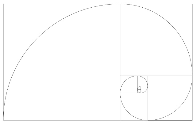
The Golden Spiral.
The Golden Spiral is created from the Fibonacci number sequence – 1, 1, 3, 5, 8, 13, 21, 34 …
You’ve probably seen it before:
My friend and fellow Daily Exhaust contributor, Jory, was the one who suggested I use it. Like any tool, the golden ratio is only useful if you know how to use it. I knew how to use it, but initially I didn’t know where I should use it.
It also brought to mind an image I came across this past year of the Apple logo:
![]()
I thought it only fitting I use sacred geometry for someone like Steve Jobs. So I just laid the Golden Spiral graphic above over my original design and started experimenting with shapes. Eventually I ended up with this:
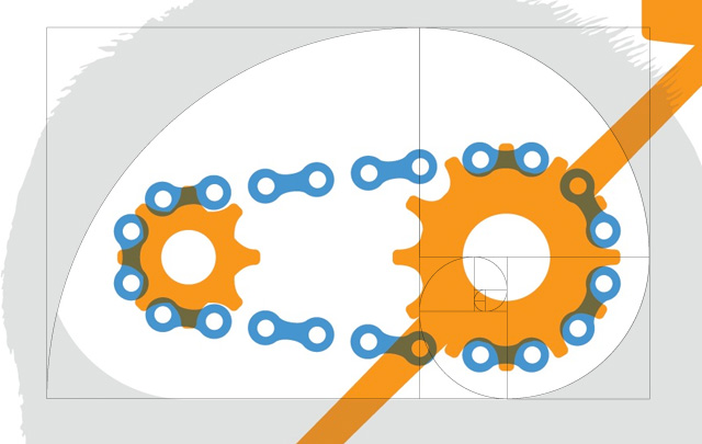
And if you flip the grid horizontally, you can see how I positioned the other elements:

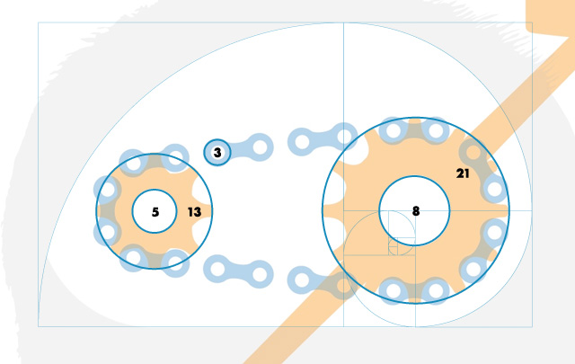
Aside from the silhouette of Steve Jobs, every shape with the brain/gears group is positioned and sized according to this ratio. Every circle diameter corresponds to the size of each box within the grid:
Even without seeing the spiral grid laid on top of the design, the elements just feel balanced. In no way does it guarantee a beautiful design, but if it’s used right, it can make all the difference.