momentum
Armin over at Brand New has a review of the Pfizer rebranding.
Great points should always be repeated, and repeated, like this one:
…you don’t push a $48 billion company to adopt a new logo just because designing new logos is fun. Instead, this is one of the most underrated challenges in the identity industry: to revitalize a company through a new identity strategy that doesn’t rely on a shiny new thing front and center.
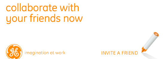
On a different note, I’d like to call attention to the influencer/influenced aspect of this rebrand. The Pfizer rebrand is no doubt fresh and looks great. I’m a big fan of the dots and dot-infused typeface, but it calls to mind GE’s innovation rebranding effort earlier this decade.
GE’s rebranding in 2004 was done by Wolff Olins and included a new palette of bright colors and a new corporate typeface, Inspira. Inspira was modern, soft, rounded and approachable. Corporations are always trying to convince people that they’re anything but cold machines who’s only purpose it to increase profits.


The point of this comparison is not to diminish Pfizer’s rebranding efforts, but to point out that we’re all on a continuum, we’re not in a vacuum.