LeBron will never be as iconic as Jordon.
Scottie Pippen: LeBron James’ Stats Have ‘Probably’ Passed Michael Jordan’s:
“The numbers don’t lie. He’s right there,” he said. “He probably will never catch him in terms of MVP, but in terms of statistics, LeBron is right there. And when you look across the board—not just scoring—check his assists, check his rebounds … he’s probably ahead of Jordan.”
Jordan averaged 30.1 points, 6.2 rebounds, 5.3 assists, 2.3 steals and 0.8 blocks across 15 seasons in the NBA (13 with the Bulls and two with the Washington Wizards).
James currently checks in at 27.2 points, 7.3 rebounds, 7.1 assists, 1.6 steals and 0.8 blocks per game as he takes part in his 15th campaign at the professional level.
LeBron is an amazing athlete (says the guy who doesn’t watch sports), but even if (when) LeBron passes Jordan’s stats, he’ll never be as iconic as Jordan. Sure, “LeBron” is a brand, but “Jordan” is a bigger brand, at least at the level of the company that has been putting his silhouette and name on their shoes for over 30 years – Nike.
I’d go so far as to say Michael Jordan is at the level of a pop culture icon like Mickey Mouse.
Leafs by Snoop
Pentagram’s Emily Oberman brands Snoop Dogg’s new line of weed products:
Pentagram partner Emily Oberman has crafted the identity for Snoop Dogg’s new line of cannabis-based products called Leafs by Snoop. Adopting a “laid-back California cool” aesthetic for the rapper and ganja lover’s range, a leaf motif features throughout. A mix of pastel gold colours and imagery like palm trees, fish, birds and cloudy skies completes the sunny identity.
You know you’re mainstream when Pentagram does your product branding for you.
I love the deliberately incorrect spelling of the product.
Just Do It
Dan Weiden (of Weiden & Kennedy) on the genesis of Nike’s slogan:
“I was recalling a man in Portland,” Wieden told Dezeen, remembering how in 1988 he was struggling to come up with a line that would tie together a number of different TV commercials the fledgling agency had created for the sportswear brand.
“He grew up in Portland, and ran around doing criminal acts in the country, and was in Utah where he murdered a man and a woman, and was sent to jail and put before a firing squad.”
Wieden continued: “They asked him if he had any final thoughts and he said: ‘Let’s do it’. I didn’t like ‘Let’s do it’ so I just changed it to ‘Just do it’.”
I know innovation is all about recontextualization, but man.
Symbols vs. Emotions
Seth Godin on the difference between your logo and your brand:
Spend 10,000 times as much time and money on your brand as you spend on your logo.
Your logo is a referent, a symbol, a reminder of your brand.
But your brand is a story, a set of emotions and expectations and a stand-in for how we think and feel about what you do.
Too many people don’t understand this.
Agreed
Now, there is the matter of the mob mentality who, yesterday, got all riled up about two things: 1) The new icon looks like the logo of Automation Anywhere and have claimed it was ripped off, and 2) the new icon looks like every sexual reproductive organ in the male and female anatomy. To the first claim: had you ever heard of Automation Anywhere before yesterday? Right, didn’t think so. To claim that DesignStudio or Airbnb copied or stole the logo is idiotic. It simply points to the fact that neither logo is highly original in its shape and that it’s possible that out of the millions of companies out there designing logos for themselves to arrive at similar solutions. To the second claim that the logo looks like testicles, a vagina, a butt, a penis, and an asshole — all already dutifully illustrated in this Tumblr (NSFW) — seriously, how old are y’all, 13? Grow up. It’s a fucking “A”.
—Armin Vit on the new Airbnb logo
Airbnb
Airbnb has new branding by DesignStudio.
It’s fun, fresh and really dig it.
Former NYTimes.com design director, Khoi Vihn disagrees:
I can’t pretend to know what went into designing the Bélo, but the end result is surprisingly tone deaf. This seems like a case of a still young startup that wants to assign meaning to its stratospherically successful brand so badly that it has quickly gotten in over its head. The story that Airbnb tells in order to contextualize its new identity seems similarly hamfisted and overly self-important to the point of satire. Airbnb is successfully disrupting the tremendous and staid lodging industry, but it’s hard to imagine this particular combination of pomposity and message mismanagement from say Holiday Inn.
Khoi wouldn’t have to “pretend to know what went into the design” because DesignStudio documented the process behind their work. I particularly like how the logo forms an “A” from two b’s facing in each other. It also looks like an upside-down heart.
Opinions are like assholes. Everybody has one (I do, Khoi does).
If Airbnb had crowdsourced a shitty logo over the weekend, they’d be getting chastised for putting to little effort into their branding. For Khoi, they’ve done too much. You’re damned if you do, and you’re damned if you don’t.
Personally, I live by the gospel according to Andy Warhol: “Don’t think about making art, just get it done. Let everyone else decide if it’s good or bad, whether they love it or hate it. While they are deciding, make even more art.”
The same goes for design.
Harry’s Brand and Their Story
First Round Capital has a great profile on the brand development of Harry’s (the guys behind Warby Parker).
I particularly like where they zagged to after Movember’s zig:
Last year, Harry’s launched National Shave Day on December 1 to much fanfare — riding on the coattails of another cultural facial hair phenomena: Movember. In doing so, they appealed their target market, and not only appeared timely, but prescient. After not shaving all month, men everywhere were in desperate need of a good razor.
“The holiday created more story around the brand. We had an event at our barber shop, put it on the web, promoted it on social media, and we watched the conversions explode,” says Morin. “When we tell stories that connect with people, it’s obvious. On National Shave Day we saw a 360% lift in traffic to the website.
Smart guys.
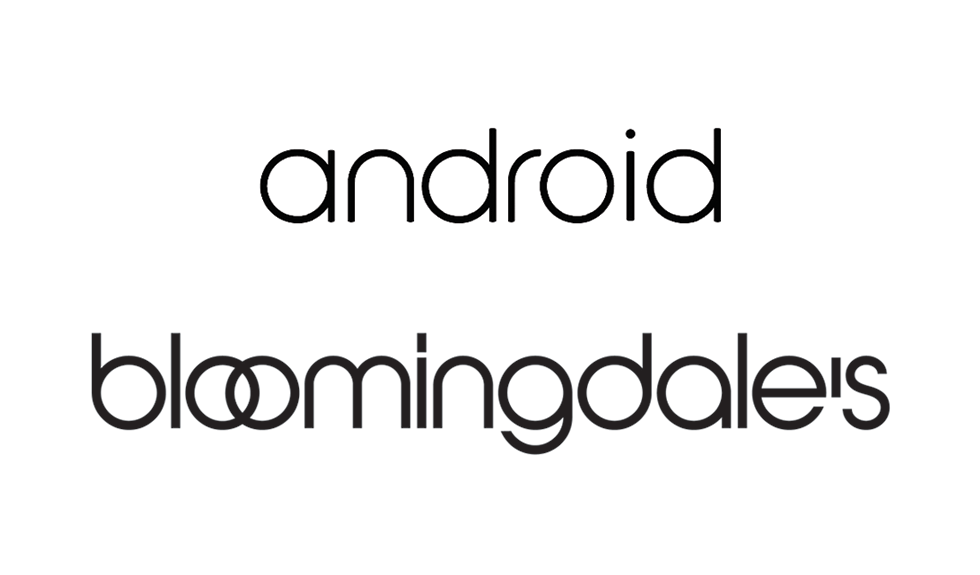
Bloomingdroids
The new Android logo looks like something I’ve seen before, I just can’t put my finger on it.
A Forgettable Brand
Armin Vit on Reebok’s new logo:
It’s probably not fair to keep comparing Reebok to Nike or Adidas but since no one ever said design blogging had to be fair I shall continue: I don’t think the previous Reebok logo ever achieved the same ubiquity or memorability as the Nike Swoosh or Adidas’ stripes. Before writing this post, if you had asked me to draw the Reebok icon from scratch I wouldn’t even have known where to start.
I’m with Armin, I couldn’t draw the Reebok logo before I read his blog post. For some reason, I think of Asics when I think of Reebok.
Maybe because they’re both forgettable brands.
Valuing Brands
Microsoft is giving up the fight for the use of the name ‘SkyDrive’:
The name change comes more than six months after Microsoft was forced to rename SkyDrive following a trademark case with British Sky Broadcasting Group (BSkyB). Microsoft is positioning the new OneDrive naming as the one place for documents, photos, and other content. “Changing the name of a product as loved as SkyDrive wasn’t easy,” admits Microsoft’s Ryan Gavin. “We are excited about what is to come, and can’t wait to share more.”
Admittedly, OneDrive is a stronger name than SkyDrive, it’s just sad Microsoft has to be sued to arrive at great brand names.
This feels a lot like when Microsoft gave up on the use of ‘Metro’ for the name of the Windows 7/8 (and Phone) user interface design language.
I think what it comes down to is Microsoft doesn’t value any of it’s brands besides Windows and Office. Ballmer can do all the reorg-ing he wants to unify Microsoft, but changing what your values are is a completely different thing.
As I’ve said many times before, Microsoft is not a consumer electronics company (save for XBox). They could very well learn the skills necessary to sell to human beings, but all their success up until now has been from selling to corporations and corporate IT departments.
Can you imagine Apple giving up the rights to ‘iCloud’ or ‘iPad’ or any other brand they own? Apple understands the importance of brands beyond just being a name or a logo on a box. In the end a brand is what people say it is and all the associations they attach to it.
Microsoft still doesn’t get this. I’m not sure they ever will.
The Windows and Office brands mean everything to Microsoft, but it’s becoming clearer and clearer how little they mean to consumers. I think many people see ‘Microsoft’ and ‘Windows’ as synonymous, both inside and outside the company.
Contrast this with Apple. Depending on who you ask, Apple means iPod or iPad or iPhone or Macintosh. Or all of the above. Every one of those answers is right. Microsoft tried to dip its toes in the consumer electrics world with Zune but failed miserably. They’re trying again with their Surface tablets, but instead of starting fresh, they’re doubling down on Windows.
I wouldn’t be surprised if Microsoft decided to scrap the ‘Surface’ name as they prepare the next iteration of Windows.
Ctrl+Alt+Del
via Daring Fireball
Entertainment on Blackberries?
BGR on RIM’s new Blackberry World:
Not only will Research in Motion’s (RIMM) BlackBerry World include more than 70,000 BlackBerry 10 apps, the storefront will also offer “one of the most robust music and video catalogs in mobile today.”
“Blackberry World”? It doesn’t say entertainment to me.
Product branding and how the public perceives it are extremely important to success.
Associating the business-related Blackberry brand with consumer-related music and movies just doesn’t sound like a winning recipe.
RIM holding on to the Blackberry brand, regardless of context, feels a lot like Microsoft holding onto the Windows brand, regardless of how many (or little) actual windows exist in their newest operating system*.
*In his review of Windows 8, Jakob Neilsen comments that they should have renamed it Microsoft Window given “the main UI restricts users to a single window”.
Playboy Letterhead
via Pinterest