Da Format
A few weeks ago, I got back into gear and continued the process of redesigning this site. The redesign includes both cosmetic and structural changes. While dozens of changes need to be made, I’ve started with the most basic and most important – the individual entry format.
My primary goal is to make Daily Exhaust a great reading experience. Most sites don’t work this way. This applies to amateur blogs to professional blogs to news sites by multi-national corporations.
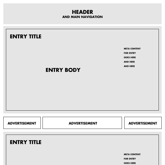
We’re all familar with layouts similar to this:
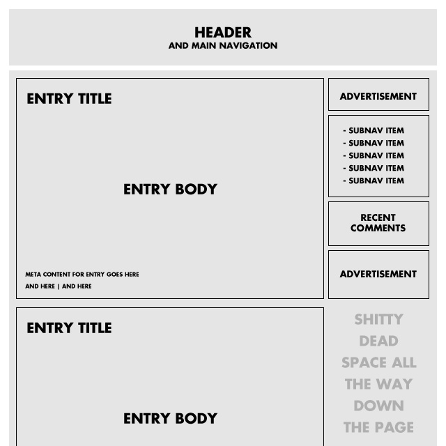
You’ve got a entry body area that may or may not be at an optimal size for readability and then over on the righthand side, a bunch of shit having nothing to do with the entry you’re reading. If you’re lucky enough to scroll past these billboards during your reading journey, you inevitably encounter the eternal sidebar deadspace, the U.S. Route 50 of websites.
I need a better driving, excuse me, reading experience on Daily Exhaust. I want people to enjoy coming here, not merely endure a sub-optimal reading layout because they like the content.
So in my world, when you’re reading, it’s the only thing in your view:
Look to the left, look to the right… it’s all related to the entry. In this case, when you look to the right, it’s the meta content related to the entry. Time stamp. Category. Keywords. No ads. No sub navigation. No dead space, just open space.
Yes, I’m not directly monetizing this site (aside from self-promotion) yet, so I have the luxury of creating any format I choose. Regardless, it’s possible to scale the current format in a way that still favors the reader while making me money. Down the road, if I do include ads on the page, I plan to do so either within designated space between posts, or in actual entries themselves. I look forward to having these types of problems.
Moving forward, there’ll be many more changes but won’t change is a focus on readability.
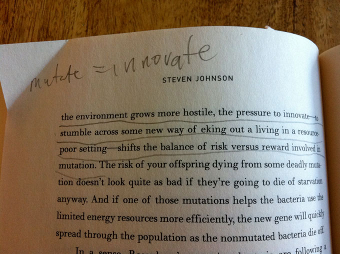 Some might look disapprovingly at image above, with all those crude lines and chicken scratch writing, but for me, being able to underline chunks of text, scribble notes and circle words I want to look up later opens up a deeper level of comprehension into the book I’m reading. Of course this method can be adapted with an e-reader by simply pairing it with a physical notebook, but it’s a little more effort and not well-spent effort. I’m not a psychologist but something about physically interacting with a book takes reading beyond simple consumption. It becomes a form of creation. By the time you reach the end of your book you’re not left with the same pages you started with. No, no … these are my pages now. Sure, the author is making his points, but I’m deciding which ones are important. Once I’ve read through and made sufficient notes I can begin the fun game of flipping back and reading over the passages I marked up.
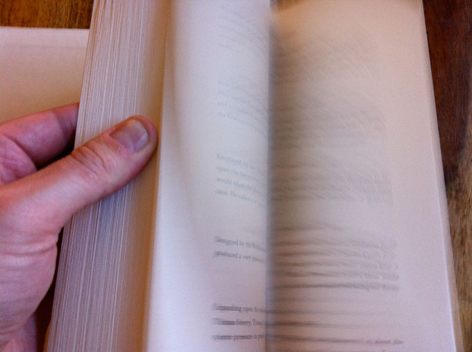 This might seem like a minor point, but the fact that I can’t easily flip between pages on a Kindle is a huge frustration. No, this doesn’t mean I’m not able to remember what I’ve read, but sometimes I want to reread passages. Great books, like great movies, are meant to be read over and over (unless you’re satisfied watching a Kubrick movie once). I’m completely confident this technological limitation of e-books will be resolved but until then, my thumbs rule.