Galvanize
Guess I missed this one when it dropped. Hot track featuring Q-Tip.
Guess I missed this one when it dropped. Hot track featuring Q-Tip.
Well,
I’m just trying to stay above water,
you know?
Stay busy, stay working
I was telling you like,
the key to this joint,
the key to staying on top of things
Is to treat everything like it’s your first project
Know what I’m saying?
Like it’s your first day,
like I wasn’t even an intern or nothing
That’s how you try to treat things, like
Just stay Humble
– Notorious B.I.G from My First Song by Jay Z
As a part of the annual review process, the company I work for, Roundarch, requires everyone to collect a bunch of things – updated resumes, bios, project reviews and a one pager.
When I first heard about the one pager, I thought it was stupid. It’s a 1-page powerpoint slide containing a full page design/illustration that represents you. It’s not a bio. It’s supposed to be more visual and creative. Some people treat it like a scrapbook, some make it a parody of something else. Some feature more outside-of-work interests and some feature more work-related content.
The whole point of the one pager is to have something projected in front of the managers and VPs when they conduct your annual review.
I so decided to drop the attitude and have some fun with my one pager. This isn’t a first impression since I’ve been working for Roundarch for over 6 months, but it’s an impression none-the-less so I didn’t want to half ass it. I should treat this like a real project. I should treat it like my ‘first song’.
I choose the parody route for my one pager.
I chose to make myself a Transformer.
Like design, a good parody is all about the details.
I also decided to deliberately break the rules for my one pager and make it a two pager. I think you’ll agree it was a crucial part of the equation (click on the images for full size versions):
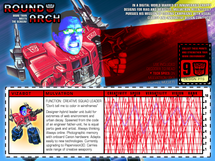

For those Photoshop-savy people out there, you’ll see how handy the Multiply layer effect is for things like Tech Spec decoders.
Apple Planning Video-Call iPhone
Stories like this make me smile and laugh at all the companies that try to imitate Apple’s innovation (yes, imitating innovation is an oxymoron).
The key to competing with a company like Apple is not to try to match their products, because what you create will be inherently derivative. It’s like keeping your attention on the person you’re racing against instead of the road you’re running on. You’re bound to slam into a wall or fall into a pothole.
What you have to do it think about the product category you plan on working in and figure out what doesn’t already exist and build that.
Although the similarities between the Palm Pre and the iPhone are strong, what’s so refreshing about the Pre is the features that Palm has created that don’t currently exist on the iPhone such as running multiple applications at once, copy & paste and global search functionality within the OS.
If you haven’t watched the Palm Pre Keynote, have a look (the good stuff starts at Chapter 4).
So while dozens of companies are jumping on the mobile bandwagon and focusing all their attention on making iPhone competitors, Apple is – as usual – years ahead of everyone by focusing on making an innovative product and not merely something that competes with current mobile paradigms.
Don’t like Apple’s game? Make up your own game and play by your own rules.
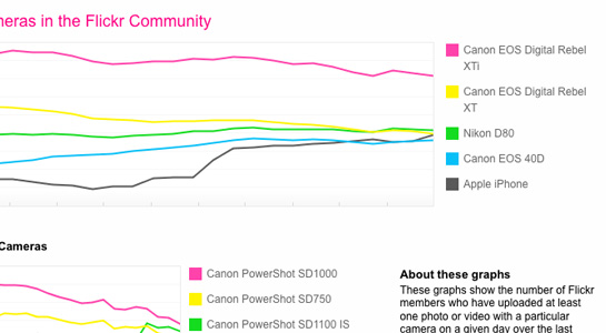
So the most popular cameras on Flickr are Canon Rebels and iPhones (oh, and Nikons).
I can’t say I’m too surprised. On my iPhone (or any mobile phone with email) all I have to do is email my custom Flickr email address and it posts my shots right to my photostream.
It’s actually become part of the process of shooting photos with my iPhone – shoot-and-email… shoot-and-email….
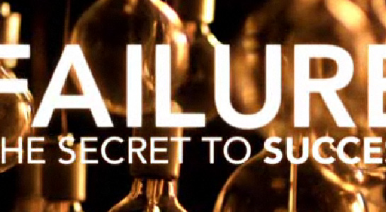
Failure – The Secret to Success is one of three short films currently featured on Honda – The Power of Dreams.
The films come across as thoughtful and sincere and show how the vision of the founder, Soichiro Honda, still carries on in the company.

My colleague Victor just wrote a great post.
From his post:
What is the service this site is providing me – or to put it another way – what’s in it for me (other than a way to waste 10 minutes of my day)?
It’s important to answer that question before your client does.
We all have to make a living, no one likes to turn down interesting work and I wouldn’t be where I am today if I didn’t know Flash and HTML….
…but – that doesn’t mean we shouldn’t question the type of interactive work we’re producing.
Why Does This Site Exist?
Uniqlo Try (via PSFK)
This subject has been sitting in the combustion chamber for a while and I need to get it out on the nets.
Email applications need to allow for specifying line width for text. When they don’t, the amount of words/characters per line is dependent on the size of your message window. It shouldn’t be the responsibility of the user to have to adjust their email message window to the width for ideal readability. Computers, and by extension, their applications should reduce complexity, not add to it.
When email applications let line width run wild, it makes it much harder to read messages as your eye has a much farther distant to snap back to get to the beginning of the next line, increasing the likelihood of a reader losing their place.
From The Elements of Typographic Style as Applied to the Web (referencing the original EoTS):
Anything from 45 to 75 characters is widely regarded as a satisfactory length of line for a single-column page set in a serifed text face in a text size. The 66-character line (counting both letters and spaces) is widely regarded as ideal. For multiple column work, a better average is 40 to 50 characters.
While this statement was referring to printed text, the same principles apply to line width for the web. Everything is relative and when designing for the web and it’s up to the designer to determine the ideal type size combined with the ideal line width (this site uses a main content width of 545 pixels against a font size of 12 pixels).
Click on the two screen grabs below to compare readability (viewed in Entourage):
plain text with imposed line breaks
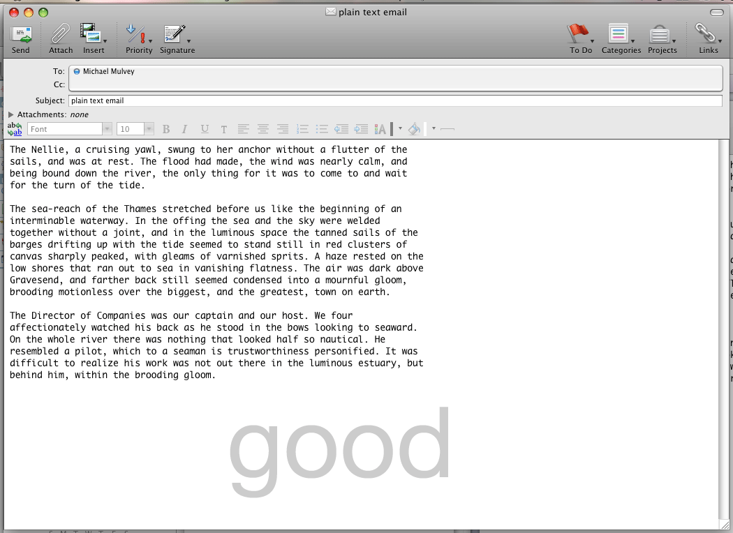
rich text with no line breaks
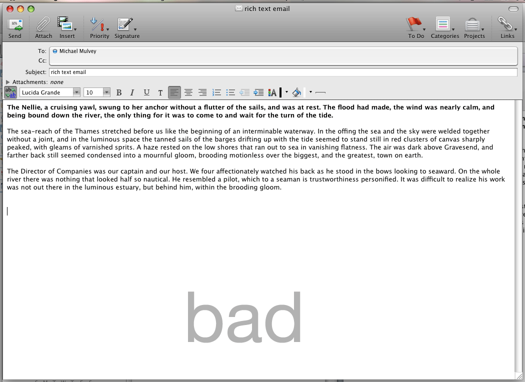
The only application on OS X I’m aware of that allows for changes in line width is Entourage. In Entourage, when you switch from rich text to plain text, it automatically resets the line width to 76 characters through the use of line breaks. In Apple’s native Mail.app, it does nothing to line width when toggling between rich & plain text.
I’m not sure what the solution to this is, since with Entourage’s method of imposing line breaks into the previously ‘plain’ text causes situations such as this on smaller screens, like my iPhone:
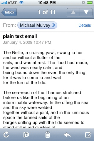
Those previously wonderful, strategic, 76-character long line breaks now look like shit on my 320-pixel wide iPhone screen.
The concept of liquidity of content is an important one when designing for the web and other digital content that lives in different environments and is interpreted by different applications. But too much liquidity means not enough structure.
…which means poor readability.
..which means poor communication.
What I suggest is that email applications (both local and web, like Gmail) impose a width on messages by default. If a user doesn’t like the default formatting, they should be able to adjust or remove it.
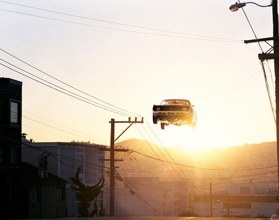
I found the work of Matthew Porter on FFFFound last week. For those of you for don’t know what FFFFound is, it’s porn for designers.
Then I ran into his work again today at the Morning News.
His shots of these classic cars are great, I’ve already added them as wallpapers to my iPhone.
It’s unfortunate his website is so small. 🙁
