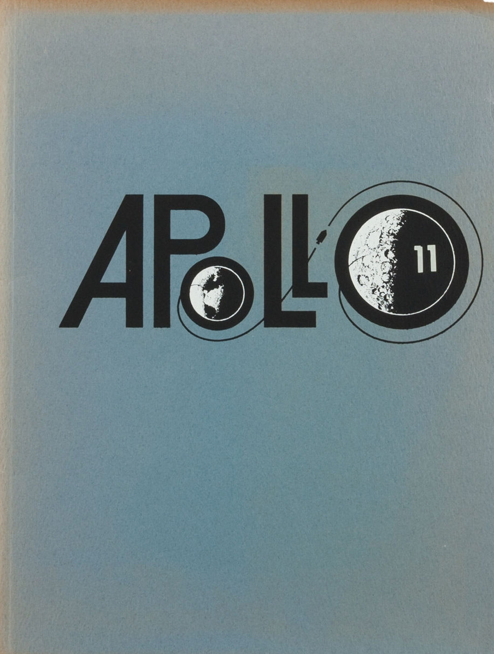
How To Get To the Moon
via Gizmodo
via Gizmodo
The redesign of Design Observer is truly a missed opportunity.
As with anything design-related, the problems are all in little details.
Here’s a list of problems that caught my eye (top to bottom, left to right):
– Is the black tray at the top necessary for 2 measly links? Seems a bit much.
– The scrolling news marquee at the top is abruptly cropped about halfway across the width the the site, why?
– Sometimes ads are necessary, but does MailChimp have to take up that much room at the top? Christ.
– The lefthand navigation. What is that, 6-point type? Again, why?
– Rolling over blog posts on the homepage reveals a blog post summary. No animation, just a jerky jump-out.
– Why are the ‘Creative Opportunities’ in white text against a light grey background? I can read them, but it’s approaching the edge of readability.
– Because the header is over 250 pixels tall, the scrollable area for the mere three articles is extremely small.
– Even though the website is over 1,000 pixels wide, it feels extremely stuffy and cramped because of all the poor design decisions made. The stacked logo feels cramped, the lefthand navigation feels cramped, the height of the header makes everything below it feel cramped.
– Most disappointing is the lack of sophistication to the typography
I could go on and critique the rest of the site, but you get the idea.
Clearly Design Observer is comprised of some heavyweights in the world of graphic design but traditional graphic design is very different than web design.
It reminds me of when Michael Jordan tried his hand at minor league baseball. Sure, he did ok, but it was anything close to his achievements in basketball.
via imgur
Great piece by my friend Jory Kruspe on ‘The Bleed’:
We are starting to see a renaissance in the world of design for the web. Some may call it a trend, but from the perspective of a designer in the profession for many years, much of the current designs are being informed by an approach that has been in place for quite some time now. The approach is one that maximizes the available space in the browser and is usually characterized by the use of large photography or video. The term I will use in identifying this approach to web design is ‘Full Bleed.’
He’s absolutely right.
Since we decomissioned Adobe Flash from the heavylifting job of building websites, the combined powers of HTML5, Javascript and CSS have come a long way.
These new ‘cutting edge’ HTML5 sites use full screen video/image backgrounds and custom typography—things we were using 12 years ago in Flash (yep, I’ll be that crabby old bastard talking about the good ol’ days).
I make this point not to strip praise from all web designers doing great work today, but to point out the precedents on which today’s work builds.
Know your fucking roots.
Daily Exhaust contributor Jory Kruspe designed a new site for The Society of Graphic Designers of Canada (for Manoverboard).
If you dig it, go vote for it at AWWWards.
via Flavorwire
via Co.Design
Gorgeous site for Yang Rutherford. HTML no less.
Bonus points for making your scroll wheel move the page horizontally.
Note: Also gorgeous on iPad, but not optimized for phone.
via siteInspire