Cornered
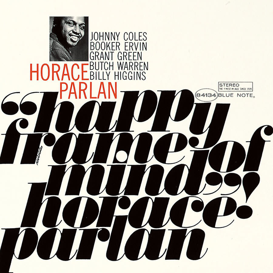
Vox has a great, 7-minute documentary on Blue Note Records and the iconic album covers they produced thanks to the art direction of Reid Miles and the photography of Francis Wolff.
Khoi Vinh on the caliber of editorial design in Apple’s App Store:
Apple’s dramatically redesigned App Store got a decent amount of attention when it debuted last year with iOS 11, but its unique success as a hybrid of product design and editorial design has gone little noticed since. That’s a shame, because it’s a huge breakthrough.
I myself paid it scant attention until one day this past winter when I realized that the company was commissioning original illustration to accompany its new format. If you check the App Store front page a few times a week, you’ll see a quietly remarkable display of unique art alongside unique stories about apps, games and “content” (movies, TV shows, comics, etc.). To be clear: this isn’t work lifted from the marketing materials created by app publishers. It’s drawings, paintings, photographs, collages and/or animations that have been created expressly for the App Store.
I don’t launch the App Store app very often, but Vinh is right. The art direction and illustrations are solid.
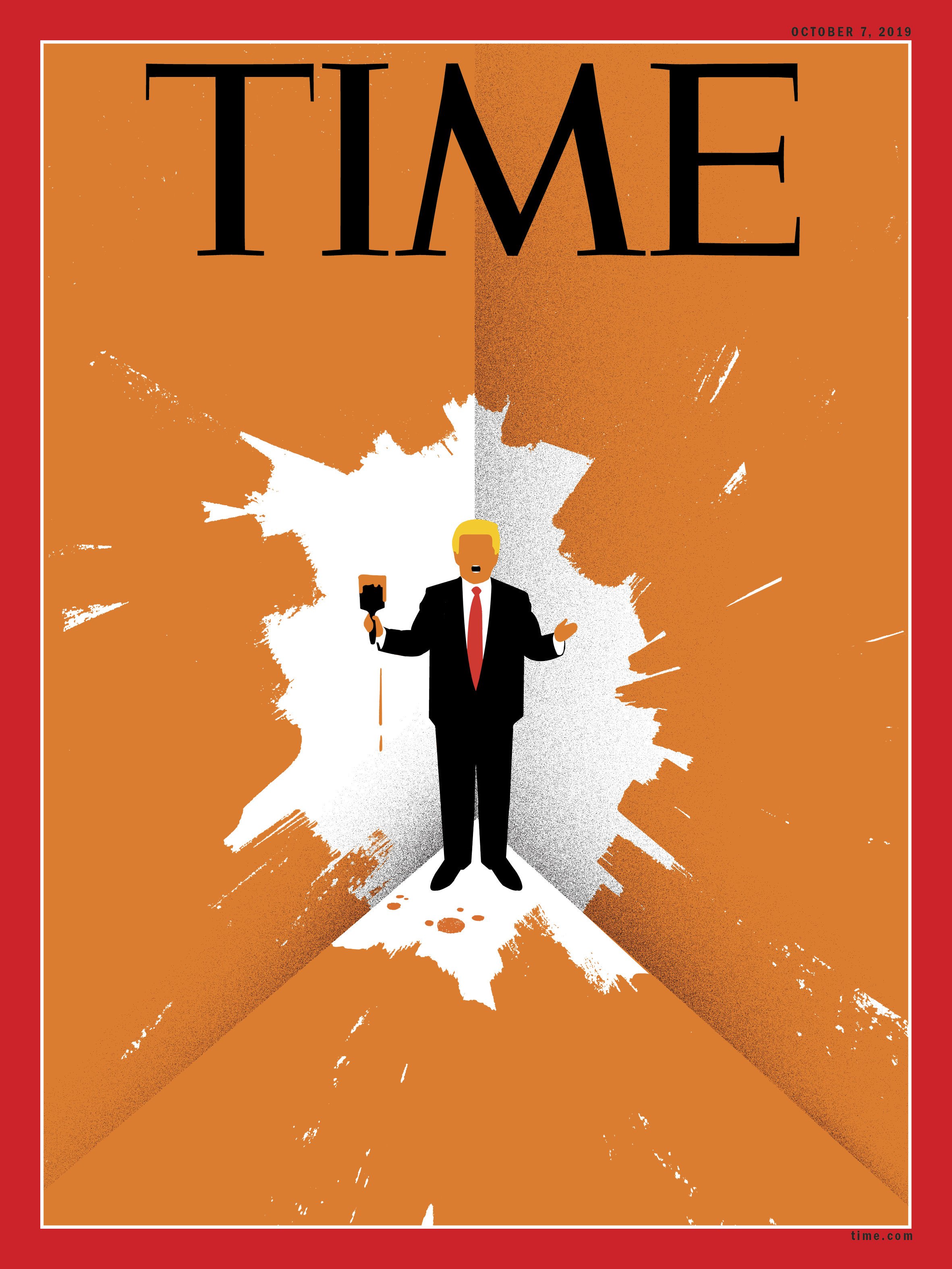
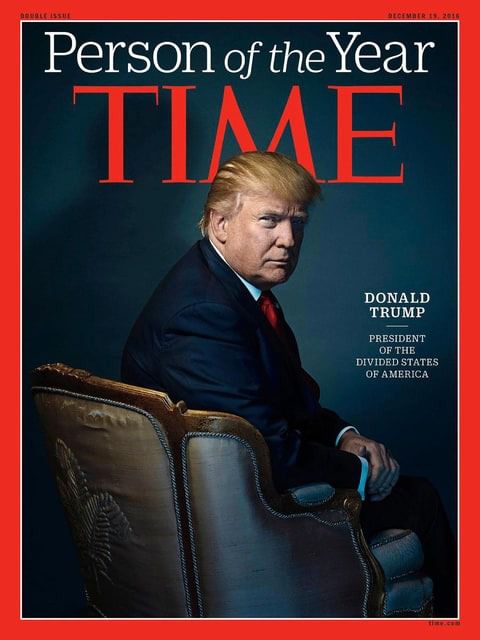
This year, Time Magazine named Donald Trump ‘Person of the Year.’
It sounds pretty congradulatory until you spot the clever placement of Donald Trump’s Cheetoh head so the negative spaces around the ‘M’ in ‘TIME’ look like horns on his head:
This isn’t the first time this has been done.
Nope, Time gave Bill Clinton the horn treatment when they named him ‘Man of the Year’ in 1993:
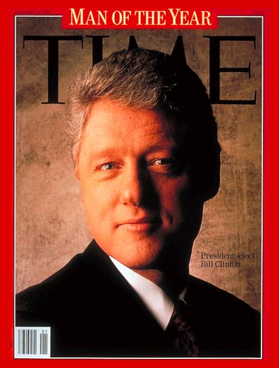
Note that in 1993 it was ‘Man’ of the Year, but now it’s ‘Person’ of the Year.
Morgane Santos sees (and feels) the unbearable homogeneity of design:
Here’s a random sampling of the top posts on Dribbble at the time of this writing. We have lots of illustrations done in the exact same style: evenly weighted lines, flat, minimal, geometric, symmetric. A few samples of mobile design that were carefully edited to look slick and show the best possible state. Lots of blue: a nice, safe color.
At some point, any one of these work samples would have been revolutionary. At this point, not a single one of them is. And yet! This is what we think of as “good design”.
Hold up.
I’m with Sacha Greif:
In that screenshot I see an awesome circular badge with great composition, an illustration inspired by church stained glass, a 50s-style illustration with a great color scheme, some kind of blackletter-inspired logo, a very weird illustration that looks to be animated, a set of vintage-style badges, and an amazing psychedelic drawing.
I’d also like to add that popular design runs the risk of looking homogeneous because it’s just that: popular. This is the same reason popular (pop) music sounds all the same and one reason (of many) I haven’t listened to FM radio in a very, very long time.
Finding culture—music, art, design—that isn’t homogenous takes effort. You literally (or metaphorically) need to dig through crates of records to find the good shit. If you’re lazy you check out the news aggregators that compile the popular stuff. I find the great influences of my favorite artists are long dead, but I make the effort to dig up their work because more often than not it’s worth it. I don’t necessarily look for or expect great design to always be happening right now.
I think Morgane Santos is giving Dribbble too much credit. For me, Dribbble is but one of many sources of design news. The same goes for design trends. Trends are trends. Don’t try and eliminate them, because new ones will always pop up like wack-a-moles.
I’m digging the living photos on Crush & Lovely’s team page.
Over at The New York Times, Matt Dorfman shares his 12 favorite book covers from 2015 that made him, “stop, stare and ask aloud to no one in particular what the cover means, only to turn to the first page and then the following and then the one after that and onward.”
With Steve Jobs gone, Apple no longer makes lickable buttons. Sorry.
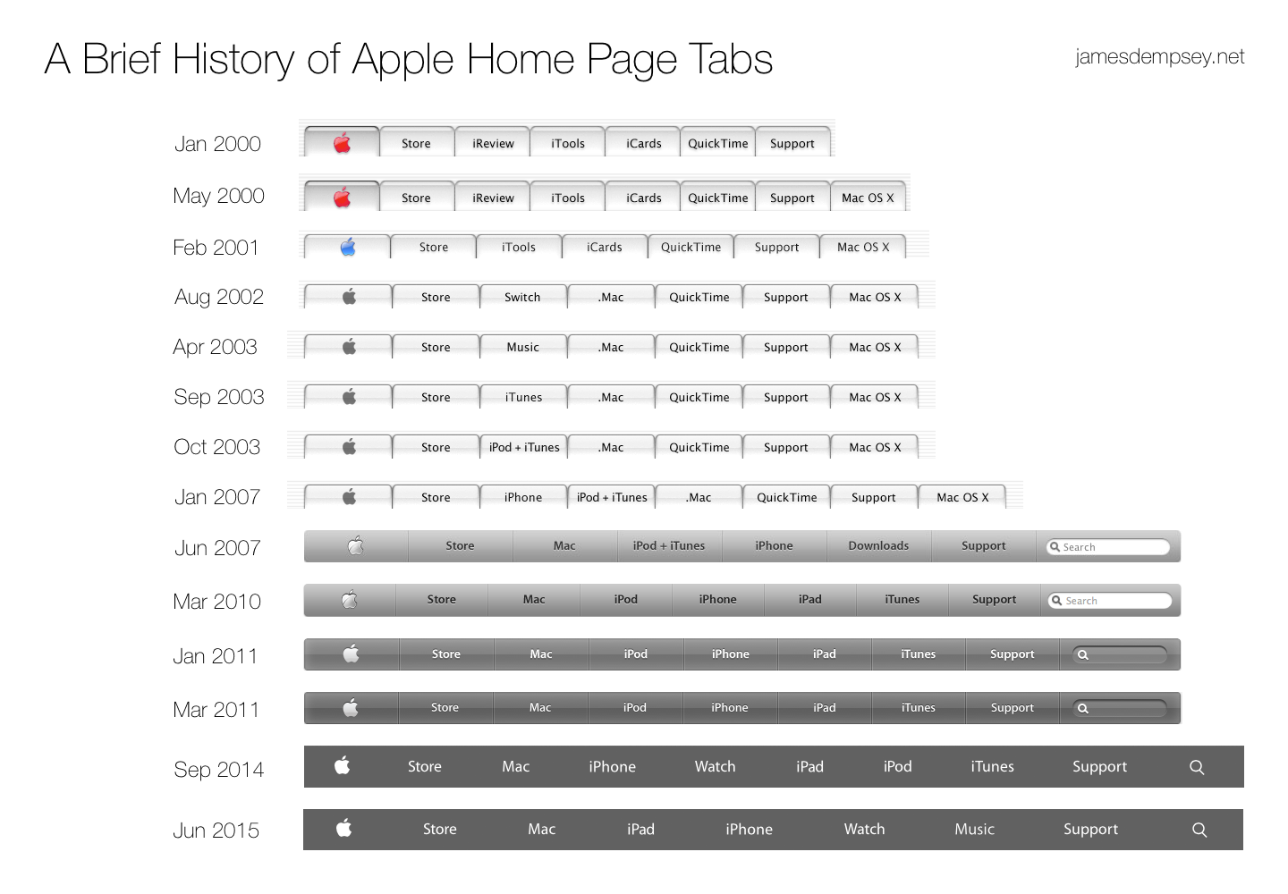
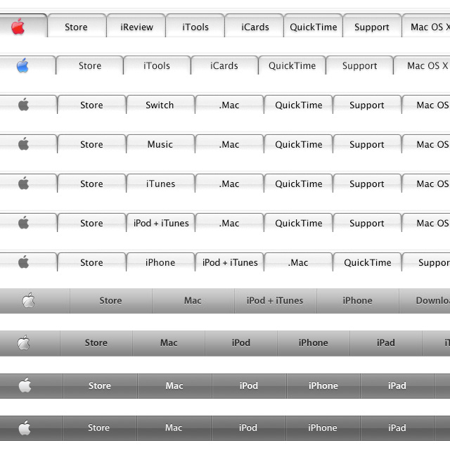
Apple nav bars compiled by James Dempsey
via Quipsologies
“The history of the album cover is so much richer and so superior to the history of the film poster,” Sagmeister told Dezeen. “The average film poster basically takes its strengths from being attached to some cultural phenomenon.”
“People like the Star Wars poster because they like the film,” he continued. “But the poster itself is ultimately a piece of shit. It’s a realistic illustration with some typeface on it related to what’s happening in the film.”
—Stefan Sagmeister talking to Dezeen
Centered type. Likely set in Futura Bold. A logo with two long forms crossing each other like an “X”, usually with four distinct icons in each of the four quadrants. An emphasis on authencity and materials in the rich, photographic backdrop of the website.
We’ve all seen this vernacular in graphic design over the last 5 years. It’s become very popular, even when the characteristics described above don’t match the product or service being pimped on the website.
This doesn’t mean this approach is wrong or contradicts the product or service, it’s just a popular trend.
Take the website for Maine Quarterly.
It’s a gorgeous and well-built website describing and showing different facets of Maine. If there’s any website (or US state) that has a good reason to adopt an identity comprised of old type, wood, iron, forests and hand tools it’s Maine.
Nice work.
Fresh site from Work & Co.
In a sea of cookie-cutter, trend-following portfolio/agency sites, this shows there’s nothing stopping companies from making great ones.
Here are a few of those posters Armin Vit was talking about:
Seemingly simple compositions, but powerful.
The other day BGR posted this animated GIF of Apple’s website from the late ’90s (based on my digging on archive.org, I’d say 1998):
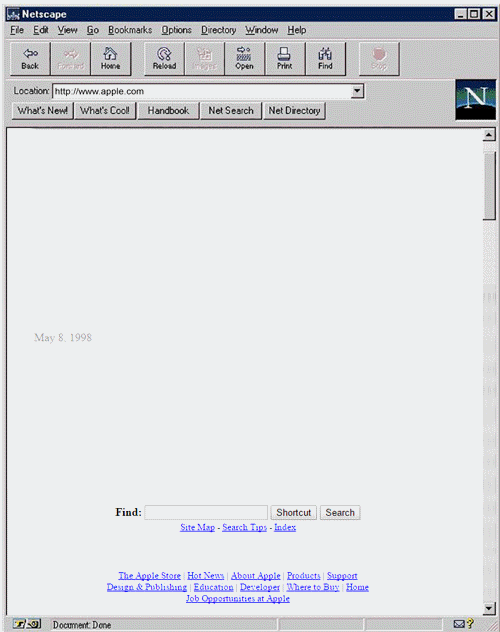
This is what they said (my emphasis):
Apple has come a long way since the dark days of the mid-’90s, when it very nearly went bankrupt. And if you want to see just how far Apple has come, then you need look no further than this awesome GIF posted on OpenUniversity.edu that has preserved Apple’s website exactly as it looked in 1997. As you’ll see below, the company’s main page has undergone a pretty drastic overhaul in the past 18 years, and it’s all been for the better. Yes, screen resolution has changed. Yes, browsers have gotten better.
Yes, Apple’s productions have evolved.
But has their website “undergone a drastic overhaul”? Not from what I see. I see a website structure that’s pretty consistent with today’s Apple.com in 2015:
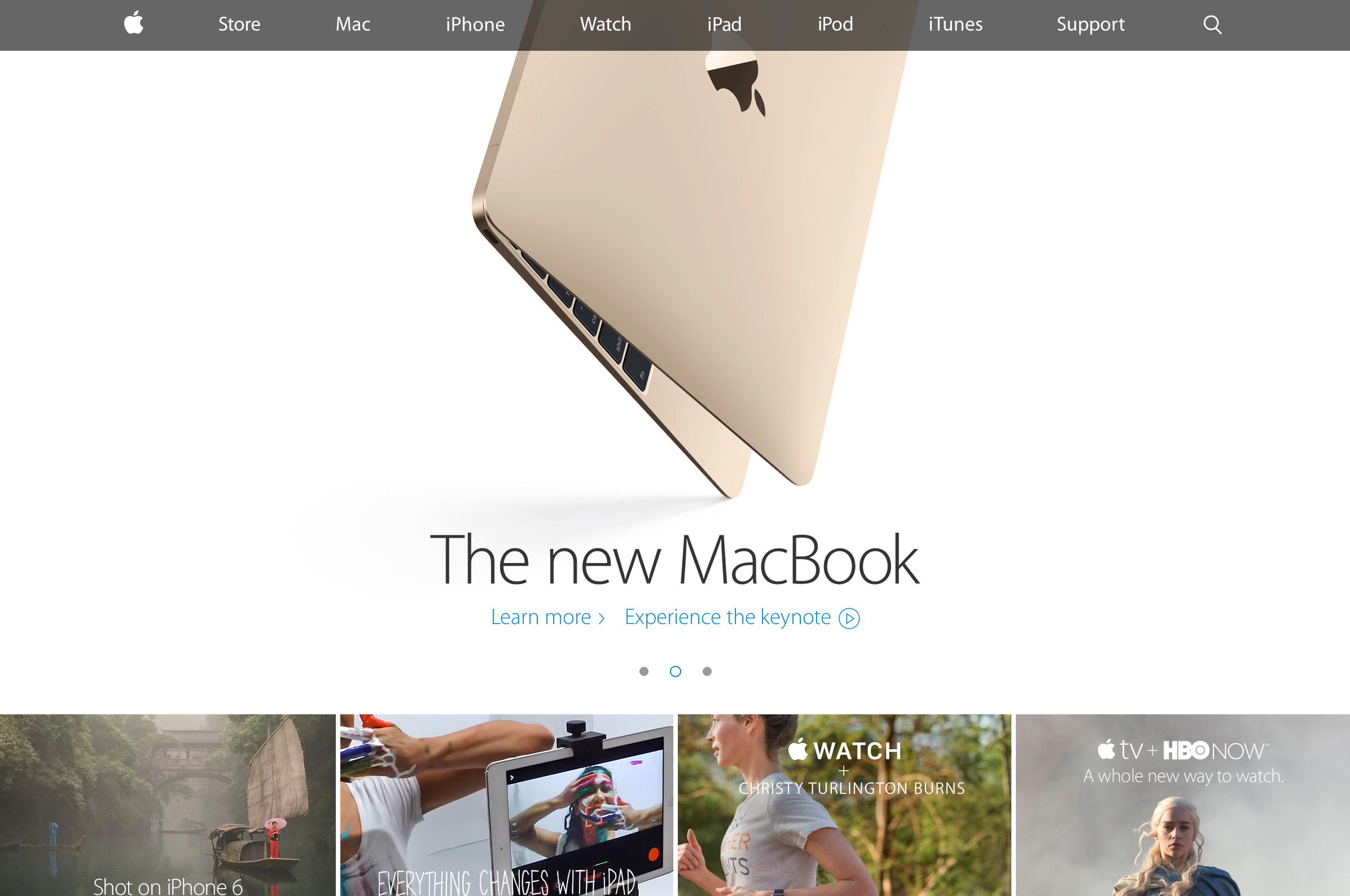
Ok, there’s 4 modules under the main carousel, not three. So sorry.