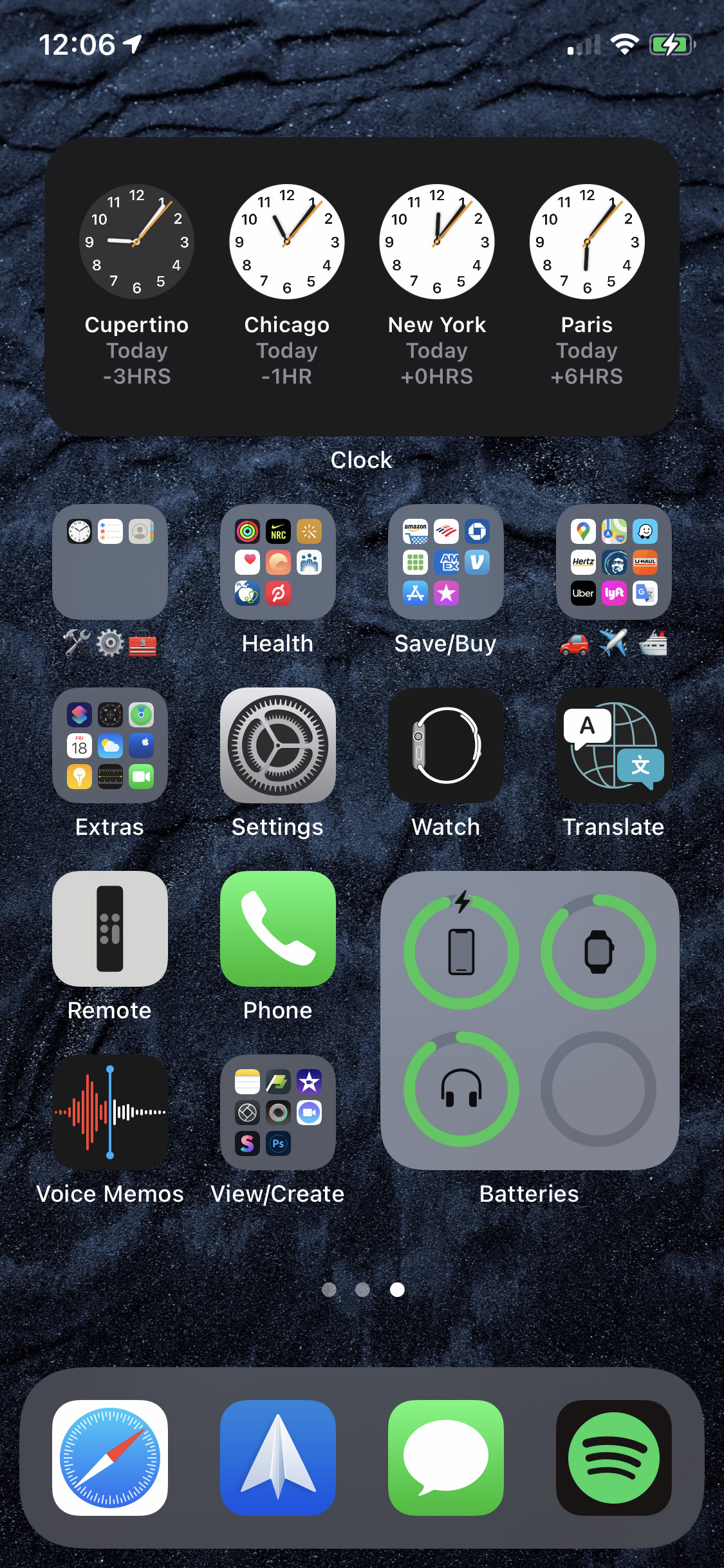
My iPhone 11 Pro running iOS 14

Yesterday iOS 14 dropped. Unlike some incremental iOS updates, this one can change how you use your iPhone or iPad, should you choose use the new Home Screen Widgets (you have the option to never see a widget if you don’t want to).

I’ve jumped in head-first.

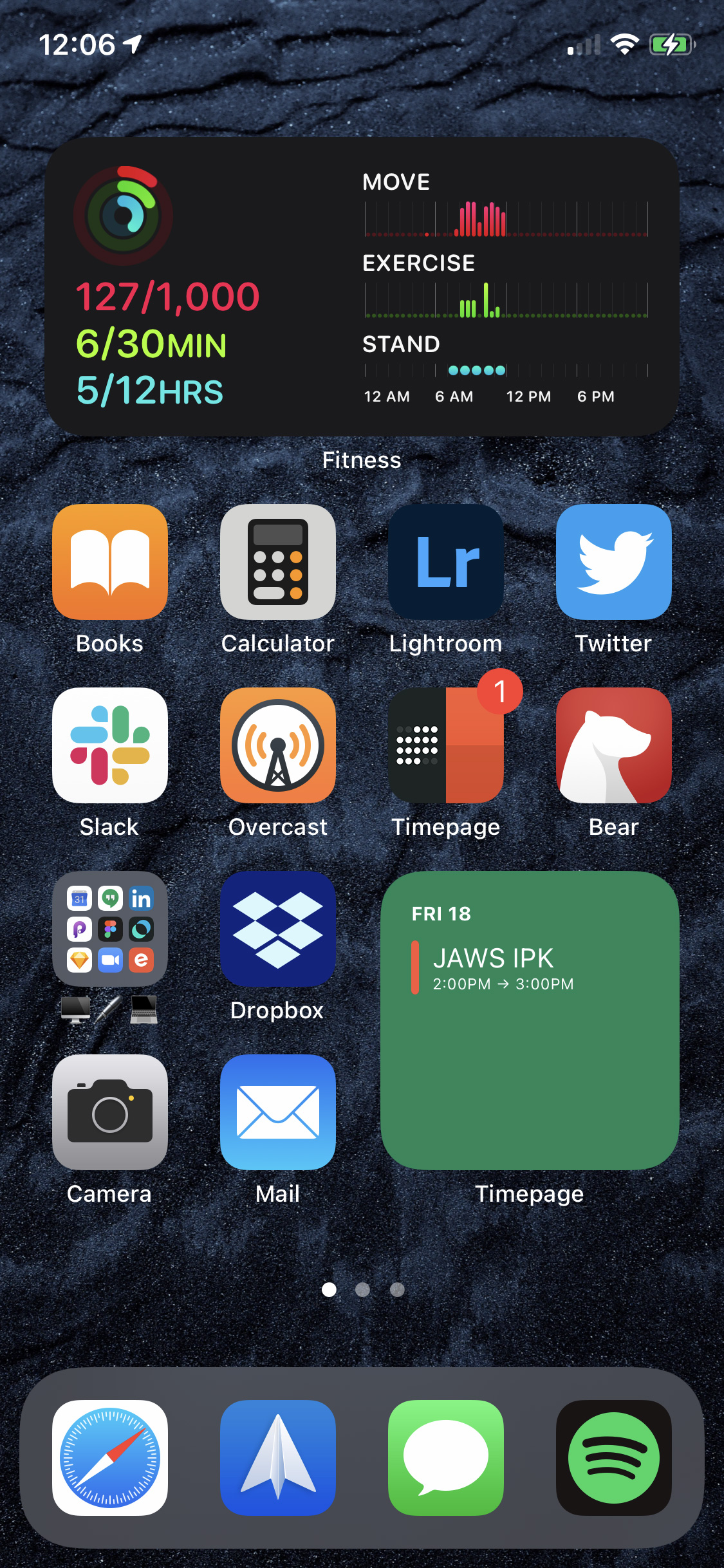
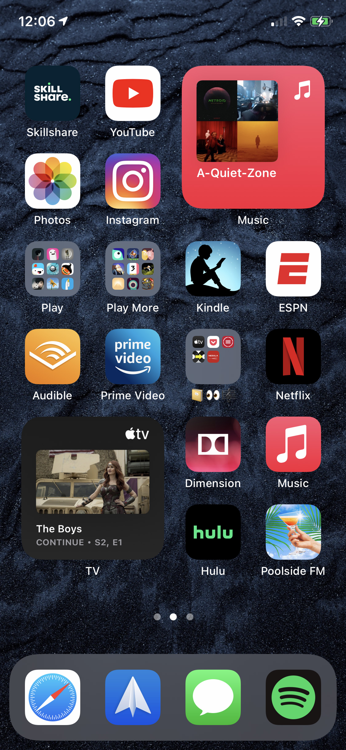
In the short 24 hours or so that I’ve been using widgets, I’ve found myself organizing my home screens into activity themes.

Roughly put, I’ve created:

Home Screen 1: Most Used Apps & Work-Related Apps
Home Screen 2: Media Consumption Apps
Home Screen 3: System Utilities & Miscellaneous Apps

This arrangement will likely change as more third-party developers release their own widgets (Spotify, I’m looking at you).

Home Screen 1 - Most Used Apps and Work-Related Apps

Home Screen 2 - Media Consumption Apps

Home Screen 3 - System Utilities and Miscellaneous Apps

Tags:

 /  /  /  / 

Icons

Windows 10 Icons

Windows 10 Icons

Looking at the evolution of the Mail icon, it appears this is the first version of Windows to not feature shitty icons.

Every version of Windows prior to 10 had icons that looked like they were bought for a dollar from a stock image site, lacking any taste or sophistication.

Categories:

Image, Interface

I haven’t seen a compelling argument for why a mobile computer with a folding screen is better than one without a folding screen.

Android pocket computer manufacturers can’t hold back their excitement over folding screens. Samsung was so excited, it aired a Galaxy Z Flip commercial during the Super Bowl before it even announced the phone.

Motorola has taken the nostalgic angle with folding screens and reintroduced the RAZR. I remember when the original RAZR debuted in 2004. There was a ton of buzz surrounding it and its ~$350 pricetag (a hefty price for a folding phone at the time).

I know fashion moves in cycles, and old things become new again, but I’m not convinced the kids today are both nostolgic for a folding phone and really want a touchscreen that folds.

As far as other 40-somethings like me, I don’t see anyone rushing out to get either of these devices. After watching MKBHD’s unboxing and review video for the new RAZR, it’s clear Motorola put nostallgia and form ahead of function, doing everything they could to keep the same shape as the original RAZR in order to create a subpar device compared to other Android mobile computers.

I like seeing gadget experiments, but I haven’t seen a compelling argument for why a mobile computer with a folding screen is better than one without a folding screen. Just because something can be done, doesn’t mean it should be done.

The iPad has fallen short.

Gruber feelings on the iPad:

The iPad at 10 is, to me, a grave disappointment. Not because it’s “bad”, because it’s not bad — it’s great even — but because great though it is in so many ways, overall it has fallen so far short of the grand potential it showed on day one. To reach that potential, Apple needs to recognize they have made profound conceptual mistakes in the iPad user interface, mistakes that need to be scrapped and replaced, not polished and refined. I worry that iPadOS 13 suggests the opposite — that Apple is steering the iPad full speed ahead down a blind alley.

I agree with Gruber that the iPad has not lived up to its original mission, but don’t think the future is as dire as he paints it. Apple can still course correct things. The question is, though, whether they will.

Categories:

Interface, Product, Software

Tags:

 / 

Metaphors

Fast Company: Apple built a $1 trillion empire on two metaphors. One is breaking:

That’s how metaphors work: Once their underlying logic becomes manifest, we forget that they were ever there. No one remembers that before the steering wheel in a car, there were tillers, and that tillers made for a natural comparison when no one drove cars and far more people had piloted a boat. The metaphor disappeared once driving cars became common. In digesting new technologies, we climb a ladder of metaphors, and each rung helps us step up to the next. Our prior assumptions lend us confidence about how a new technology works. Over time, we find ourselves farther and farther from the rungs we started with, so that we eventually leave them behind, like so many tiller-inspired steering wheels. Or like the various metaphors—hyperlink, browser, search engine—that taught Westerners how to use the World Wide Web.

I wrote about this ‘disappearing metaphor’ problem back in 2009:

Fine. As long as we have our living analogue ancestors around, our iconography can stay in place and mutate when some of them become extinct. We get it. Let’s stretch this out to it’s logical conclusion – there is no interface. We become the interface. The interface becomes us.

We’ll reach a point in the future where what Mr. Dawes is saying does come to be. People will no longer understand that bell telephone means ‘call someone’. Phones will become implants and we’ll simply say a person’s name to our interfaceless voice recognition system. We have HUDs in jets and cars, is it really a stretch to image an HUD eye implant?

Picture an iPhone without the iPhone.

It will be a strange, new world once we fuse with our devices.

Categories:

Interface

Tags:

 / 

Flash

Last week Vice posted an article on Rob Ford’s newly published book, Web Design: The Evolution of the Digital World 1990-Today.

The 640-page book, full of pictures of interactive websites from prior eras, benefits from taking a wide view of the visual culture of the past: Starting at the embryonic stages of the World Wide Web, it follows the art of web design through periods of extreme experimentation on the way to the convention-driven scaffolding we have today. The book makes a compelling case through its general structure that the sweet spot of creative web design came during the late 1990s through the mid-2000s—periods in which major brands were willing to invest a whole lot of money in a website intended for show, not just tell.

Ford’s main perspective is that Flash is responsible for the Internet’s most creative era.

I started my career as a designer in the “sweet spot” Ford highlights in his book, so I am both biased and knowledgeable about the breakthroughs in web/interactive design of the period. I remember Joshua Davis and his website Praystation, where he posted his digital art experiments in Flash on an almost daily basis. Davis also provided his pre-compiled source files for anyone to take and run with. There was also Eric Natzke, James Paterson (Presstube), Robert Hodgin (flight 404) and dozens of other digital artists and experimentors pushing the envelope with what was possible with Flash on the Web.

Then there were all the nascent digital agencies blazing a trail in web design like Huge, Big Spaceship, grupoW, hi-res, RG/A, Kioken, group94, and Firstborn to name a few.

It was also during this period that I was a contributing editor to one of the larger web design portals, Moluv (it’s actually still up). As a young designer I’d sift through hundreds of website submissions every day to find just a small handful that were actually great — great interactivity, great typography, great animation, and great content.

Sure, you could say Ford and I are looking back at the Web through a rose-colored, 72dpi monitor, but it’s a fact that every immersive website – powered by HTML, Javascript, and CSS – you see today on design portals like Awwwards, siteinspire, and Designer News has it’s roots in the experimental Flash sites of the early 2000s.

Parallax scrolling, custom typefaces, scripted motion, dynamic masking, video backgrounds, interactive 3-D objects — these all began life on the Web as Flash websites.

There are also interesting comments on this Vice article over at Slashdot.org. Many of the comments are negative, shitting on Flash as a buggy plug-in, plagued by endless security holes. While the security concerns around Flash are very real (Adobe will stop distributing and updating Flash in 2020), this discounts all creative work created in Flash.

Flash’s greatest contribution to the world of digital design is it lowered the barrier to entry for creating experimental, immersive, digital experiences. Designers and artists were no longer stuck with static HTML and images. They could now express themselves though motion, sound, and interactivity. If he or she was unable to figure out how to achieve a particular effect, they could go one of the many vibrant forums and find the answer – and source files – from someone else.
Samsung continues their time-honored tradition of copying Apple.

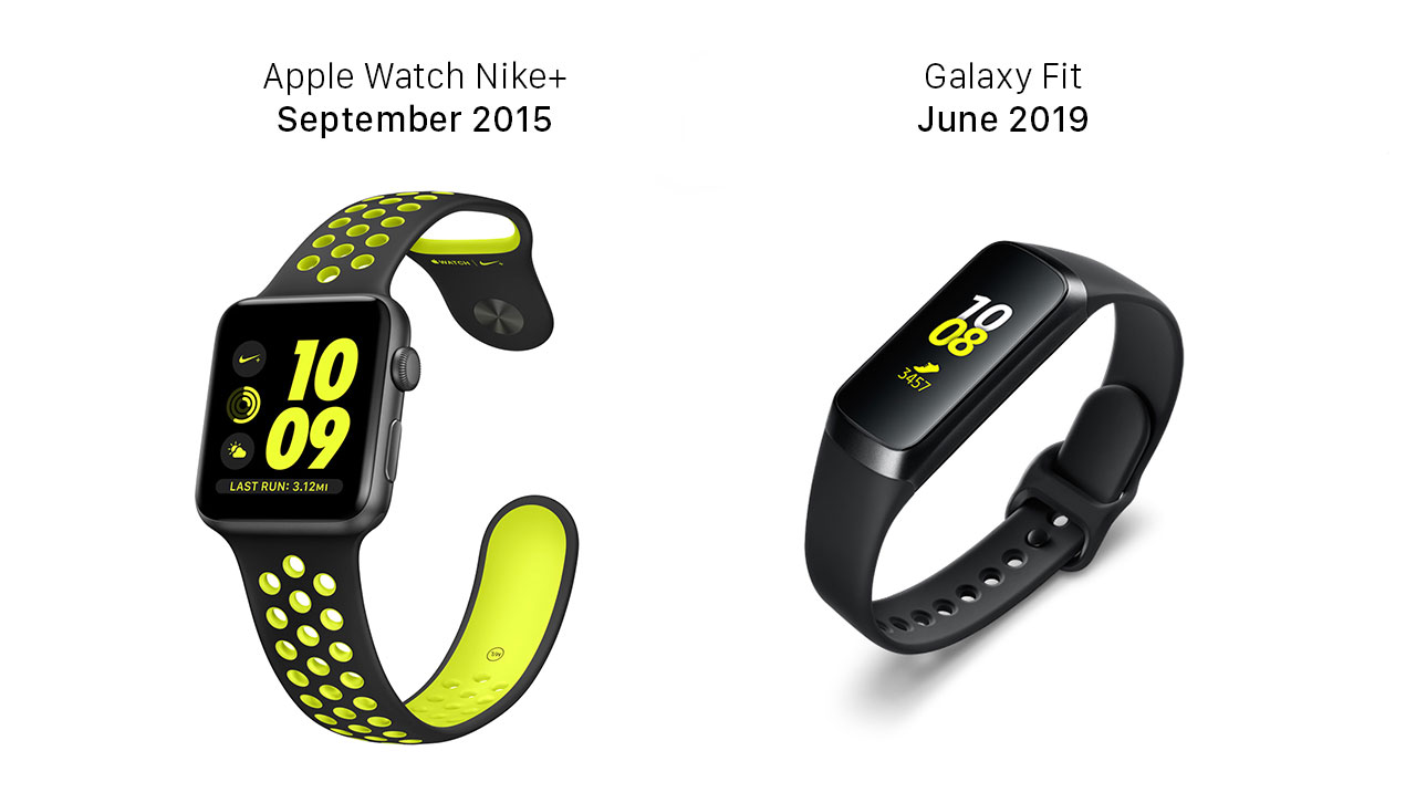
Samsung hasn’t just copied Apple’s product design once, they’ve done it repeatedly for over a decade now. At least they’re consistent. Today’s announcement of the new Galaxy Fit is no different.

A quick look at their product renderings shows they’re not only ripping off Apple’s watch face aesthetic, but the Nike+ design style too.

Apple Watch vs Galaxy Fit Apple Watch vs Galaxy Fit

Categories:

Interface, Product

Fun Interface

John Gruber on the upcoming iOS 13 and what bothers him with the “post-iOS 7” UI:

I don’t know why, but one of those things has been bugging me a lot in recent months: the drab gray color that indicates tapdown state for list items and buttons. Putting aside skeuomorphic textures like woodgrain and leather and the 3D-vs.-flat debate, the utter drabness of tapdown states is just a bad idea. I didn’t like it when iOS 7 debuted, and I like it even less 6 years later.

In classic iOS, when you tapped down on list items or buttons, they’d instantly light up in vibrant color. The standard color was a bright cheerful blue. In iOS 7 through 12, the tapdown state is the color of dirty dishwater.

I agree with Gruber to an extent.

I remember how weird iOS 7 felt when it came out. It was the first major iOS update after Scott Forstall left Apple and Jony Ive took ownership of iOS. Readability was shitty (it used a lot of Helvetica 35 Thin) and there was poor foreground/background contrast in Control Center with greys and whites. It felt like a print designer was designing their first RGB interface. It also didn’t feel fun. Love skeuomorphism or hate it, iOS, up to version 6 felt fun (I hate to break to the the skeuomorphism haters, but iOS still a lot uses skeuomorphism, but that’s for another post).

Fast forward to today and I think iOS 12 feels much more fun. There are more rounded corners (and bigger radii on those corners), and animations have more easing to them. Transitions are not as robotically linear as they used to be.

This isn’t to say there’s not room to improve iOS and make make it more fun.

Tags:

 / 

Command + Z

Jon Gruber doesn’t think iOS has gotten ‘Undo’ right yet on iOS:

Undo has been in the same position in the same menu with the same keyboard shortcut since 1984. Undo and Redo are powerful, essential commands, and the ways to invoke them on the Mac have been universal conventions for almost 35 years. (Redo came a few years later, if I recall correctly.)

iOS does in fact have a standard convention for Undo, but it’s both awful and indiscoverable: Shake to Undo, which I wrote about a few months ago. As I mentioned in that piece, iOS does have support for the ⌘Z and ⇧⌘Z shortcuts when a hardware keyboard is connected, and the iPad’s on-screen keyboard has an Undo/Redo button. So for text editing, on the iPad, Undo/Redo is available through good system-wide conventions.

The shake gesture was fun and novel in the early days of iOS but it’s silly, inefficient, and cumbersome in 2018.

Categories:

Interface, Software

Tags:

 /  /  / 

Square Peg in a Round Hole

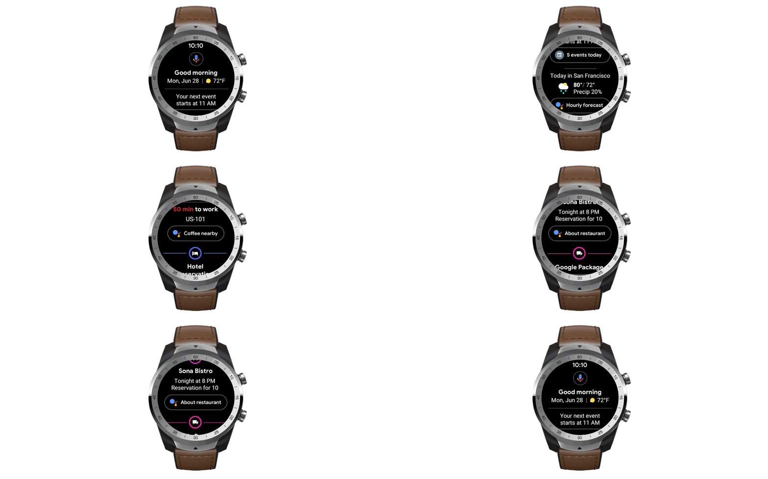
The Verge has a look at Google’s revamped Wear OS.

First off, ‘Wear OS?’ I know they replaced ‘Android Wear’ a while back, but when you update a product or service you’re supposed to make it better. Engineer-led companies are just the worst at product naming and branding (and Microsoft is still champ).

Secondly, Google wants their round watch interface to work so bad, but it just doesn’t:

The circle is a beautiful shape and in my 20 years of being a graphic designer I’ve seen many attempts made at round interfaces on everything from kiosks to websites, with varying degrees of success.

Screen real estate is extremely limited — therefor valuable — on a watch and by using a round screen Google is throwing away a lot of real estate. They’re also throwing away the whole history of written language.

Unless Google is presenting Mayan and Aztec calendars on their watches, circular screens are inferior to rectangular screens for presenting anything more than the time.

Categories:

Interface