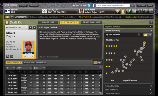
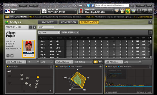
walled garden?

From the NY Post:

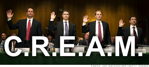
The term “walled gardens” refers to a service or technology that restricts access only to those using that service, as is the case with Apple’s iTunes, in which music can only be played on Apple devices or through iTunes itself.

What the hell are they talking about? Apple has been selling music as DRM-free MP3’s since April 2009. I can play my tracks on any computer I want.
A more accurate slam would have been Apple’s DRM-protected video content.

Categories:

Art, Film, Music

Tags:

what is, not what could be

Hints, previews and sneak peeks.
They go hand-in-hand with prototypes, demos and proof-of-concept products.
These impossible-to-buy, incomplete, vaporware products – coupled with speculations – form the bulk of technology news. It’s bullshit is what it is.
Here are a few recent ones I like:
Yahoo, Nokia to unveil ‘Project Nike’ deal – Yahoo announces an alliance with Nokia. Wow. Screenshots? Mobile apps to demo? Nothing? Amazing stuff guys.
Microsoft Cancels Innovative Courier Tablet Project – Microsoft first leaks videos featuring a concept product, and then cancels it about 6 months later. Nice.
NVIDIA hints webOS tablet, rags on Apple and Intel – The title says it all. All talk, no walk.
This is just one of the many reasons Jory Kruspe and I started HEED (It’s one of my reasons anyway). HEED is about the process that creates well-designed products. It’s about how something that’s well-designed can improve the quality of life. It’s about pointing out places in world where there’s bad design and why businesses and individuals need to wake up and heed to design.
I’m not saying not to dream. I’m saying do something with those dreams. Make something. Find a process that allows you to execute your ideas. And when you find that process, use it.
The articles mentioned above are all (potentially) great ideas, but a design isn’t successful unless it’s executed.
That’s why Jory and I started HEED as Twitter and Flickr accounts. We both are busy with our jobs and haven’t been able to put aside the time to create the picture-perfect venture we’ve envisioned in our heads. So we’re starting with a seed.
Hey, at least we’re starting.

Categories:

Art, Education, Innovation

Tags:

hell hath

Art is a jealous mistress, and if a man have a genius for painting, poetry, music, architecture, or philosophy, he makes a bad husband and an ill provider.

—Ralph Waldo Emerson, 1860
via Laphams Quarterly

Categories:

Art, Education, Image

Tags:

Awesomeness

Jay Parkinson’s Awesomeness Manifesto:

The vast majority of companies — in my research, greater than 95% — can only create what I have termed thin value. Thick value is real, meaningful, and sustainable. It happens by making people authentically better off — not merely by adding more bells and whistles that your boss might like, but that cause customers to roll their eyes.

Heed to Design.

Categories:

Art, Innovation, Technology

Tags:

Tufte on WP7

Edward Tufte on Windows Phone 7:

The WP7S interface has an extra sequence/layer added by big-button opening screens for the new ways of organizing stuff. Compared to the IPhone, most of the WP7S organizing screens have lower content resolution, which violates flatness and leads to hierarchical stacking and temporal sequencing of screens. In day-to-day use, maybe the panorama screens will solve the stacking/sequencing problem, or maybe they will just clutter up the flow of information. Of course Microsoft’s customers are already familiar with deep layerings and complex hierarchies.

I thought similar things when I watched a handful of demos of the new Windows mobile OS. It’s definitely different, un-iPhone, for lack of a better term, but not different in a good way.
It looks like a shell for an eventual mobile operating system, a working wireframe if you will.
On this note, Tufte nails it on the flatness and confusing ‘openness’:

The WP7S screens look as if they were designed for a slide presentation or for a video demo (to be read from a distance) and not for a handheld interface (read from 20 inches). For example, the headline type is too big, too spacious. One design lesson here is that most interface design work should be done at actual final scale and all internal demos should be on actual hardware rather than on pitch slides or big monitor screens. After all, users see the interface only at actual size, and so should interface designers, their managers, and so on up the management chain.
Categories:

Art, Image, Technology

Tags:

vbrunetti.com (2010 update)

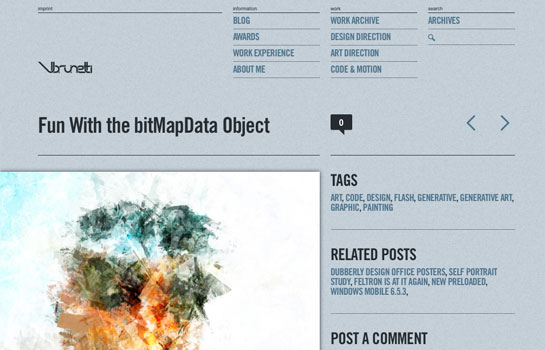
vbrunetti_2010_screengrab.jpg
Giving a linkup to my boy Victor’s impressive 2010 portfolio redesign. I first linked up to Victor’s site in 2007 while I was working at Schematic. Two weeks after my linkup, by sheer coincidence, he’s interviewing with my design team and gets hired. Fast forward 3 years and we’re good friends and working together at Roundarch.
So what’s so impressive about this redesign?
Well Vic has managed to tame the beast that is @font-face so you should see custom fonts throughout the site for all the headers, titles and global nav. Mind you it’s real HTML text, and it’s not being rendered with sIFR.
In addition, he’s unified his blog and portfolio on a custom install of WordPress. Sure, this trend might not be new, but he’s taken the time to treat every section of his site differently, in a way that’s appropriate for the content type so the only section that feels like a blog is the actual blog section. A lot of big agencies haven’t even gone that far with their own sites.
…and, he’s also working on some great generative art experiments in Flash.
Big ups.

Tags: