Visual Affordance

Earlier this year Matt Gemmell defended the flat, buttonless UI aesthetic of iOS 7:

The thing is, we’ve grown up. We don’t require hand-holding to tell us what to click or tap. Interactivity is a matter of invitation, and physical cues are only one specific type. iOS 7 is an iOS for a more mature consumer, who understands that digital surfaces are interactive, and who doesn’t want anything getting in the way of their content.
Nigel Warren calls bullshit:
I appreciate some of their other insights, but I call bullshit on this specific point. Who, exactly, has grown up? In the past 30 years of traditional desktop GUIs, no one questioned the need for basic visual cues to demonstrate interactivity. When it comes to smartphones specifically, billions of people around the world have never used one. To take an example of a particularly smartphone-happy country, almost half the population in the U.S. has yet to buy one.
I’m with Nigel.
The lack of visual affordance in iOS 7 is just one of a handful of problems I have with iOS 7 (Fitt’s Law, anyone?).

Categories:

Human Experience

Tags:

Less, More & Moore

John Maeda on making decisions in the post-Moore’s Law world:

But we are now starting to wake up and look at the “Or else!” list and realize it reads like a “Do I care?” list. Do I care if my iPhone has enough storage to hold every bit of data on my laptop that is already synced to the cloud? Do I care if my desktop computer is sufficiently powerful to edit a few hundred full-feature films at levels of cinematic quality? How much smoothie do I really want to ingest right now? Back in the day when we all felt like we needed more horsepower and storage to do all the wonderful things we dreamed of doing in the digitalverse, the answer was always, “Hll yeah! More please!” But now, like many other areas of our lives, the answer is, “Well … do I really need that?”
The tech press and analysts are perplexed Apple is able to sell 3-year-old iPhones. Sure the iPhone 5s is faster and has more features, but that doesn’t change the fact that the 4 still offers a great *experience
.
It’s similar to buying a new BMW versus one from 5 years ago. Move past the bells and whistles—what does it feel like when you’re driving it?

Categories:

Human Experience

Tags:

Sad Cushion

Great little essay on the value of Design by Mike Monteiro:

This is the value of good design. We understand it in common objects like chairs, clothes, shoes, watches. But when it comes to web sites, we tend to think of it as a surface layer that can be applied at the end. But in truth, design is happening from day one.
Related to the problem of people treating design as a veneer is mobile ‘app’ design. Those who don’t understand application and UI design think it’s just glossy buttons and drop shadows (or now, frosted glass and buttonless Helvetica Light buttons).
It’s just a 99ยข app, it doesn’t require a lot of thought, right?
Wrong.

Categories:

Human Experience

Tags:

Hollow Icons Are Still A Bad Idea

Dave Wiskus shares the methods to his madness for the note-taking app, Vesper.
First off, Dave and his team members put a lot of time and effort into their creation. That said, I still think the rationale behind icon outlines is bad:

At first glance, it looked as though the fashionable thing to do in iOS 7 would be to take your existing icons and just turn them into outlines. That ends up looking pretty good for most glyphs, but instead of mimicking the style we wanted to emulate the spirit. It’s not about being thin or wispy, I don’t think. It’s about lightening the UI so the content can stand out more.
His rationale sounds good, but he still implemented outlined icons:
vesper_icons_are_bad.png
I’m going to once again quote Aubrey Johnson’s observations on the cognitive issues with hollow icons I quoted back on October 2nd:
Take a look at the example above. The red lines indicate areas where cognitive load is occurring. Your brain traces the shapes on the first row an average of twice as much. Your eye scans the outside shape and then scans the inner line to determine if there is value in the “hollow” section.

Icons without this empty core are processed as definite and only the outer lines are processed. Depending on the outline of the shape, this happens pretty fast. No matter the shape, though, the hollow icons take more time to process.
If I may be a broken record,
Hollow icons are an example of form over function.

Categories:

Human Experience

Tags:

iOS 7 Doesn’t Have Icons, But Wireframes of Icons

Over at Campaign Monitor they’ve published an article on how to design iOS 7 style icons.
Bad idea.
Apple has introduced some great, new features in iOS 7—iconography and typography are not on the list (more on this in a forthcoming post).
Aubrey Johnson has an insightful post on the cognitive issue with hollow icons.

Take a look at the example above. The red lines indicate areas where cognitive load is occurring. Your brain traces the shapes on the first row an average of twice as much. Your eye scans the outside shape and then scans the inner line to determine if there is value in the “hollow” section.

Icons without this empty core are processed as definite and only the outer lines are processed. Depending on the outline of the shape, this happens pretty fast. No matter the shape, though, the hollow icons take more time to process.
I completely agree. Since I installed iOS 7 on my iPhone 5 a few weeks ago I’ve been thinking the icons aren’t icons so much as they’re wireframes of icons. This makes them hard to distinguish from each other (particularly in Mobile Safari).
In short, the iconography in iOS 7 is a perfect example of form over function.

Categories:

Human Experience

Tags:

Switch Gears, Samsung

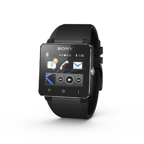
On September 4th, Samsung announced their smartwatch, Gear (It looks and sounds weird without “the Samsung” in front of it, right?).
What’s ironic about Samsung’s efforts to beat Apple to market with their own smartwatch is that in cobbling together a half-baked product with no clear purpose and problem to solve, they’ve set up Apple to look even better when Apple announces whatever it is they’re cooking up with the M7 chip.
Samsung is much more successful when they follow Apple’s lead, as they’ve done up until now.
Just check out these reviews below. Pretty harsh.
Gizmodo:

Ultimately, though, this feels like a beta product. Apps feel unfinished, gestures are finicky, and very little about the whole experience is fluid or easy. It often takes a lot of scrolling around to finally find the app you want, and even then it’s easy to accidentally back out of it because it mistook your tap for a swipe. It seems like Samsung just wanted to put some feelers out there and try to get some feedback from consumers, while charging them $300 for the honor.
The Verge:
A smartwatch the Galaxy Gear is not. Frankly, I’m not sure exactly what it’s supposed to be. Samsung describes it as a companion device, and the Gear is indeed chronically dependent on an umbilical link to another Samsung device, but it never left me feeling like it was a helpful companion. The notifications are Orwellian, the media controls are exiguous, and the app selection has no substance to underpin the hype. Samsung’s attempt to turn the Gear into a style icon is also unlikely to succeed, owing to the company’s indecision about its target demographic. Trying to please all tastes has resulted in a predictably charmless and soulless product.
BGR:
Wearables may or may not be the future of computing, but the Galaxy Gear makes envisioning that future very difficult.

Samsung is pitching the Gear as a smartphone companion device that is designed to make your life easier. It does not. In some cases the Gear adds conveniences to the mobile experience but they are minor at best and they come at too great a price: Another device to charge each day, an awful experience where voice controls are concerned, and a constant uncomfortable feeling shared by the user and those around him or her.
Engadget:
The Gear isn’t bad for a first-generation Samsung product, and it’ll get better as the ecosystem grows. Of course, that’s if the watch catches on and developers decide it’s worth their time to produce a special app for it. Of any Android manufacturer, Samsung stands the best chance of gaining support. If it doesn’t succeed, however, the $300 retail price will be even harder to swallow than it currently is, and no assortment of hot colors will change the fact that it’s little more than a glorified time-telling device.

Categories:

Human Experience

Tags:

A Zero-Button Mouse

John Carmack from ID Software shares his thoughts on the new Kinect for XBox One at Quakecon, calling it, “A zero-button mouse with a lot of latency on it.”
As someone who’s currently working on an application for XBox One, I’ve seen the v2 Kinect firsthand, and that’s a spot-on analogy.
Kinect, at least in it’s current form, is still half-baked.
It’s also tiring and not gratifying to stand around and wave your hands with no haptic feedback. Kinect is one of those technologies that seems awesome in concept and in movies like Minority Report.
The reality is something different.

Categories:

Human Experience

Tags:

Long Shadows

You know, like, flat design is out, and like skeuomorphism is out-out.
Long shadows are the new coolness in flat depth.
Update your Dribbble pages, kids.
Or something.

Categories:

Human Experience

Tags: