A Car Can’t Be A Motorcycle
Stephen Hackett was nice enough to post some reviews of the Microsoft Surface Pro from across the tech press.
Let’s be clear, these reviews aren’t just from Apple users.
No, even guys at PCWorld don’t like it:
The bad news: Surface Pro doesn’t run away with the Windows 8 hybrid crown. And based on your needs, it might not be the best Windows 8 portable you can buy in the neighborhood of $1000. This is a problem because Surface Pro needs to stand out as a kick-ass reference design, and not be just another interesting-but-imperfect hardware option for anyone taking the Windows 8 plunge.
Microsoft is Microsoft, damn it! It owns Windows. Its war chest is huge. If it can’t conceive, manufacture, and market the hands-down best Windows 8 hybrid in the world, it’s got unfinished business.
In trying to be everything to everyone with their “No Compromises” philosophy they’ve failed. This is unfortunate because Windows 8 really had a chance to be kick-ass. Instead, Microsoft chose to advertise the shit out of the fact that their tablets have magnetic keyboards.
I have a news alert: a keyboard is the first thing a lot of iPad owners buy (and there’s some good ones out there). Microsoft thinks their Touch Covers are giving them an edge, but they’re really only giving them parity, if that.
So what’s so wrong with Microsoft Surface and Windows 8?
Let me count the ways:
- [Regular?] Surface tablets run Windows RT and Surface Pro tablets run Windows 8, and neither are compatible with each other.
- Surface and Surface Pro tablets look and feel almost identical further confusing regular, non-nerdy people.
- Microsoft took away the Start Menu
- It’s hard to differentiate labels from buttons
- A Surface Pro with an advertised storage capacity of 64 gigs has only 23 gigs of actual, usable space. Yeah, try explaining that one to mom.
You can’t chop 2 wheels off an automobile and expect it to ride like a motorcycle. In essence, this is what Microsoft tried to do.
No More Harmony
Logitech to sell Harmony remote division after ‘unacceptable’ Q3 results
This is unfortunate.
I’ve been meaning to write a review of the Harmony One remote. It’s the best universal remote I’ve ever owned (going on 2 years now).
The web application interface is not the greatest, but the macros you can program with it are awesome (turn on TV, select HDMI 1, turn on cable box, set channel to 400). It’s particularly helpful when guests are over. There’s no figuring out 10 remotes, there’s 3 macros I’ve programmed on the remote: Watch Cable, Watch Apple TV, Play Video Games. Tap one of those 3 on-screen options and the remote does the rest. Done.
The other, more subtle quality I love about the Harmony One is that despite being a universal remote with dozens of buttons on it, the remote is molded in such a way that without looking at it, you know exactly what button your finger is on.
This sounds silly, but it’s something you can only appreciate when it’s in your hand. You’d be surprised how many remotes fail to physically differentiate buttons.
All this being said, Logitech does charge a premium for these remotes, so I can understand the poor Q3 results.
Responsive Exhaust
Over the last few days I’ve been updating the pages of this site to be responsive. Whether you’re viewing it on a laptop, tablet or smartphone, the text and images should adjust in scale for optimal reading.
The starting point for the design was taken from 37Signals recently redesigned company blog(embrace the remix). I feel the same way the guys at 37Signals do in regards to priorities with Daily Exhaust. I want the reading experience to be great and I’ve always had problems with sidebar columns on sites. Sidebars are usually good for the first 600-700 pixels down the page, but after that, all you have is a big, empty gap next to posts. It’s always driven me nuts.
It’s been a while since I’ve messed with HTML and CSS so it’s taking me some time to understand exactly how all the code works, but I’m getting there. The layout will continue to evolve over the next month. At this point I’ve only been able to tackle the landing page and individual entry pages. There’s still a lot of work to be done.
So if you’re reading this from the RSS feed, I invite you to check it out in a browser.
Know The Rules, Then Break Them
TheNextWeb: Google Finds Its Design Voice On iOS:
The string of well designed, if not exactly perfect, app updates continued. In no particular order, YouTube, Chrome, Google Search, YouTube Capture and of course, Google Maps all displayed a much surer design hand on Apple’s platform. They obeyed the right conventions for things like the back button and the bottom-oriented navigation bar, but they maintained a sense of what Google has been about from the beginning.
Because Apple established strong human interface guidelines*, Google knows where to break them to make apps that feel both at home on iOS and ‘Google-y’. Once you know the guidelines, you can break them.
When you have no design guidelines you have no foil act against. This is why it’s taken Android’s UI design so long to evolve. While far from perfect, Apple App Store Rules and Human Interface Guidelines have made developers a ton of money and created thousands of well-designed mobile applications. Android can be as open as the ocean but restrictions can be a good thing too.
*Notice how Apple refers to them as guidelines, not rules. You get in trouble for breaking rules, whereas guidelines are just, guidelines.
And seriously, if you haven’t read through the HIG yet, do it. You’ll see there’s a method to Apple’s madness. It’s not all bevels and drop shadows.
Notifications
Speaking of Notification Center in iOS, Alex Saretzky has some interesting ideas. The point isn’t if they’re perfect. The point is to at least start thinking about how Notification Center can be improved. And it can be.
You can’t know if an idea is good or shitty until you execute it, so points to Saretzky for walking the talk.
via The Loop
Keeping Up With The Kids
I think it’s funny and amazing to see Facebook’s new Poke app tanking in popularity in the Apple’s App Store.
At the tender age of 28, Mark Zuckerberg is already finding himself keeping up with what’s popular with the kids. Not too long ago, he was one of those kids, coding up thefacebook in his dorm room.
Moves like this and Twitter’s decision to make itself look more like Instagram with the inclusion of image filters just make both companies look dumb and out-of-touch.
Feature parity can been really boring and pointless without strategic thinking behind it.
Apple copied Android’s pull-down notifications when they launched Notification Center in iOS 5 in 2011. This is an example of gaining feature parity and giving people something that improved the overall experience of using an iPhone or an iPad.
You always have to ask yourself why you’re doing something. It doesn’t matter if it’s adding new features to your mobile app or buying a new pair of jeans. If you don’t truly believe in the decisions you make, you have no reason to follow through with them.
Saying, “I’m doing this because [fill in person or company name] is doing it.” isn’t enough.
Snow Fall
Pretty amazing piece over on the NYTimes.com called Snow Fall.
I have Flash disabled on my machine but they’re using some beautiful, fullscreen animated GIF loops for motion.
Pinch To Zoom
U.S. patent authorities rejected Apple Inc’s key “pinch-to-zoom” patent in an initial ruling, the second setback in less than two months for the iPhone maker in its patent battle with Samsung Electronics Co Ltd.
This rejection is good for everyone. Apple shouldn’t be the only company able to use pinch-to-zoom on mobile devices. They definitely didn’t invent it (that link is a TED Talk by Jeff Han from 2006, one year before the iPhone debuted.).
Also—it’s not “pinch-to-zoom”. It’s pinch-to-zoom-out and spread-to-zoom-in. That drives me insane.
Greatest Mess
Dear iTunes—
Just because I have multiple albums in my library titled “Greatest Hits” does not mean they are all part of the same album.
Fix that shit.
Thanks,
Mike
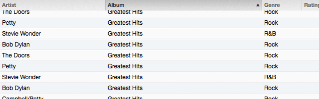
Update: Sorry iTunes, it seems with another click of the “Albums” column and I can organize by “Album by Artist” and Album by Artist/Year”.
Sorry about that.

iPhone, Landscape Orientation
Realization: After using an iPhone for ~4 years, I find the ability to work, particularly type, in landscape mode more and more insignificant.
Playing games and shooting photos are a different story.
Improvements
Jesus Diaz on the new Google Maps app for iOS:
After some intensive testing since its yesternight release, there’s no doubt about it: Google Maps for iOS is, hands down, the best maps application, perhaps on any platform. So good, so fast, and so clean. There’s really no contest. They nailed it, and shamed Apple in the process.
It’s not the snarky tone that bothers be. You can dig up a whole bunch of my pro-Apple snark on this site. What strikes me is the irony of the snark used by Jesus.
Let’s be clear what just happened—Google delivered a best-of-breed maps app for iOS. It features more accurate map data, Street View (oh how I missed you, Street View) and turn-by-turn directions (which I still can’t get on my iPhone 4 running iOS 6). In building their Maps app, Google has improved the overall experience of iOS and made a lot of people happy.
Google has also lit a much-needed fire under Apple’s ass to improve their own Maps app. Forget what Tim Cook says about, “If you think what are customers’ expectations are high, you should see our own internal expectations…” Yes, we know Apple expects the best, but there’s nothing like another car in the race to make things interesting.
So did Google just school Apple? Oh snap, oh no they di-int!!! Did Apple just get directions on where to get its ass handed to them?
Hell yeah they did, and I got a better iPhone for it.
What an iPad Isn’t
More and more people are choosing to use iPads instead of “PCs” because of shit like this.
When’s the last time your iPad had to do an ‘Automatic Repair’?
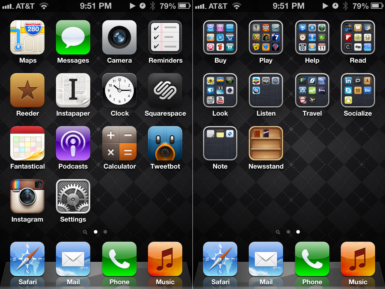
iPhone Home Screen Organization
There’s many places in my life where I need more organization. My desk. My closet. The stacks of books accumulating in my office.
The opposite is true for my computers (read: MacBook, iPad, iPhone).
My digital life wasn’t always organized, but now I border on obsessive-compulsive. When I see people’s iPhones scattered with banks and banks of unordered app icons I start to twitch. It takes all my mental strength to not grab their phone from them and organize their icons. “It’s for your own good!”
Last night I reorganized my own iPhone. The first home screen contains only apps I use on a daily basis. My essential apps. The second bank of apps are folders of apps labels with verbs indicating the action applied to those apps: Buy, Play, Help, Read, Look, Listen, Travel, Socialize, Note (and Newsstand).
Update: Hat tip to Shawn Blanc for the slick, subtle wallpapers of Marcelo Marfil.