The HP TouchPad

I’m not going to write an enormous review of the TouchPad, A good handful of reviews have been written already, covering all the bases. What I do want to do is briefly give give a short list of observations.
Please take into account this is coming from someone who’s owned multiple iPhones for 3 years and an iPad for about 9 months:
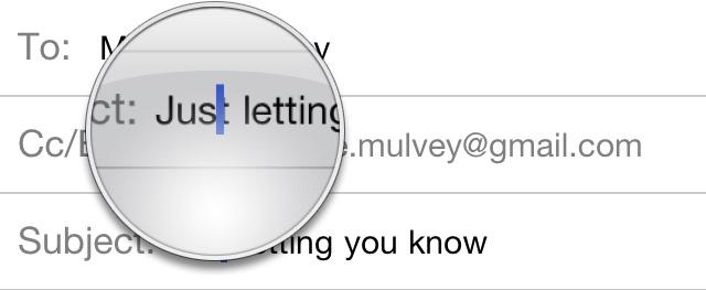
No magnifying glass when tap-holding on input/text fields
You don’t appreciate something until it’s gone. While I probably only use this feature a fraction of the time I spend on my iPad, not having it, or something like it on the TouchPad feels like a major tool in my tool belt is missing. It makes editing URLs, email or notes extremely difficult.
(below is a screen grab from my iPhone)
iOS_mag_glass.jpg
No temporary scroll-location bar when scrolling
On iOS, when you flick to scroll page, a temporary scrollbar appears on the right side of the screen, letting you know how far down the page you are. On the TouchPad I’ve found no scroll bar in any of the core applications (Internet, Mail, Messages, Photos, Calendar). It’s not a deal-breaker by any means, but it’s another detail missing.
UPDATE: I discovered the Instapaper app, Paper Maché, does have an iOS-like scroll bar. I’m willing to bet it’s creator, Ryan Watkins, knows a thing or two about iOS.
No jumping to the top of a page by tapping the time/status bar
I’ve come to rely on this a lot on iOS, and like the magnifying glass, it’s something I didn’t realize was so important until I found it missing on the TouchPad.
Overrides fonts on websites and emails with webOS system font (Avenir)
This is obviously a gripe from a designer and won’t bother the average user, but holy shit this pisses me off. Why should I even bother with my style sheets if webOS is going Avenir-ize all content?
HP_TouchPad_does_not_acknowledge_style_sheets.jpg
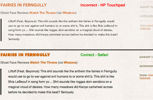
Can’t render my unicode ‘exhaust’ puff (it’s fucking UNICODE)
While I’m on designer gripes, why can’t webOS render Unicode characters? Visiting Alan Wood’s great Unicode resource site shows the TouchPad has some serious holes in it’s character rendering.
HP_TouchPad_does_not_render_UNICODE_characters.jpg
Overall choppy feeling to the OS, as if it’s underpowered
Lastly, the whole operating system has a choppiness to it. Web pages don’t scroll nearly as smoothly as they do on an iPad (hell, even a first generation iPhone). I also find myself waiting for things to load, even simple things like a new email message window.
I was really planning on liking the TouchPad. They’ve done some nice work but the nice work is overshadowed by all the details they missed. They’ve clearly copied many of the conventions Apple introduced, but I wonder why they didn’t adopt all of them, like the tap-the-header gesture to return to the top of a page, or the magnifying glass?

Categories:

Human Experience

Tags:

Bad Restaurant Sites

Slate asks. Why are restaurant websites so horrifically bad?

While lots of people have noted the general terribleness of restaurant sites, I haven’t ever seen an explanation for why this industry’s online presence is so singularly bruising. The rest of the Web long ago did away with auto-playing music, Flash buttons and menus, and elaborate intro pages, but restaurant sites seem stuck in 1999. The problem is getting worse in the age of the mobile Web–Flash doesn’t work on Apple’s devices, and while some of these sites do load on non-Apple smartphones, they take forever to do so, and their finicky navigation makes them impossible to use.

I’ve also pondered this for years.

Categories:

Human Experience

Tags:

Golden Rules

Shneiderman’s Eight Golden Rules of Interface Design:

1. Strive for consistency.

2. Enable frequent users to use shortcuts.

3. Offer informative feedback.

4. Design dialog to yield closure.

5. Offer simple error handling.

6. Permit easy reversal of actions.

7. Support internal locus of control.

8. Reduce short-term memory load.

Categories:

Human Experience

Tags:

Oops

Electronista: Acer stalls 7-inch tablet after realizing UI is too small

Acer’s decision to delay the Iconia Tab A100 may have come from learning a hard lesson from Apple, sources hinted Wednesday. The tablet was moving from its June target to either August or September as Acer had discovered that Android 3, an OS designed primarily for 10-inch tablets, wasn’t working properly on a seven-inch design. With many apps not working properly, Acer was waiting in the hopes Google will have solved the problems later, Digitimes heard.

As my father and John Gruber like to say, measure twice, cut once.

Categories:

Human Experience

Tags:

Categories:

Human Experience

Tags:

So much design, so little function.

Michael Wolff wrote a great piece on the sad state of publishing on tablets (read: the iPad).
Here’s a few choice nuggets I loved:

But, back to Rupert. The Daily is a pure I-don’t-get-it-but-I’ll-be-damned-if-that-stops-me play (and who can stop me, anyway?). It was conceived by Murdoch himself, willed into being by Murdoch, and executed by him. A man who has an absolute belief in the medium of newspapers and almost no firsthand experience or interest in digital media–save for having sometimes to awkwardly pose next to a computer to suggest he might use one, although he doesn’t–decided to address the problem of old ways and new technology with the greatest certainty and resolve. The Daily is the result–a hopeless misreading of the form.

And:

There’s a loud, jarring, jumpy, desperate, look-at-me sense of tablet publishing–it tries too hard. It’s not just that tablet design invites people to look over your shoulder and enter your space–but it makes the reader self-conscious too. So much design, so little function. So much brand, so little purpose. Vulgar.

via FishbowlNY

Categories:

Human Experience

Tags:

Drudge

Forbes magazine on Pew Research Center’s new study on where big news sites get their traffic from.
Turns out The Drudge Report kicks some ass:

Facebook figures larger in the mix, driving anywhere from 1 percent (AOL News, MSNBC.com) to 7 or 8 percent (CNN, ABC News and, leading the pack, the Huffington Post). But if what you want is a real firehose of visitors, no newfangled social network can compete with the Drudge Report. The 15-year-old aggregator of links was responsible for between 5 and 10 percent of the traffic to the New York Times and USA Today during the period studied. It accounted for 15 percent of the traffic to the Washington Post, 20 percent to the New York Post and an astonishing 30 percent to the Daily Mail.

Remember too, the site is only one page.
Maybe Jason Fried over at 37Signals was right when he declared in 2008 that The Drudge Report was one of the best designed sites on the web.
via FishbowlNY

Categories:

Human Experience

Tags:

Annoying Alerts

Nick Fletcher on the flaw in iOS’ Notification System:

Quite simply, the modal alerts that iOS currently uses are broken not because tech bloggers everywhere are struggling with notifications all the time, but because the iOS system fails to account for the contextual areas in which showing a notification is actually impeding your use of the device. For example: when you’re on the phone and an SMS comes in. I’ve never once been on a phonecall where, after concluding the call, knowing I got an SMS from my fiancée was more important than hanging up the call.

I’m looking forward to the next version of iOS where this is fixed. I know it’s something Apple is aware of and has every intention of fixing, but make no mistake, it’s a BIG fix. I would say it’s on par with copy-and-paste because it’s a core feature effecting every part of the operating system.
And like copy-and-paste, Apple is going to take it’s time to make sure the solution release is thought out, elegant and easy to use.

Categories:

Human Experience

Tags:

3D is not the future

Ben “Yahtzee” Croshaw on the the future of gaming consoles and the false promise from 3D:

3D is not the future. It’s not “immersive.” At best it makes everything look like a six-inch paper cut-out, and in order to create that effect it has to reduce the quality of the image. After years and years of the entertainment industry working towards making bigger and crisper images, suddenly they’re trying to make us forget about all that because, holy shit, a thing looks like it’s in front of another thing because of an exploitable quirk in binocular vision. Well, they can’t do it. You either need glasses or you need to keep your head still at all times, and no new technology has ever lasted that’s less convenient to use than what it’s supposed to replace.

Categories:

Human Experience

Tags:

Research In Motion, In Perspective

I’ve read articles in the tech news about RIM has a long history of creating great business software and devices – specifically the famous Blackberry messaging devices and smartphones.
The thing is, these last few years for RIM haven’t been good and they’ve just slashed their outlook for Q1 2011.
I’m not sure why RIM doing poorly should be the slightest bit surprising. From a user interface perspective there hasn’t been any breakthoughs. I’ve used my wife’s Blackberry enough to know how stiff and devoid elegance it really is. Yes, the home screen has some unique iconography, but once you get into the email program – the Blackberry’s bread and butter – it’s like taking a time warp back to the 90’s.
Just to put it in perspective, when RIM was winning, this was the smartphone competition:
Palm-Treo-600.jpg
Just sayin’.

Categories:

Human Experience

Tags:

The iPhone Tab Bar

Some good advice over at significantpixels on designing for the iPhone’s tab bar.

Over the last couple of years, the iPhone has greatly popularized the tab bar navigational model for mobile handsets. Apple has put together a design rationale for the tab bar in their Human Interface Guidelines (HIG) along with lots and lots of other information — they do however leave some question unanswered. Having worked with interaction and graphical design for iPhone applications during the last couple of years I’ve managed to pick up some lessons the hard way, and in this post I would like to share my thoughts on a couple of do’s and don’ts.

Some obvious points in the post, but good advice usually is obvious.

Categories:

Human Experience

Tags:

Easy As Pie

Categories:

Human Experience

Tags:

Why We Need Storytellers

UX Magazine: Why We Need Storytellers at the Heart of Product Development

This question reflects a painful problem that is common at both small startups and large corporate organizations. Far too often, teams focus on execution before defining the product opportunity and unique value proposition. The result is a familiar set of symptoms including scope creep, missed deadlines, overspent budgets, frustrated teams and, ultimately, confused users. The root cause of these symptoms is the fact that execution focuses on the how and what of a product. But in a world where consumers are inundated with choices, products that want to be noticed and adopted must be rooted in the why.

One of the most obvious places lacking the why is technology products. How often to do we read articles about a company “prepariing a new Product X to fend off Apple’s Product Y”?
So what it really comes down to many times is the why is focused on affecting competition when it should be focused on providing value to the consumer.
Thanks Jory

Categories:

Human Experience

Tags: