Eli Schiff has an interesting multi-part series on the “Fall of the Designer”.
Here’s a bit from Part 3, Conformist Responsive Design and the shift away from shiny, roundy, textural UI elements and towards ‘flat’ design:
Similar to web design, application design is becoming homogenized. Where before, apps like Tapbots’ Tweetbot were worlds unto themselves, with robotic sounds and futuristic cartoon aesthetics, today the only remnant of that past is robotic sound effects, devoid of any rationale as to why they sound the way they do.
Paul Haddad of Tapbots seemed to laud the shift, explaining in 2013 that he and his team “talked about making the Mac version a little bit more…plain” too. This hesitation might have invited our skepticism about their approval of flat design. But in the following years, Tapbots announced proudly their newly flattened Tweetbot 2.0 for OS X.
Tapbots is not alone in castrating Calcbot and their Twitter client Tweetbot. The Iconfactory’s Twitteriffic and Twitter’s proprietary iOS app in earlier days all attracted dedicated followings based on expressive designs which each exposed unique feature sets. But with their new flat interfaces, they struggle to differentiate their brands. Even with custom glyphs, animation and functionality, at a 10 foot view, it is difficult to tell one of these flat UIs from the next.
Did these developers suddenly have an epiphany and conclude that their former designs were ugly and overwrought? Or was it instead an imposed, though convenient, ideological shift by operating system designers?
I respect the time and thought Schiff has put into this series on design, and I think the answer to this last question is simple: fashion. UI design, like clothing, goes through different different phases and trends. Thats’ really it.
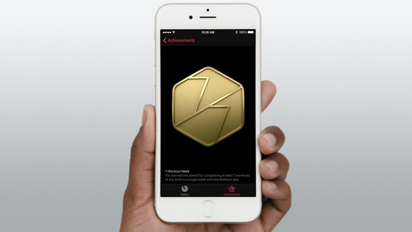
If you’re afraid skeuomorphism is gone forever, fret not. All you need to do is look at the achievement badges in the new Apple Watch exercise app:
There are gaudy ways of using depth and shading in UI design and there are tasteful ways of using depth and shading just like there tasteful and gaudy ways of using chrome and paint on a car.
I think what we’re seeing, as Schiff has pointed out is not so much flat design as lazy, flat design.