Windows Phone Wireframes 7

wp7_3_screenshots.jpg
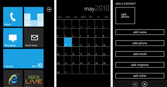
So last week, Paul Thurrott posted ‘near-final’ screenshots of Windows Phone 7.
I have the same opinion now, as I did last month when I posted and reacted to Edward Tufte’s thoughts on the mobile interface design.
They’re still just wireframes.
Jack Moffett astutely observed, “There isn’t enough variation between what is tappable and what isn’t.”
Just to be clear, this isn’t me wanting or expecting the WP7 interface to be shiny and polished like iPhone interface. There’s many ways to design a GUI, and these just don’t look designed. At all.
It’s impossible to ignore what you’ve seen from your competition, but I’m hoping that the Windows Phone 7 team didn’t deliberately rage against the machine and decide to reject all implied dimensionality within the WP7 interface. If you want things to look clickable, you need to make them look, um, clickable. This doesn’t mean you need to use bevels, gradients, reflections and gloss. A lot can be achieved using just one of those effects.
A minimalist interface would be amazing, but WP7 isn’t minimalist, it’s empty.
Which brings me to my next point about WP7. In an interview with Steve Jobs back in the 80’s, he comments that “… they [Microsoft] don’t think of original ideas and they don’t bring much culture to their products …”
When first watched the interview, I understood what he said in theory, but it wasn’t until I saw the WP7 screens that I truly ‘got’ what Jobs was saying. The WP7 interface is completely uninspired and has a complete lack of culture.
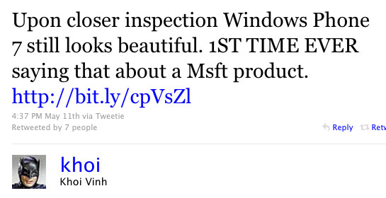
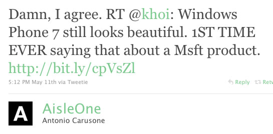
Given WP7’s lack of real design, I was shocked at tweets from Khoi Vinh and AisleOne:
khoi_tweet_wp7.jpg
aisleone_tweet_wp7.jpg
I’m waiting for another company to give Apple some real competition to the iPhone. I love Apple products, but Apple needs competition and there’s so much more room to innovate with the mobile space.
Let’s not get excited over wireframes posing as finished designs.

Tags:

Garbage Kin

Gizmodo reviews Microsoft’s new mobile phones for hipsters:

It’s smart for a company to control its focus in designing a device, and that’s what Microsoft has done here. Messaging and social media are the Kin. But that doesn’t mean it shouldn’t come with a mapping application (there isn’t a native one, despite the presence of a GPS receiver.) It doesn’t mean that the browser shouldn’t have tabs, or a rendering engine that isn’t excruciatingly slow. It doesn’t mean that there should be no way to watch any web video of any kind, or that the phone should be arbitrarily tied to Microsoft’s Bing search service. It’s no excuse for excluding any kind of calendar.

Kids don’t do maps and browsers and shit like that, yo! They’re all up in all those social networks, hundreds of them! (read: Twitter and Facebook)
And regarding no calendar, I like this one from the comments:
“I can understand the lack of a calendar. Have you ever seen a hipster in a hurry? They don’t have appointments.”

Categories:

Image, Technology

Tags:

Android is best without Bumps

VentureBeat: Google acquires BumpTop: Will Android get a 3D facelift?:

What’s Google going to do with BumpTop? The search giant hasn’t said anything about the deal yet, either on the main Google blog or in response to VentureBeat’s email requesting comment. The most likely area seems to be its Android operating system for smartphones and (eventually) other devices, such as tablet computers. Some of these ideas and technologies might give the Android interface a leg up over Apple’s iPad and iPhone. Google is also developing the Chrome operating system for netbooks, but BumpTop seems less relevant there, since the Chrome OS is all about the web browser.

I reacted to BumpTop in ‘07 and ‘09 and now that Google has bought them, I’ll respond again.
First off, I still feel the same way now as I did in my last two posts on BumpTop. In short, I still feel they’ve taken the desktop metaphor too much in the direction of a real-life desktop as to render it useless. It suffers from not enough abstraction.
To err is human, and it’s the computer’s responsibility to reduce human err[or]s.
John Gruber made a great analogy:

Used to be that to drive a car, you, the driver, needed to operate a clutch pedal and gear shifter and manually change gears for the transmission as you accelerated and decelerated. Then came the automatic transmission. With an automatic, the transmission is entirely abstracted away. The clutch is gone. To go faster, you just press harder on the gas pedal.

and:

That’s where Apple is taking computing. A car with an automatic transmission still shifts gears; the driver just doesn’t need to know about it. A computer running iPhone OS still has a hierarchical file system; the user just never sees it.

In addition to a lack of abstraction, the desktop metaphor doesn’t have any relevancy in the mobile space. The desktop metaphor bridged the gap between the pre- and post-computers worlds when Xerox debuted their Star workstation in 1981. Apple would subsequently co-opt that idea and build on it with their operating system for the Lisa.
We still have folders, files and and trash icons in the mobile space but we’re entering a world where what you call the space where all these icons live matters less and less. The iPhone has “home screens” and the upcoming Windows Phone 7 and Palm webOS both use “tiles”.
Unless Google makes significant changes and simplications to BumpTop I see it’s implementation in Chrome OS and/or Android and a FAIL from the start.

Tags:

hypnotizing chickens

Great cover story at the NYT on Powerpoint:

Gen. Stanley A. McChrystal, the leader of American and NATO forces in Afghanistan, was shown a PowerPoint slide in Kabul last summer that was meant to portray the complexity of American military strategy, but looked more like a bowl of spaghetti. …“When we understand that slide, we’ll have won the war,” General McChrystal dryly remarked, one of his advisers recalled, as the room erupted in laughter.

Reminds me of a great essay by Edward Tufte I bought a few years back on the topic of how shitty Powerpoint is:

Alas, slideware often reduces the analytical quality of presentations. In particular, the popular PowerPoint templates (ready-made designs) usually weaken verbal and spatial reasoning, and almost always corrupt statistical analysis. What is the problem with PowerPoint? And how can we improve our presentations?
UPDATE: Tufte on the topic of his Powerpoint essay (Wired.com, Sept 2003)

Categories:

Career, Education

Tags: