That’s The Ticket
Some quick thoughts on the new Podcasts App for iPhone:
It’s extremely laggy on my iPhone 4. Sometimes when I click to download an episode from list within a podcast the app becomes unresponsive for over more than 5 seconds. For instance, when I’m in a list of episodes within a podcast, the list won’t scroll when I flick, and when I tap the ‘Podcasts’ or ‘Library’ button in the top left corner to go back to the previous list, it also won’t acknowledge my taps. I have to hit the Home button, and relaunch the app, at which point the app reflects whatever tap sequence I tried while it was frozen.
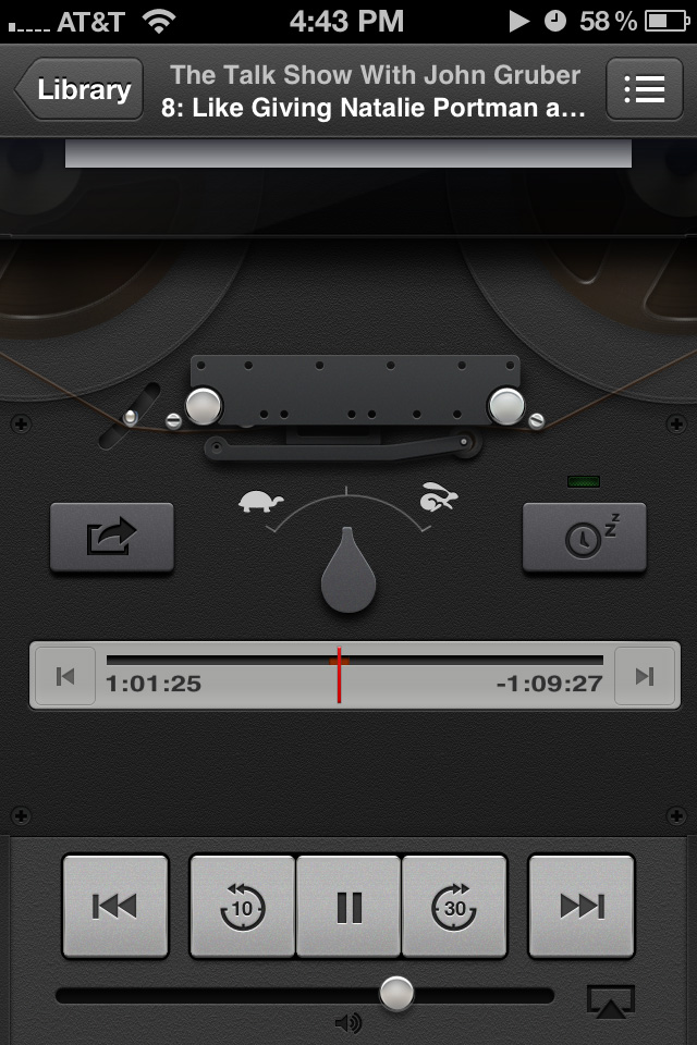
While the reel-to-reel is unnecessary, it doesn’t get in the way for me. I see it as designers at Apple having fun, and it’s clear a lot of work went into all the little details — watch the rocker arm wiggle when you hit the pause button.
The scrubber bar. What’s the deal with the needle thin red line you have to scrub the track with? Not only is it hard to see where you’re dragging, but it’s also another area with choppy responsiveness.

Elapsed/Remaining time labels – why is the type distorted? Look at the image above, It’s smushed. Nasty looking.
Radio dial interface for Top Stations. Again, I don’t mind the skeuomorphic dial they use, what I mind is how chuggy it is.
Update: While scrolling through Top Stations, the app froze, so I hit Home, but on every subsequent relaunch the app quit after a few seconds. The only way I could fix it was to delete the app and re-download it from the App Store. I like having a separate application for my podcasts. It’s particularly helpful when I’ve been listening to my music library on shuffle and then I decide to listen to a podcast.
Before, the Music app controlled playback of both music and podcasts, so there was no way for me to continue where I left off in my music shuffle playback. Now with two discreet apps, I can pick up where I left off on both music and podcasts.
Apple just really needs to resolve the performance issues in this app. I would like to think an application for audio download and playback doesn’t require a lot of processor power and/or system resources.
From The Big Think, Henry Rollins recounts the one decision that changed his life forever.
via Open Culture

UPDATE: I incorrectly attributed Harry McCracken as being against the idea of the iPad as a content creation device. I meant Richard Gaywood.
Harry McCrackenRichard Gaywood still thinks content creation on the iPad is a silly idea (via DF).
Apparently he hasn’t talked to David Hockney.
How many logos have been set in the Gotham typeface? Enough to start a Tumblr with, that’s how much.
I’M COMIC SANS, ASSHOLE. Another classic from McSweeney’s.

Words of wisdom from Jory.
Horace Dediu puts the spotlight on the crazy way Steve Ballmer speaks. One of the first signs of bullshit is when someone can’t talk in plain English.
He reminds me of this chick.
Ars Technica’s headline says, “Google’s Nexus 7 is a fantastic $200 tablet”
Why the need for the qualifier ‘$200’? Why can’t it not be just a great tablet?
Back on 5 June, Verge posted a story by Chris Ziegler on the inside story of the death of Palm and webOS. It’s fascinating to read about how closely designers and engineers at Apple, Palm and HP are connected.
In light of Microsoft’s Surface Keynote on the 18th of June, this passage caught my eye:
The demos at CES weren’t faked, but large swaths of critical functionality were still missing under the covers. “The emperor had no clothes,” one source told us. Even though Palm had left webOS’s Prima underpinnings in place to save time and effort, there was still a tremendous amount of work to do in order to get the Pre ready to ship, and everyone inside the company knew it. Palm made the controversial decision to prevent any members of the media from touching the phone after CES prior to launch, a move that raised eyebrows and led many to start asking questions about the company’s readiness.
You could easily replace ‘Palm’ and ‘webOS’ in the quote above with ‘Microsoft’ and ‘Windows 8.’ Danny Sullivan at Marketing Land wrote a great piece on the whole hands off aspect of Microsoft’s event too.
Now Microsoft and Palm are two very different companies so the death of one does not mean the death of the other is inevitable. The important take-away from this story is despite the hard work and creativity of talented people, your product can still come up a day late and a dollar short. Microsoft is up against the same Apple snowball Palm/HP was up against, except now that snowball is farther down the hill and it’s much much bigger.
Here’s another metaphor to throw into the mix: Apple has had 5 years to get up to the speed with iOS and the iPhone and the iPad. Apple didn’t have everything at launch in 2007 (like no GPS, no 3G, no video calls, poor camera, no multi-tasking, no third party applications …), but, as John Gruber wrote in Macworld, they kept iterating and iterating and iterating, cause that’s how Apple rolls down the consumer electronics highway. When you looked at them last, they were doing 60 mph in the slow lane, but now they’re way ahead of you, doing 110 mph in the fast lane.
So Microsoft has to sell something great this fall. Doing the speed limit ain’t going to cut it. They need to drop it into 4th gear and slam the accelerator when they hit the highway on-ramp and at least keep up with Apple. In truth though, they really need some hidden NO2 tanks in trunk.
Matt Bucanan wrote a review of the HP TouchPad and these were his final words:
You’re stepping on my dreams, HP. The TouchPad is so close, closer than anything else, to being good. But it’s also very, very far from it.
Microsoft is dangerously close to getting an identical product review with their Surface tablet. They best be sure it’s fully baked.
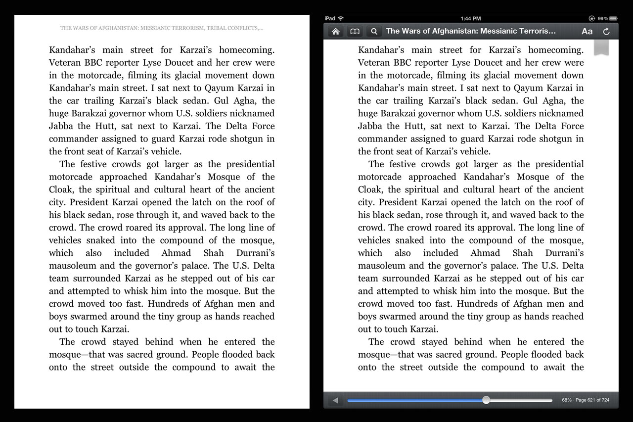
After howls of protest in the app store from users, Amazon walked back some of the changes it made to Kindle for iPad. Seen above are screenshots from an update Amazon released to the app store last week. The margins surrounding the text that had been eviscerated in the name of readability have been somewhat restored. However, the new, intrusive toolbar interface remains. The user reviews that the previous update had gotten are doubtless behind the changes, showing that companies do indeed respond to heavily negative feedback from customers.
In reading those customer reviews, there is nary a review that praised the narrow margins of last month’s update. So Amazon changed it. But there were also hardly any reviews that were critical of the toolbar, so Amazon left it as is. Make no mistake, the current toolbar is a downgrade compared to the previous iteration, but it was saved because the new margins were so atrocious that users completely missed the toolbar. Mediocrity is invisible when it stands next to hideousness. Next, Amazon is going to have to figure out how to keep the app from crashing.