Reconfigurable
Interesting, the new Cadillac STX will have a reconfigurable gauge cluster.
via CarScoop
Interesting, the new Cadillac STX will have a reconfigurable gauge cluster.
via CarScoop
Over at Macworld, John Moltz gives his non-objective review of Windows 8:
This is the pig of Windows 8 that resists any attempts at applying all forms of lipstick. There’s simply no getting around the fact that this is a confusing dichotomy. Additionally, Windows on ARM–now saddled with the mock-worthy name “Windows RT” for “Run Time”, which has so much meaning to consumers–won’t run traditional desktop applications other than a core set provided by Microsoft. (Please refer to the matrix, thank you for calling.)
So, Microsoft’s big hope for getting into the tablet space is an operating system with an attractive but flawed front end that’s incongruously tied to a legacy desktop, and will require different versions of applications depending on which hardware you have.
What could go wrong?
To give them a bigger metaphor than they deserve, Microsoft has built a brand new Ferrari and dropped an 8-track tape in the dash and some seats from an ’86 Ford Taurus.
via Minimal Mac
Based on my site stats, there looks to be a good chunk of people who read Daily Exhaust via RSS.
While I am also an avid RSS Reader reader (huh?) and have no intention of changing your reading habits, I encourage you to take a peek at the design changes I’ve made to the site.
In short? Cleaner layout. Less clutter. Bigger type for easier reading – particularly on tablets and phones.
My sketches for this redesign have been in the works for a while, and coincide with Jeffrey Zeldman’s great Web Design Manifesto 2012 he posted the other day.
Abdel Ibrahim reviews the HTC One X for The TechBlock:
When it comes to Android, though, my second in-depth experience wasn’t any less jarring than the first. Despite my time in the trenches with ICS on the Galaxy Nexus, HTC has slapped on so much paint with Sense that I often struggled to find my way. And what I recognized I still didn’t like. Granted, I cut my teeth on iOS devices, which pride themselves on simplicity, but I refuse to believe Android couldn’t be more user friendly. For all its options, there’s too much clutter. But if you can look past that or are accustomed to Android, I have little doubt you’d love the HTC One X.
Translation: If you’re cool with messy, shitty experiences you should love this phone.
Talk about Android apologists.
From the NYTimes:
Already surrounded by machines that allow him, painstakingly, to communicate, the physicist Stephen Hawking last summer donned what looked like a rakish black headband that held a feather-light device the size of a small matchbox.
Called the iBrain, this simple-looking contraption is part of an experiment that aims to allow Dr. Hawking — long paralyzed by amyotrophic lateral sclerosis, or Lou Gehrig’s disease — to communicate by merely thinking.
Crazy.
The future is now.
Jim Darymple reacting to my plea for publishers to not make iPad magazines with giant PNGs for pages:
Magazine publishers that use giant PNG images just don’t give a shit about their customers.
Not only do publishers not care, but they’re just being plain lazy.
The iPad is an opportunity for publishers to create truly new, unique and engaging reading (and watching and interactive) experiences.
By no means is it the only way, but just look at what Apple has created with iBooks Author and the inspiration for iBooks Author, Al Gore’s Our Choice book-app.
I don’t listen to music when I’m working on the computer – unless it’s mindless production work where my brain doesn’t require intense concentration. If I’m listening to anything, it’s usually something ambient or neutral (like brown noise, or sounds from nature). I like it quiet when I’m working creatively.
The same is true for for visual noise. I (try to) keep my computer and actual desktops clear of shit.
But even if my computer desktop is clean, I still have to deal with application windows stacked on top of application windows …stacked on top of application windows. It looks noisy. Messy.
Thanks to my friend Ryan, I’ve now solved this problem with Spirited Away.
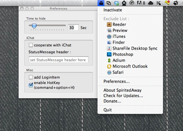
Spirited Away is an invisible program that runs in the background and listens for inactive programs. When you haven’t used a program for a certain period of time, it hides it.
I’ve only been using it for a few hours now, but I love it.
Perhaps this also a side effect of using an iPad and an iPhone more and more. I’m getting accustomed to only seeing one program at a time. Multi-tasking is great when you have focus. And Spirited Away helps me get back some focus.
Some people might say it’s simply a matter of quitting out of programs you’re not using, but I’ve found that by simply not seeing the program, it’s almost the same as them not running. It also saves me the time of relaunching them.
Spirited Away is free, but I donated to the developers. I like supporting independent developers producing smart work.
Late last year, Apple announced a recall of 1st generation iPod Nanos due to a (potential) battery defect. If you qualified and sent them your old Nano, they would mail you a brand new one.
My wife had a 1st gen Nano, so I had it replaced. Upon getting the new Nano, I began to play with it more than my wife did, so she ended up giving it to me as a Valentine’s Day present a few weeks ago, along with a watch strap.
Since using this Nano as a watch I love it. I would have never bought a Nano for myself otherwise. It comes loaded with 18 different watch faces. I use this one:
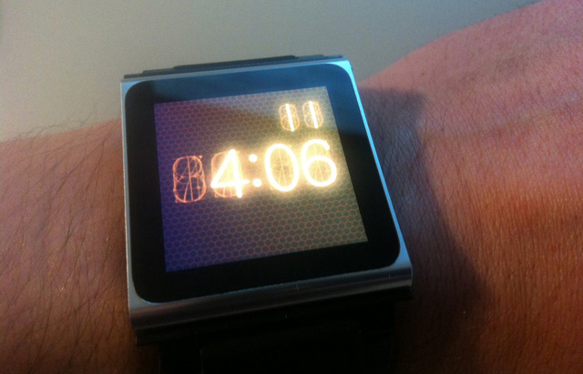
The style of the numbers reminds me of of the digital multimeter my father has in his basement laboratory and what I used to use to test batteries for my toys growing up. The number display looked exactly like my Nano’s watch face.
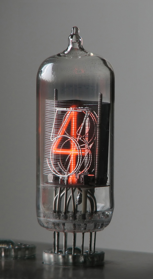
I saw my dad this past weekend, and being gadget geek like me, inquired about my watch.
My Dad: Is that a new watch you’re wearing?
Me: Yeah. Check out the watch face, remind you of anything?
My Dad: Sure, those are Nixie tubes.
I never knew the name for them, but that’s what they are. Nixie tubes.
Here’s a bit from Wikipedia on them:
A nixie tube is an electronic device for displaying numerals or other information. The glass tube contains a wire-mesh anode and multiple cathodes, shaped like numerals or other symbols. Applying power to one cathode surrounds it with an orange glow discharge. The tube is filled with a gas at low pressure, usually mostly neon and often a little mercury or argon, in a Penning mixture.
Although it resembles a vacuum tube in appearance, its operation does not depend on thermionic emission of electrons from a heated cathode. It is therefore called a cold-cathode tube (a form of gas filled tube), or a variant of neon lamp. Such tubes rarely exceed 40 °C (104 °F) even under the most severe of operating conditions in a room at ambient temperature.
It’s quite a beautiful piece of hardware:
If you scroll down the Wikipedia page for Nixie tube, there’s a picture of Steve Wozniak wearing a real Nixie tube watch.
Here’s a picture:
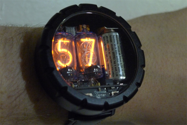
Looks like you can buy one for around $400.
How much more awesomely nerdy can you get?
After watching this video on Gizmodo, that was my reaction – Windows 8 actually looks fun to use.
Now I have no idea how many holes are in Microsoft’s new OS and I hate that it goes back into classic, ‘non-Metro’ mode, but how awesome would it be if Microsoft wupped Google’s ass in the tablet market? You know, created an operating system people wanted to use?
Because based on my first impressions of Windows 8, I’d pick it over an Android tablet without thinking twice.
Shawn Blanc thinks about the possibilities of the next Home screen on iOS:
Not until recently have we felt much of a need for a revamped home screen. Since 2007 iOS has evolved significantly in both its functionality (i.e. multitasking and Notification Center) and in the amount of available apps (thus folders, and multiple Home screens). After five years the Home screen is feeling cramped and outdated.
If I were a betting man, I would wager that the iOS Home screen as we know it today is not Apple’s long-term plan. My hunch is that the Home screen is still the way it is because the long-term ramifications of what it could be are huge.
A reimagined springboard is a prime opportunity for significant innovation. And significant innovation takes time.
It’s really exciting to think about what’s next.
Not because it’s a fantasy, but because for those of us who understand Apple, we know this is inevitable.
It’s inevitable Apple is skating to where the puck is going to be (as they always have). It’s inevitable they’re re-imagining the Home screen. It’s inevitable they’ll make a lot of people happy with their next software paradigm. It’s also inevitable they’ll piss off a lot of people in the process.
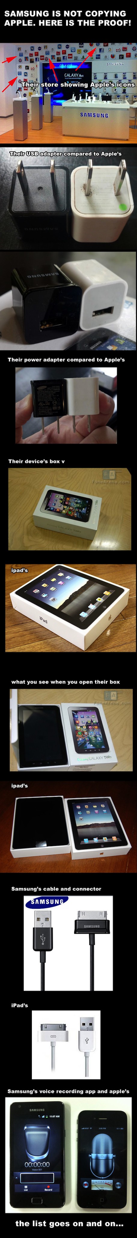
It’s also all very sad when you think about the opportunities that exist for Android and hardware manufacturers like Samsung who copy everything Apple does.
Comparisons like this stop being funny and just look pathetic.
This is why I’m so happy with Microsoft’s Windows Phone 7 mobile operating system. It’s a complete departure from everything that came before it. It’s not stale, contrived, fussy or silly. It’s clean, efficient and modern. Microsoft acknowledged a missed opportunity in mobile computing but still pushed forward and came to their own conclusion.
Mutliple futures exist for multiple UI paradigms in software. It’s a painfully commonplace expression, but it’s true – there’s more than one way of doing something. It would be great if more leaders of more software companies realized this, strapped some sets of balls on and took some risks.
Scott Gilbertson, over at webmonkey, has an interesting piece on developers preferring the -webkit prefix in their CSS, and how this could be bad for the web.
…at the CSS Working Group meeting, Microsoft, Mozilla and Opera announced that each are planning to add support for some -webkit prefixed CSS properties. In other words, because web developers are using only the -webkit prefix, other browsers must either add support for -webkit or risk being seen as less capable browsers even when they aren’t.
via webmonkey
Justin Williams’s definition of friction within mobile applications:
If at any point in that process I see a crash, frustrating design decisions, confusing experiences or perceive a lack of functionality, I delete the app and go on with my day. Put more succinctly, if at any point in the first use experience I experience friction, it’s game over.
Sounds right to me.
The sketches of Susan Kare, the designer of the original Macintosh icons.
So good.