Yes, please.

Image taken from Behance
via sidebar.io

Image taken from Behance
via sidebar.io

Robin Williams, Dead at 63
Brad Reed at BGR:
It’s something we’ve long suspected but now we finally have the proof we need: Your wireless carrier wants to push you to buy a Samsung smartphone over an iPhone. Kantar Worldpanel has just released a new study (PDF) confirming reports that we’ve long heard about carriers trying to steer their customers away from the iPhone and toward rival devices — most prominently, Samsung’s.
No shit. Mobile carriers and cable companies are run by scumbags.
Let’s continue:
Why, exactly, are carriers doing this? It’s not exactly a conspiracy so much as it’s rational self-interest. The iPhone carries a very high subsidy cost for carriers, who are concerned about Apple racking up too much market power. After all, if the iPhone becomes more popular than it already is, then it gives Apple leverage to push for even stronger carrier subsidies.This is exacerbated by the fact that iPhone customers are the most fanatically loyal smartphone users around — once they’ve been converted they don’t even think of trying other devices.
This last part is the key: “This is exacerbated by the fact that iPhone customers are the most fanatically loyal smartphone users around”.
This isn’t as correct as it should be. Apple sold 1-2 million iPhones in 2007. They sold over 35 million iPhones in Q3 2014.
It’s not only that iPhone customers are loyal: Apple continues to gain more and more loyal users each quarter of each year. There’s a good chance the person you’re pointing at and calling an “Apple fanoi” or an “Apple fanatic” wasn’t one 6 months or a year ago. This is despite the efforts of scumbag carriers trying to convince you to buy phones you don’t want.
As Steve Jobs once said, “Let the consumers vote with their wallets.”
The best thing Apple could do to increase the quality of apps is remove every top list from the App Store.
I hope Apple realizes how important it is to everyone — developers, customers, and Apple — that they make changes to encourage more high-quality apps. If they’re trying to boost iPad sales and increase differentiation between iOS and Android devices, that’s the first place to start.
But that won’t solve the biggest problem. (Neither will upgrade pricing, trials, or any other theoretical panacea.)
—Marco Arment, App Rot
The Verge takes a look into the thinking behind the ‘material’ design philosophy for Android:
What is software made of?
The answer came from a design exploration, when Jon Wiley, principal designer for search, and his colleague Nicholas Jitkoff were looking at the now-ubiquitous cards that Google started using in Google Now. They looked at those sliding cards and wondered: when you swiped one away, what was underneath?
“It sounds like such an innocent question,” Duarte says, “and yet it was such a powerful spark.” It led the team to come up with a new way of thinking about the software elements we use and (virtually) touch every day. Instead of just talking about pixels on a screen or abstract layers, the team imagined that these cards and the surfaces they slid around on were actually real, tangible objects.
Software imitating tangible objects. This doesn’t sound like “authentically” digital design does it?
Or does it?
I thought Microsoft was leading the way into the future of software design with Windows Phone and their flat approach. Right? Right?
The answer is: it doesn’t fucking matter. Oh and if anyone tries to use the term “authentically digital design”, punch them in the face and explain to them that term does not exist. Also, to be clear—flat design is not a philosophy, it’s an aesthetic. Like the decision to wear Italian leather dress shoes every day or Chucks (disclosure: I wear Chucks every day).
The answer to Google’s sharp work for their Material Design is that it is both authentically digital AND skeuomorphic. Heresy! Oh no he dih-ent!
Operating systems, mobile applications, ATM screens and every other piece of software with a user interface was made so that human beings could interact with them. Computers, on the other hand, operate using zeros and ones. Everything else we humans build on top of those zeros and ones is made for us to communicate with them.
Software and user interfaces can be neither authentically or inauthentically digital. Software either well-designed or poorly designed.
Curt Aldredge has concluded there’s no proof hollow icons are harder to interpret/recognize than solid icons:
Johnson’s warning against using hollow icons in user interfaces just isn’t supported by evidence from real users. For one thing, an icon’s style doesn’t exist in isolation, but interacts with other attributes like color to create compounding effects on usability. Furthermore, less than half of the icons in my set of 20 performed better in a solid style than a hollow style. A different set of icons would likely result in a different overall result.
Me? I don’t care if hollow icons are harder or easier to decode than solid icons.
I’ll repeat myself 50 million more times if I have to: hollow icons are not icons, they’re wireframes of icons.
Different strokes for different folks, but I think a more appropriate approach to icon design is thinning them out, not hollowing them out. Let your icons stay solid, just streamline them so there’s less area to fill in.
I don’t care what you call it. I call it awesome.
Kindle version 4.3 was released today, and it has some great features, including the ability listen to audiobooks directly in the app. But…does it have scrolling view yet? No, it does not.
When iOS 8 hits, the notification center is going to be the most important screen in your iPhone. Think about it: Notifications already are the way you know about everything that happens without having to fire up an app. A notification lets you know you have a new email, a new text message, a new Snapchat. (Hi, Tony. Looking good.) But with iOS 8 they become interactive. They’re not just simple announcements–or even calls to action–anymore. They are actions in and of themselves. Entirely new windows onto our data. It’s nearly impossible to overstate how much this will change the way you use your phone.
— Mat Honan, Wired
I’m very cautious with notifications. They can be dangerous and annoying as shit.
Right now on my iPhone running iOS 7 I’ve turned off almost all notifications for email and text messages. I don’t get interrupted with message panels and windows whenever something new pops onto my phone. I find doing this helps me act less like a person with obsessive-compulsive disorder.
Some people might view my OS customizations as making my iPhone less smart. I’m fine with that if it means making me less distracted.
I’ll keep an open mind with notifications in iOS 8 when I see how they work differently.
All these assholes calling for the death of skeuomorphism and praising flat design can continue on with their pointless quest because skeuomorphism isn’t going anywhere. It’s thriving in the supposedly flat iOS 7 (and 8) and in OS X Yosemite.
The truth is we still need and like visual cues telling us certain things are clickable and other things are not. That certain things are (virtually) closer to us, and others are (virtually) farther away.
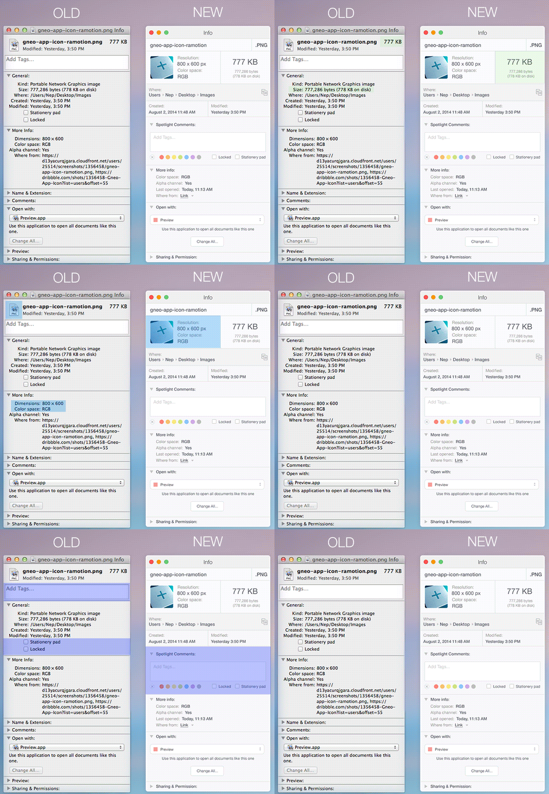
Below are Mavericks icons (left) and Yosemite icons (right):
![]()
![]()
Sure, iOS 1 through 6 might have looked a bit like a whore with the amount of skeuomorphism she wore, but she’s still wearing it in iOS 7 & 8, just this time she’s applying it sparingly. She’s started letting her natural beauty shine through in iOS 7.
*[*I say IOS 7 & 8 are “supposely flat” because they are. There are still shadows when you go back and forth between interface panes in Mail, Music and many other apps and system-level panes can be pulled in from the top and bottom of the screen, blurring the content underneath them like translucent, frosted glass. So I repeat: skeuomorphism is doing fine.]
The art of designing Office for iPad from the Office 365 Team.
Microsoft, you’re killing me. You’ve just announced what looks like a killer new tablet that you’re hyping as “the tablet that can replace your laptop.” It looks like a big improvement over the Surface 2 in just about every possible way, from the display quality to the super-thin build. But for some reason, you are still insisting on selling the keyboard cover separately for $130 a pop. To use an old science fiction cliché, this does not compute.
This bothers me for no other reason than because it seems like an assault on basic logic. You are selling a tablet that is, by your own admission, meant to be a laptop replacement. You compared it to the MacBook Air repeatedly during your presentation. And yet you’re still telling customers that having a keyboard is optional for something that’s supposed to be a laptop replacement… why?
—Brad Reed, BGR
If Microsoft opened a car dealership, they’d be selling the cars without wheels.
If Microsoft were a clothing retailer, they’d be selling shirts without buttons, and pants without zippers.
I have more, should I go on?
Seriously, Microsoft, what the fuck is wrong with you?
From Jacob Miller:

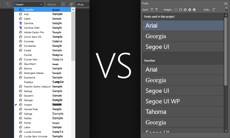
Until I switch to a new program like Sketch, I’d like to see Photoshop improve.