BOP!
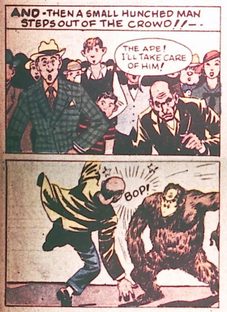
—Found in Batman #395
The grand appeal of using an e-reader is the ability to own a large library of books without adding to the colossal weight of one’s possessions. Ever since I moved away from print books I’ve been able to remove hundreds of pounds of clutter from my apartment and from my life. Storing books digitally has improved my quality of life. That being said, the various e-readers that are out there have an obligation to provide a good user experience, and they do that through design.
In the past I’ve taken Amazon to task for user interface design that I felt was subpar. Since it’s introduction, Kindle for the iPad has gone through numerous updates to its UI, and while still not perfect, it provides a fine balance of text and whitespace. The only reason I don’t use the app regularly is because Kindle doesn’t have continuous scrolling. Enter iBooks, the e-reader app from Apple.
Apple prides itself on the quality of its design. One can see it from the look and feel of Apple’s signature hardware, to the way fonts render in OSX, and everything in between. Which makes this so inexplicable:
That is a screenshot of a page in iBooks, with continuous scroll turned on, after an update to iOS 10. The margins to the right and left are too small, leaving the text crowded to the edge of the screen. When using one of the new model iPad Pros, the text is less than an inch from the edge of the device. The width of the text also interferes with the eye’s ability to flow from one line to the next. What happened to all that whitespace that designers value so much? It used to be there. This is a screenshot of the same text taken in iBooks from an iPad running iOS 9:
The second screenshot shows a much better use of margins. I know there are charlatans out there who prefer text to be much closer to the edge, but they’re wrong. Luckily, a solution that satisfies most users should not be that difficult for Apple to implement. The Kindle app already has a margin selector in the same menu where a user adjusts fonts and background colors. The settings in iBooks does not. As of right now, the experience in iBooks on the iPad has been degraded by the decision to close the margins. Were Apple to add a margin selector, it would be a vast improvement to the app.
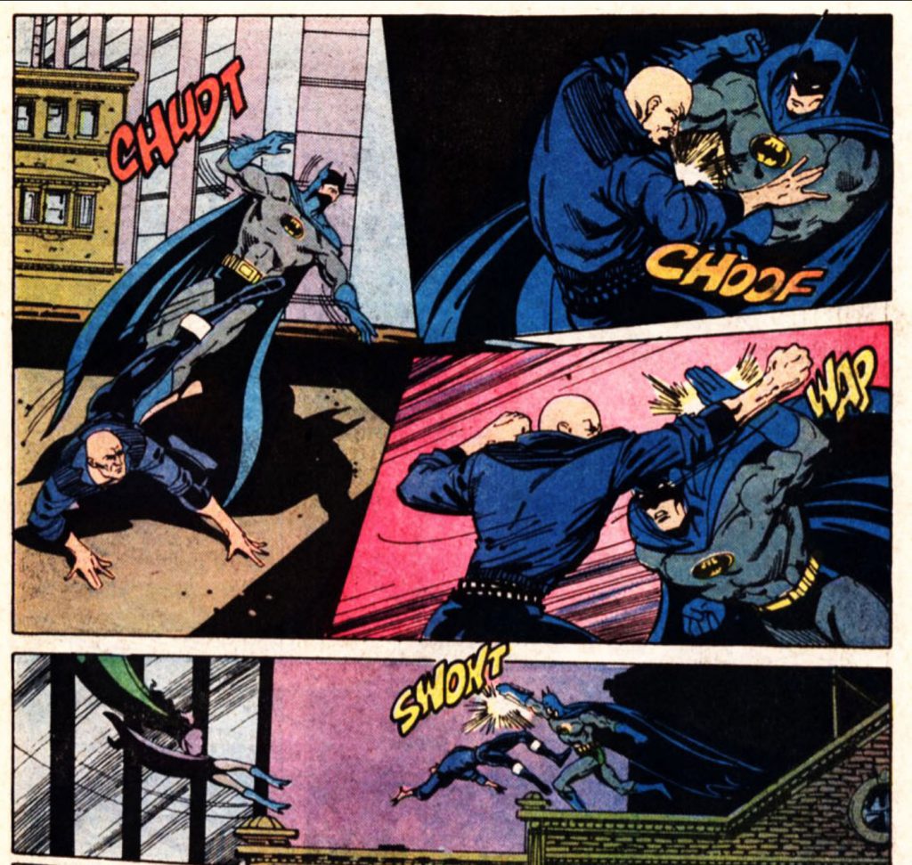
I’ll bet it doesn’t stink down there, either.
Read enough old comics and this type of stuff shows up more regularly than one would expect.
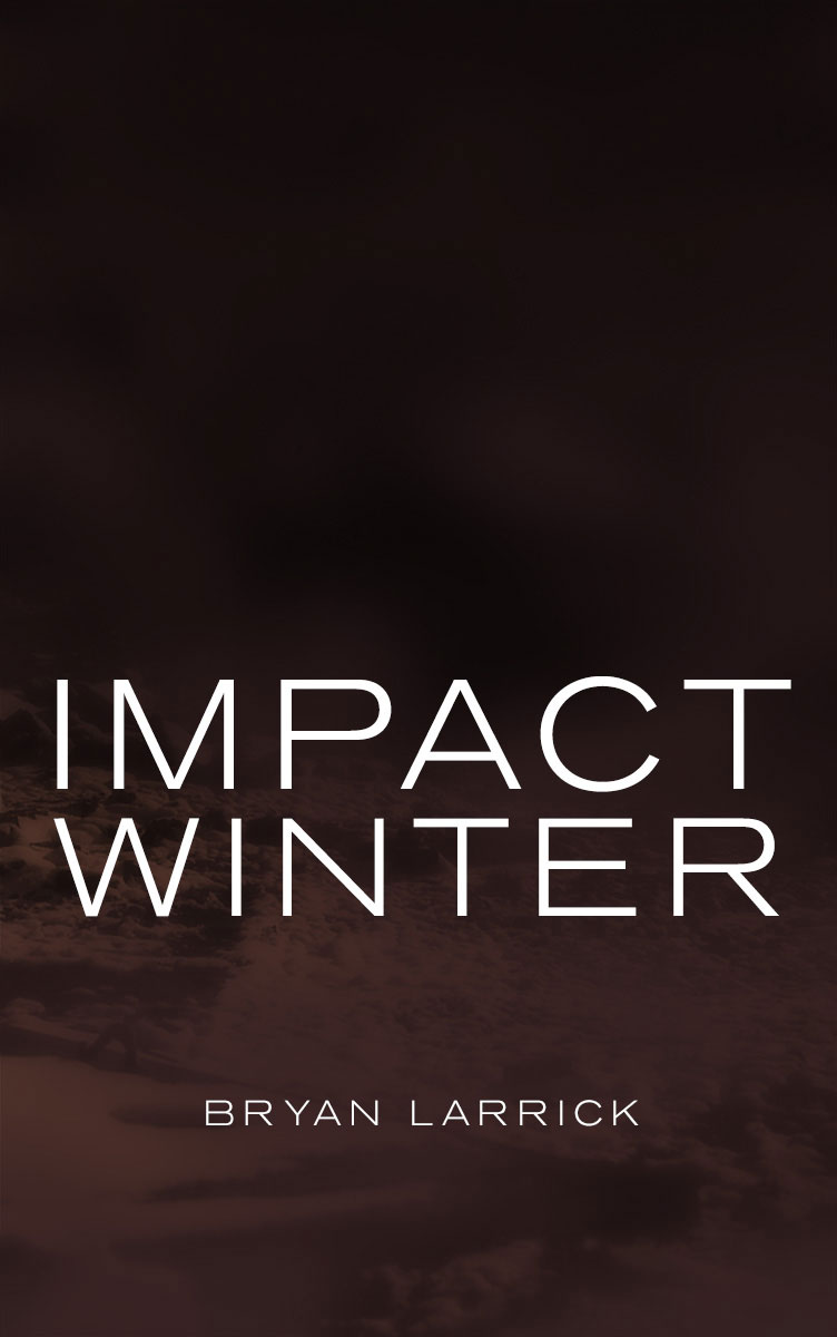
What’s the point of contributing to a website if you can’t use it to sell your shit? With that in mind, I hereby announce that my second book, The Blasted Lands, is now available in the Kindle store for $3.99 in the U.S., and adjusted in other markets.
The Blasted Lands is a followup to last year’s Impact Winter, a sci-fi novel where the earth has been enshrouded in ejecta from a meteorite impact in northern Canada. This latest novel is a standalone tale, not a direct sequel to the first, but it does take place in the same area of central Pennsylvania, and features some of the same characters.
In writing this book and the one before, I did my best to imagine what would happen to the land and the people after a significant impact. What would the seismic effects be? How much damage would the air blast do? And what about the most lasting effect; the dust flung into the stratosphere, blocking out all light from the sun for an extended period? There are no good answers as to what would befall civilization were an event like this to take place.
In this novel, some time has passed since the impact, and dusky light has managed to penetrate the shroud, giving the land an eerie countenance. Edward Gray and his small group have weathered the worst of the collapse of society and government, and are now, like other survivors, preparing for the time when the sun will shine once more. They have claimed a small farm in rural Pennsylvania and have set about readying house and field. But, a land with no laws can snatch away plans and dreams without warning. Edward and his people learn that lesson, much to their hardship.
Check it out.
The other day I saw this article from the New York Times:
In Busy Silicon Valley, Protein Powder Is in Demand
Here’s a quote:
Boom times in Silicon Valley call for hard work, and hard work — at least in technology land — means that coders, engineers and venture capitalists are turning to liquid meals…While athletes and dieters have been drinking their dinner for years, Silicon Valley’s workers are now increasingly chugging their meals, too, so they can more quickly get back to their computer work.
This is absolutely ridiculous. If a person is working so hard that they can’t take a break, then they need a different job. If a person does not want to take a break, then they need to have breaks forced on them for their own good, and for the good of the rest of us.
I’ve been working in the tech industry since 2003, and as a salaried employee, at times there is pressure to work large amounts of overtime. When I worked remotely for a company in Silicon Valley, I would have to remind my supervisors and coworkers that while they were working on national holidays, I was not. The picture many people have of the working culture in Silicon Valley is one of foosball tables and being allowed to bring a dog to work everyday. What I found, instead, is a culture of workaholics who are either chasing an elusive fortune, or who are not cognizant of the fact their lives no longer belong to them, but to the company. As just about everyone who is not an hourly worker knows, there is usually no overtime pay for salaried positions. It’s not enough for companies to rent out a person’s life for 40 hours a week. They want free labor, as well.
It’s a travesty that this is the case. Past generations fought hard for fair pay and worker protections, including the forty-hour work week and breaks during a shift, that have steadily been eroded as labor unions have lost their influence. People died for these rights, at the hands of thugs hired by their employers, and from the U.S. military. They died for all of us, and the worst part about this situation is that modern-day workers have gone into arrangements where more and more of their time, for free, is ceded to their employers voluntarily.
This new fad of protein shakes replacing meals is but a small symptom of the larger problem of American workers not being fairly compensated for their labor. The people mentioned in this article should not be praised for their work ethic. They should be pitied. And the companies that employ them should be ashamed that they are, or are allowing, their talent to be exploited in such a way.
There’s been a lot of piling on about daylight saving time. So much so that it’s become a twice yearly ritual to point out that it’s an outdated, unnecessary, and even dangerous practice. Washington, Oregon, and Alaska have all had state lawmakers introduce bills to abolish daylight saving time in their respective states. There will probably be more as it’s an easy and painless issue for our craven politicians to get behind. Fine. I have no problem with that. With one caveat…
Many years ago, back when I was working as a bartender in New York City, I used to get out of work sometime after 4 in the morning. Around the summer solstice, there would already be a hint of blue in the sky at last call. And this was during daylight saving time. Without daylight saving, the lightening would have started well before closing time, with the actual sunrise occurring around 4:30. Ugh. If we’re going to abolish shifting our clocks around, how about we stick with having them an hour ahead, and leave it at that? That way, during the winter, the sun will set at 5pm instead of 4pm in New York, and there will still be a lovely glow in the sky at 9pm in the summer.
Last year, I got it into my head that I could write a book. Check that, I’ve known I could do it for a long time. Last year was when I finally figured out that, in order to be a writer, one must write, instead of thinking about writing. So, I sat my ass down four or five days a week and banged out a first draft. I then inflicted the book on friends and family. Many revisions and tweaks later I felt I had something polished enough to begin shopping it around to literary agents. The literary agents, so far, do not agree. I chose to go the traditional route for publishing a book because it is still a valid business model. But, following the traditional route, unless an author is picked up by an agent, said author’s book remains a lonely file on a lonely computer.
Well, the hell with that!
This is the 21st Century. I have other options, which, in lieu of traditional publishing, I am choosing to exercise.
I wrote a book. It’s called Impact Winter. It’s a post-apocalyptic sci-fi story set about a year after a meteorite impact with the earth. Dust from the impact has shrouded the earth and plunged it into a winter that will last for years. In this bleak setting, humanity struggles to survive. My book is now available for purchase as a Kindle eBook. As soon as the legal stuff is taken care of, it will be available from iBooks and other retailers.
My book! Mine. I love writing those words. Check it out. Also, many thanks to Daily Exhaust Mike for the cover art, as seen above.
Kindle version 4.3 was released today, and it has some great features, including the ability listen to audiobooks directly in the app. But…does it have scrolling view yet? No, it does not.
Kindle for iOS, version 4.2 was released the other day. New features include easier access to the table of contents of books, and something called X-Ray Smart Look-Up. It’s a welcome addition, actually. But, has continuous scrolling, one feature that has been missing for years, been added yet?
No, it has not.
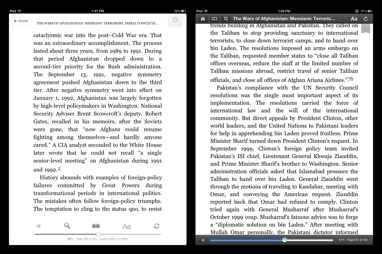
Last week, Amazon updated it’s Kindle app for iOS. For the iPad, the new update is a case study in poor design. From the update blurb in the app store:
Improved reading experience on iPad: Smaller margins and a cleaner look help you focus on the author’s words.
When I first saw this in the blurb, I was immediately suspicious. It’s hard to overstate the importance of healthy margins and whitespace in good design. Generally, it’s also one of the earlier casualties when good design meets project managers and clients who aren’t designers. But I updated the app anyway. Upon opening, I saw what had been a decent treatment of margins had been destroyed by the redesign:
The image on the left is a screen capture from an iPad without the update installed (I’m a developer, I have more than one iPad. How first world of me.). The image on the right is with the update installed.
The smaller margins do indeed help a user focus on the words. In fact, that’s all a user can focus on. What Amazon has done is create a solid mass of text that has no breathing room. It’s claustrophobic. It’s stressed.
It’s like standing three feet in front of a brick wall and pretending you’re appreciating the architecture of a building.
The words are the most important aspect of a book. That’s intuitive. But, presentation is very important. Having ample margins helps the eye flow over the text and makes it easier to move from one line to the next while reading. Making the margins smaller in the app hinders the ease with which the eye can move over the page, making the book harder to read, not easier. Also, it’s just ugly.
There is also a usability gap that was created with the update. Previously, the app’s toolbar overlays would not interfere with the text on the page. Some people like to read with the toolbar visible. I’m not among them, but I respect that. After the update, keeping the toolbar visible is no longer a workable option:
Also, the new toolbar design has none of the nuance of the previous version. It’s black, bold, and in a user’s face. Even if it didn’t cover up text, the look and feel of the new toolbar is a downgrade.
The Kindle app in the iPad has been a conundrum ever since I began to use the device, simply because the presentation has always been suspect. The options for reading have been limited in ways I could never understand.