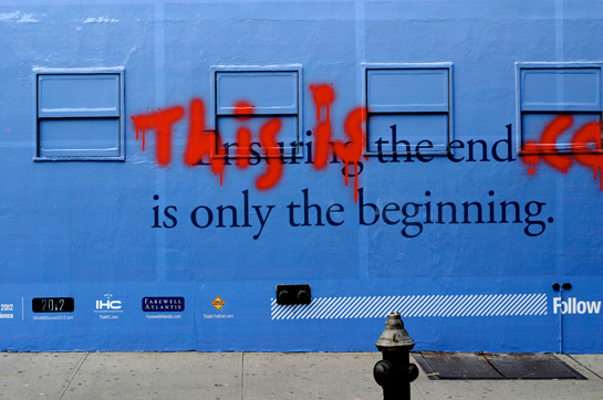
the end
Little belated shout out to my friend Promila on her site, Still Life.
She’s quite the curator of design and art.

When I spotted this car I had to look around me and make sure I was indeed on the upper east side of Manhattan and not Collins Ave on South Beach.
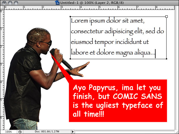
I had to do it:
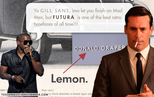
UPDATE 18.09.2009 – After creating the image above, I went and posted it to my friend Dalematic‘s Facebook wall. I hadn’t anticipated what this action might start, but given Dalematic’s arsenal of design chops and knowledge, I should have.
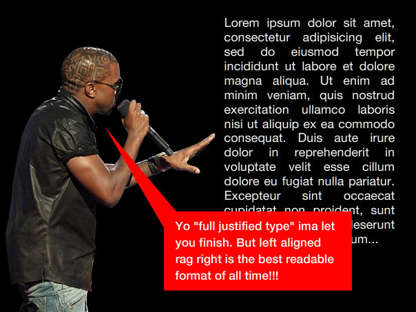
Dalematic’s response #1:
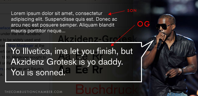
The Combustion Chamber’s response #1:

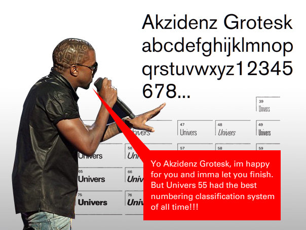
Dalematic’s response #2:
The Combustion Chamber’s response #2:
Dalematic’s response #3:
The Combustion Chamber’s response #3:
Do Google and Microsoft understand what Human Experience is?
Sometimes they do and sometimes they don’t. They’re both companies run by engineers, so that’s bound to happen.
Google has launched Fast Flip and Microsoft has launched Visual Search – both of which are search-related tools. Both of which are confusing.
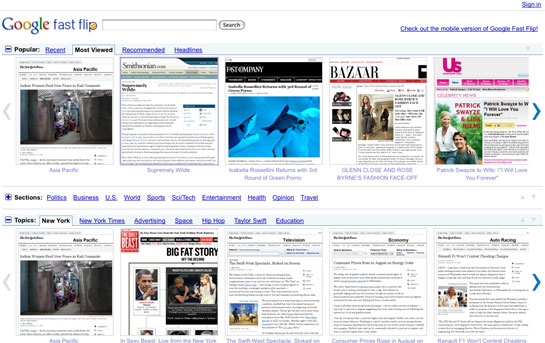
Google explains Fast Flip on their blog:
Fast Flip also personalizes the experience for you, by taking cues from selections you make to show you more content from sources, topics and journalists that you seem to like. In short, you get fast browsing, natural magazine-style navigation, recommendations from friends and other members of the community and a selection of content that is serendipitous and personalized.
The problem is, Fast Flip doesn’t make scanning headlines any easier or enjoyable for me. Just because something is visually rich, doesn’t guarantee it’s easier to understand. When I want to scan news headlines, I, uh, scan news headlines. I don’t need screengrabs of websites to act as training wheels for me. Google News is more than sufficient for me.
I concur with Richard Ziade’s thoughts over at Basement.org:
What’s interesting about this tool is that it’s the anti-Readability. Instead of helping us get rid of the junk around what we’re trying to read, Google fossilized the layout – junk and all – in images.

Then we have Microsoft’s attempt to make search results engaging by making them pictures. My co-worker Rob calls them ‘glorified image galleries’. The novelty of Visual Search wears off quickly and makes me pissed that I bothered to install Silverlight in the first place.
If Visual Search was integrated in some other Microsoft properties, it might add some value and move beyond a one trick pony.
Influencer:

2003 Land Rover Range Rover
Influenced:

2010 Ford Flex
I was in Chicago a last month for Roundarch’s annual company event. Over the weekend I had no plans so I decided to explore the city. I texted my brother who, like me, lives in New York, but spent the summer in Chicago last year.
I asked him, ‘What’s the equivalent to the East Village in Chicago?”
He said, “Wicker Park”
Coincidentally, my coworker RJ lives in Wicker Park so he gave me a tour. He introduced me to the super awesome bookstore Quimby’s (For New York designer-bookstore-junkies, if you dig St. Mark’s Books, you would love Quimby’s).


I’ll definitely survive if they haven’t addressed this in Snow Leopard, but it’s something that has bothered me for a while now.
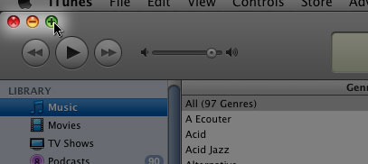
In most applications within OS X, when you click on the green jellybean button in the top left hand side of the window, that window will maximize to the full width and height of your monitor. I spend 97 percent of my computer time on a MacBook Pro, so I value that behavior (the other 3% is on an iPhone).
In iTunes, when you click on the green button, it gives you the MiniPlayer:

While I’ve grown used to this behavior, I still think it needs to be fixed. In every other program green means bigger and yellow means minimize-to-Dock. Then you have iTunes who rages against the machine.
Clicking on the green button again in the MiniPlayer brings you back to the full view of iTunes, in the dimensions you left it.
Perhaps iTunes warrants a special MiniPlayer button so that the usually universal behaviors can stay, well universal.
Whatever the right behavior might be, the current implementation ain’t it.
UPDATE: I’ve found a few other rebels in the fight against the green button – Photoshop and Preview. Clicking the green button in Preview does absolutely nothing while Photoshop trims the grey, outside-of-canvas area around your document.
It seems like every successful person I learn about now fits into the pattern that Malcolm Gladwell highlights in his book, Outliers, which is:
timing + talent + insane amounts of practice = rich & successful
It’s like when you buy a car, and then you see that model everywhere you go. I see the outliers pattern everywhere since reading that book.
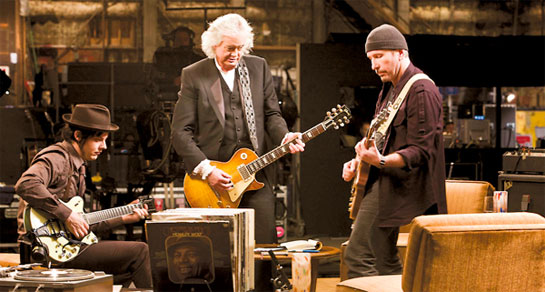
And so it is after having just watched It Might Get Loud down at the Sunshine Theatre on Houston Street. I know Jimmy Page, The Edge and Jack White are extremely talented musicians, what I didn’t realize (but should have guessed) is that they also all practiced their asses off for years before making it big.
Like the examples Gladwell gives in Outliers, Page, The Edge and White were lucky enough to have gotten an early start to playing guitar. Gladwell talks about the magical 10,000 hours of practice one needs to get order to get to that ‘next level’ of success in a particular field/trade.
I haven’t done the math, but I’d be willing to put money down that these 3 musicians all hit that number early one in their lives.
Practice and book references aside, It Might Get Loud was awesome. I was fairly confident it was going to be. I couldn’t picture these 3 giants (ok, Jack White isn’t a giant yet, give him a little time) letting me down.
My favorite part in the film was when Jimmy Page starts playing the guitar on Whole Lotta Love (I think?) and the camera turns to White and Edge who both look like little kids seeing their favorite superhero in real life – eyes as big as their head with smiles from ear to ear.
Gave me chills and I wasn’t even there.
I caught this story today: Customers Angered as iPhones Overload AT&T
From the article:
More than 20 million other smartphone users are on the AT&T network, but other phones do not drain the network the way the nine million iPhones users do. Indeed, that is why the howls of protest are more numerous in the dense urban areas with higher concentrations of iPhone owners.
Here’s how I see it in a nutshell – AT&T was happy to sign up as many iPhone customers as they could. Their mentality was probably very similar to gyms who sign up as many people as they can in January when everyone makes their New Year’s Resolution to lose weight. Gyms are packed the first few months after January but then there’s a drop-off in attendance, because people tend to slack off, so even though the gym might ‘overbook’ their spaces, it’s only being used by a fraction of the members. The gym wins – few customers to take care of and lots of profits.
This didn’t happen with iPhone customers. Unlike average customers with average cellphones that have small screens and poorly designed user interfaces who just use their phones for calls and occasionally check email – iPhone owners users integrate their iPhones into their lives. They surf the web, check their GMail, Yahoo and thanks to Exchange integration, their work email. Not to mention downloading applications, music and videos.
Oops AT&T, you done messed up.
You sold a bunch of Ferarris and didn’t think people would drive em.
Well, too bad, you gotta fix it.
![]()
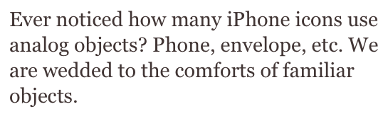
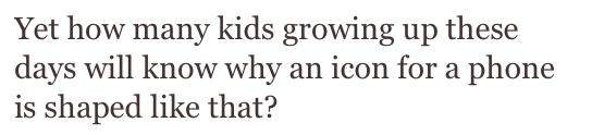
A little over a month ago I came across an interesting thread on Brenden Dawes’ Twitter stream on the lifespan of iconography that I thought warranted a longer post: Brenden asks:
And:
These are very valid questions.
I think answer to the first question is that we’re not so much wed to familiar, analogue objects – they’re part of our iconographic DNA. We don’t have a say in the matter, we’re stuck with our analogue icons until our technology progresses far enough to render them obsolete, killing them off and forcing us to reference these extinct symbols through fossilized JPGs, GIFs and PNGs. Every generation is inherently transitional. What’s different with each successive generation are the specific things that are mutating, evolving, dying and spawning.
Horses to automobiles. Radio to television. Gas lighting to light bulbs. Even now, those previous three examples are could still be used be used as icons (the horse might come across a bit obscure and humorous, but I bet it would still work to convey ‘transportation’).
When we transition from one technology to another, this doesn’t mean the technology being replaced has run it’s course. Radio technology was invented in the late 1800’s but we still have it to this day (Hell, the Microsoft Zune still come equipped with FM tuners, god knows why). It is the reason the NPR iPhone app can use an old-fashioned radio to indicate their ‘radio’ programs and a radio tower to indicate their stations. We still understand what these things symbolize.

bottom row of icons on the NPR iPhone app
The bottom line is, for the time being, our icons of televisions, radios, cars, envelopes, paper pages and hardcover books are more than sufficient to represent their digital counterparts.
Fine. As long as we have our living analogue ancestors around, our iconography can stay in place and mutate when some of them become extinct. We get it. Let’s stretch this out to it’s logical conclusion – there is no interface. We become the interface. The interface becomes us.
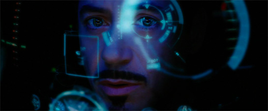
We’ll reach a point in the future where what Mr. Dawes is saying does come to be. People will no longer understand that bell telephone means ‘call someone’. Phones will become implants and we’ll simply say a person’s name to our interfaceless voice recognition system. We have HUDs in jets and cars, is it really a stretch to image an HUD eye implant?
Picture an iPhone without the iPhone.
Ironman without (or with) the special suit.
Given enough time, I could easily expand this post into a full thesis, but alas, I have to get back to work.
*in addition to Brenden Dawes tweets, I also found great thoughts by Samuel Cotterall here, here and here.
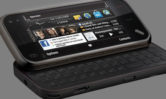
What the hell is going on with that home screen on the N97?
By cramming everything on the screen, they cram nothing on the screen.
It does have an ‘analogue’ clock and Facebook access, so it must be cool.
Interesting insight by Matt over at 37Signals:
Want something to blow up? Tell the world about it on a Tuesday morning. Avoids the Monday avalanche people face and gives you the rest of the week to get play …Want something to fade away? Tell the world about it on a Friday afternoon. It’ll fade into the weekend.
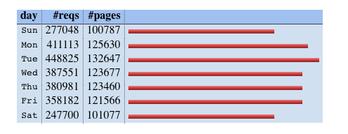
This backs up what appears to be the case on Daily Exhaust:
UPDATE: My brother brought to my attention the unfortunate choice of words Matt at 37Signals decided to use in his post in light of next week’s upcoming anniversary. It should have been more obvious to me, considering I was there.