Manhattan
I think it should have 5 keyboards
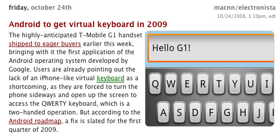
So many of the reviews of the iPhone thus far have complained about the lack of a physical keyboard. Now there’s word that the Android OS, that currently runs on the T-Mobile G1, will get a virtual keyboard included in the next iteration of the software in 2009.
Hold up – the G1 has a great slide-out physical keyboard. It was supposed to be the feature that gave it an advantage over the iPhone.
uh, apparently not:
Users are already pointing out the lack of an iPhone-like virtual keyboard as a shortcoming, as they are forced to turn the phone sideways and open up the screen to access the QWERTY keyboard, which is a two-handed operation. But according to the Android roadmap, a fix is slated for the first quarter of 2009.
Wow. Now the physical keyboard is the shortcoming.
I thought the iPhone’s virtual keyboard was its shortcoming?
Do you see why market research and user testing are a complete waste of time? If we designed products based on what people thought were good ideas, we’d have a phone with 5 keyboards, 3 headphone jacks, a stylus, a standard AND Phillips head screw driver and a place to keep your change.
Let me say this once (or more than once) – consumers don’t know shit.
If you want to have a successful product – ignore what outsiders say and design something that makes sense. Design something that fufills a need.
If your product needs more than one keyboard on it for it to be usable, then the keyboard isn’t the problem – the design of the phone is.
There’s a name for this behavior in product design – it’s call feature creep.
Feature creep (or feeping creaturism[1]) is the proliferation of features in a product such as computer software.[2] Extra features go beyond the basic function of the product and so can result in baroque over-complication rather than simple, elegant design.
I give the Android G1 another year before it looks like a universal remote control with 50 buttons.
Choice
Design is about choice.
What options do you give people to choose from?
If you give people too many choices, they won’t know what to choose (Barry Schwartz calls this the Paradox of Choice).
If you give people too little choices, they won’t know what to choose.
A great design finds the right balance of choices. It shows you the essential. The rest it hides – either by minimizing, breaking into smaller pieces/steps, or removes them entirely.
Today’s case study is Garmin and their Product Page for Automotive (props to dalematic for pointing this out to me):
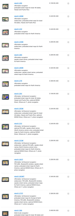
By the way – this is just half the automotive product list page – I figured it was enough to get my point across.
As a car owner and someone who needs an onboard map/location device, this page has way to many options. Way too many. While I believe that Garmin makes a good product, I don’t believe that there’s any meaningful different between most these products. I’m willing to put money on it.
Just as Barry Schwartz describes, I have so many choices on this page:
a) I don’t know what to choose from
b) I don’t want to waste time reading through 30 product descriptions
A big part of a company’s job is not just to sell products, but to help people make informed decisions on which product(s) to buy.
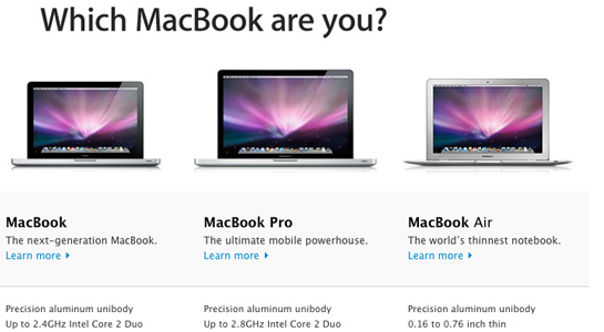
Which brings us to the other end of the spectrum – Apple MacBooks.

Apple’s current lineup of laptops comes in 3 different models – the MacBook, the MacBook Air, and the MacBook Pro. For the 3 models, you can choose between 2 to 3 different configurations.
That’s it.
And if their simplified product lineup wasn’t simple enough, they’ve also provided a great comparison page to help you decide.
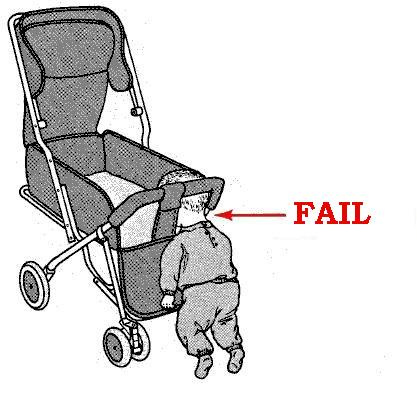
Fail Baby
IDEO
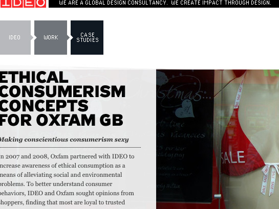
IDEO launches a new site. Interesting use of Javascript. (via ChangeTheThought)
sup shorty
So I have a new girlfriend, her name is Leighton Meester. I’ve told my wife about her, and she’s totally cool with it (She’s been seeing David Beckham for a few years now anyway).


Oscar still has a point
So Khoi Vihn, over on his blog, Subtraction, has a post about design magazines and how he perceives – and inevitably handles them differently than the beat-up copy of the New Yorker in his bag.
With regard to publications such as Eye and Print:
It’s taken me years of subscribing to these magazines or buying them on newsstands to finally admit to myself that, more often than not, they sit on my desk upon arrival and don’t get read. Whether consciously or subconsciously, I consider them to be objects to be stored and protected from the ravages of reading.
This calls to mind one of my favorite quotes, from the book, The Picture of Dorian Gray:
We can forgive a man for making a useful thing as long as he
does not admire it. The only excuse for making a useless
thing is that one admires it intensely.
All art is quite useless.
My advice to Mr. Vihn is to do his best to get over his phobia of using magazines. I’m not saying he needs to go as far as to dog ear the pages, but use them, break them in like a good baseball mitt. Believe it or not, the books and magazines I’ve knocked around a bit tend gain more value to me than the museum pieces I haven’t touched for years.
I feel the same way about electronics. The more you try to keep them scratch-free and perfect, the more upset you’ll be when they get scratches, nicks and dings (I’ve written about this before).
vernacular design
I’m surprised how many designers (web or otherwise) that don’t know the term vernacular design. Considering how much vernacular design is out there, I can guess a lot of people don’t know that they’re even engaging in it.
Vernacular design refers to a style, not to a methodology. A common example would be the vintage/retro style this site uses. I love old car manuals, diagrams and typographic styles from the 1950’s & 1960’s. I could use a similar style on any site if I chose to – what gives the style meaning is underlying metaphor from my studio – The Combustion Chamber, and the extension of this ‘brand’ into this blog, Daily Exhaust.
Many designers don’t reach out at all in order to marry a vernacular design style with a concept, they just do it because it looks good and many can make a good living designing by style and not by meaning derived from the content of the project. This doesn’t make it right.
Which brings me to a great example of vernacular design I found today – Field Notes.
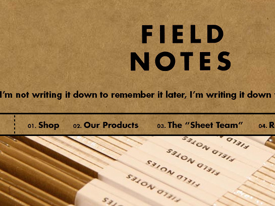
This site is beautiful in and of itself (both the design and the HTML code).
…but once we dig deeper, we find a wonderful concept to support this stylistic approach:
INSPIRED BY the vanishing subgenre of agricultural memo books, ornate pocket ledgers and the simple, unassuming beauty of a well-crafted grocery list, the Draplin Design Company, Portland, Oregon in conjunction with Coudal Partners of Chicago, Illinois bring you “FIELD NOTES” in hopes of offering, “An honest memo book, worth fillin’ up with GOOD INFORMATION
Every project has a concept – find it and exploit it.
It’s only going to make your work stronger.
it’s real
dynamic stills
It’s a trivial feature, but the fact the I can screengrab anything on my iPhone is great.

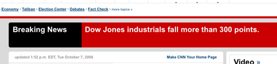
The Medium is the Message
The CNN ‘Breaking Alerts’ are starting to read like Twitter messages:
CNN.com:
Twitter:
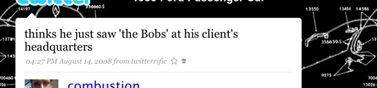
No context, no supporting link to more info.
No who, what, why, where or how.
Barking Irons
So I’ve got a new favorite t-shirt brand:
![]()
They’re called Barking Irons on the Bowery.
From their Wikipedia page:
The name “Barking Irons” comes from a 19th century slang term for pistols. The term was created by gangs of youths that haunted New York’s infamous Bowery. The Bowery, a theatre district for much of the century, was a critical proving ground for indigenous American culture in the 19th century. Uniquely American art forms such as tap-dancing, minstrel shows, and vaudeville theatre all gained popularity in the Bowery theatres of the time.
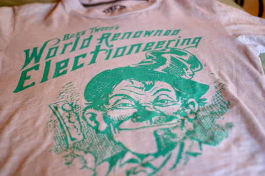
Over the last 10 years or so, I’ve become more and more interested in the history of New York. It began in earnest after seeing Gangs of New York and realizing my Irish ancestors on my father’s side came to to New York not long after that film takes place. Since then I’ve read books and watched documentaries on the city – most recently Secrets of New York on NYC TV.
These shirts are fueling my continued curiosity of the city.
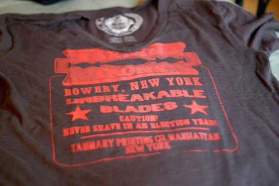
What’s great about these shirts is each of the collections they’ve put out are themed on a particular aspect of New York history.
barkingirons.com
I recommend against it, personally…

Advertising sure has come along way since the Mad Men days. (via BuzzFeed)