The world is insane. And I love it.

I shot on a roll of Slide Film. Got it back this morning. Looks insanely clear. I have to shoot with it more now. Costs so much to develop though. The world is insane. And I love it.
via ddo’s posterous
I shot on a roll of Slide Film. Got it back this morning. Looks insanely clear. I have to shoot with it more now. Costs so much to develop though. The world is insane. And I love it.
via ddo’s posterous
Last week I got into an argument with my mother. She asked me why I take forever to return her calls and also why I hang up on her. She begged me to get another phone. And because she loves me and knows I love Apple, she even offered to buy stock in AAPL.
First, I acknowledge my flakiness in regard to returning phone calls. This is something I have the power to fix.
As for the hang-ups, I had to explain to my mother that I never deliberately hang up on anyone, especially my own mother. I went into detail about the situation with my iPhone and its service in New York City. In short, it’s horrible. Ask anyone with an iPhone what they hate the most about it and they’ll most likely tell you their AT&T service (no, it’s not the lack of a removable battery). The majority of my friends and coworkers in New York City have iPhones and they all hate AT&T.
But momma’s question got me thinking, why do I put up with AT&T’s shit?
The answer is simple – because I don’t use the phone part of my iPhone very much, relative to all the other applications on it.
Below is a grab of my Home screen. Back in July I wrote a post on how I organize my icons based on orbits from my left hand thumb (Unless I’m typing, I usually operate it with one hand).

While you can see the phone icon is fairly close to the bottom left of the home screen, I’ve moved it out of the persistent tray it’s in by default. Compared to e-mail, web browsing, tweeting and reading cached articles on Instapaper, I don’t make phone calls that much.
Please AT&T, move some of that $65 million over to the east coast, I don’t want a upset mother anymore.

Beautiful set of long exposure experiments from Missiletest.

This is what’s wrong with our culture. There’s always an easy way out.
This ‘Maybe’ option is inherent in the structure of Microsoft Outlook, not my iPhone calendar (I’m synced with my company’s Exchange server). I’d like Microsoft remove it as an option.
Imagine you send out a meeting invite to 500 people, and 400 people reply ‘Maybe’. Are you just supposed to hope those 400 people are going to make it? Suppose a client’s going to be there, or you’re ordering food?
Have some balls in life and make concrete decisions, and if you see those three options, either Accept or Decline.

Allison Mossart from The Kills and the The Dead Weather
Despite Microsoft’ recent attempting to improve fix their products and their product design through mimicking Apple’s retail stores as well as superficial interpretations of Apple’s operating system style, there’s just something soulless about everything Microsoft does.
Somehow they manage to make whitespace feel like dead space. It’s the same feeling I get when I walk into a Walmart:

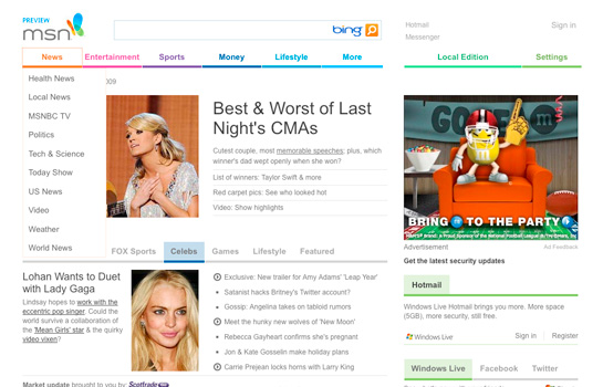
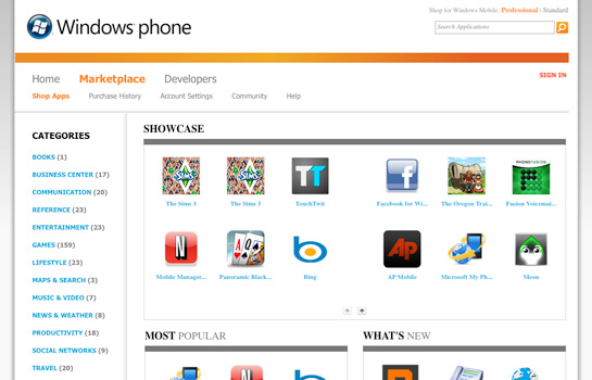
All 3 of these screenshots just blend together. There’s nothing unique about any of them. No heirarchy, no details. Nothing.
This clip of Steve Jobs must be at least 20 years old, but it’s just as relevant:
The only problem with Microsoft is that they just have no taste. They have absolutely no taste …I don’t mean that in a small way, I mean that in a big way …In the sense that they don’t think of original ideas and they don’t bring much culture into their product. And you say, ‘Why is that important?’ …Proportionally spaced type comes from typesetting and beautiful books, that’s where one gets the idea. If it weren’t for the Mac they would never have that in their products.
Armin over at Brand New has a review of the Pfizer rebranding.
Great points should always be repeated, and repeated, like this one:
…you don’t push a $48 billion company to adopt a new logo just because designing new logos is fun. Instead, this is one of the most underrated challenges in the identity industry: to revitalize a company through a new identity strategy that doesn’t rely on a shiny new thing front and center.
On a different note, I’d like to call attention to the influencer/influenced aspect of this rebrand. The Pfizer rebrand is no doubt fresh and looks great. I’m a big fan of the dots and dot-infused typeface, but it calls to mind GE’s innovation rebranding effort earlier this decade.
GE’s rebranding in 2004 was done by Wolff Olins and included a new palette of bright colors and a new corporate typeface, Inspira. Inspira was modern, soft, rounded and approachable. Corporations are always trying to convince people that they’re anything but cold machines who’s only purpose it to increase profits.


The point of this comparison is not to diminish Pfizer’s rebranding efforts, but to point out that we’re all on a continuum, we’re not in a vacuum.
Everything should be made as simple as possible, but not simpler.
The word ‘blog’ carries a stigma with it for some people. It’s a cutesy word, sounds a bit childish. It’s one reason I call Daily Exhaust my online journal. Online journal is just as accurate as blog (if not more) and it carries more professionalism to it (The next step down from ‘blog’ would have been ‘diary’, and I would have sounded like a 13-year-old girl writing about My Little Pony).
But never underestimate the power of the blog. Blogs are capable of so much. And by ‘so much’, I’m talking about success and money. While most blogs consist of nothing more than a log of thoughts, quotes, images, videos and anecdotes, some venture into the territory of obsessions and thesis projects.
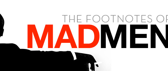
Case in point – Footnotes of Mad Men. The premise of the blog is very simple: to explain all the historical references shown and talked about in the AMC series Mad Men.
The creator of the series, Matthew Weiner (of Sopranos fame), is obsessed with details. We the viewers are the ones who ultimately benefit from this obsession. We get a show that sparkles – from words, to clothing down to the size of the fruit on the table (for more on Weiner, check out Vanity Fair’s profile on him).
And so, from a creator obsessed with details, we get a blogger obsessed with documenting those details and a readerbase obsessed with learning about those details.
Quality begets quality.
It’s no surprise then, that Footnotes creator Natasha Vargas-Cooper revealed news in September that Harper Collins will be adapting her blog into a book.
Think beyond your labels.
Sorry folks, there’s plenty of exhaust that needs to leave Chamber, I’ve just been slammed with work these days.
Stay tuned.