iTunes – inconsistent window behaviors

I’ll definitely survive if they haven’t addressed this in Snow Leopard, but it’s something that has bothered me for a while now.
itunes_window_controls.jpg
In most applications within OS X, when you click on the green jellybean button in the top left hand side of the window, that window will maximize to the full width and height of your monitor. I spend 97 percent of my computer time on a MacBook Pro, so I value that behavior (the other 3% is on an iPhone).
In iTunes, when you click on the green button, it gives you the MiniPlayer:
itunes_mini_player.jpg
While I’ve grown used to this behavior, I still think it needs to be fixed. In every other program green means bigger and yellow means minimize-to-Dock. Then you have iTunes who rages against the machine.
Clicking on the green button again in the MiniPlayer brings you back to the full view of iTunes, in the dimensions you left it.
Perhaps iTunes warrants a special MiniPlayer button so that the usually universal behaviors can stay, well universal.
Whatever the right behavior might be, the current implementation ain’t it.
UPDATE: I’ve found a few other rebels in the fight against the green button – Photoshop and Preview. Clicking the green button in Preview does absolutely nothing while Photoshop trims the grey, outside-of-canvas area around your document.

Categories:

Education, Technology

Tags:

louder and better with practice

white_page_edge.jpg
It seems like every successful person I learn about now fits into the pattern that Malcolm Gladwell highlights in his book, Outliers, which is:
timing + talent + insane amounts of practice = rich & successful
It’s like when you buy a car, and then you see that model everywhere you go. I see the outliers pattern everywhere since reading that book.
And so it is after having just watched It Might Get Loud down at the Sunshine Theatre on Houston Street. I know Jimmy Page, The Edge and Jack White are extremely talented musicians, what I didn’t realize (but should have guessed) is that they also all practiced their asses off for years before making it big.
Like the examples Gladwell gives in Outliers, Page, The Edge and White were lucky enough to have gotten an early start to playing guitar. Gladwell talks about the magical 10,000 hours of practice one needs to get order to get to that ‘next level’ of success in a particular field/trade.
I haven’t done the math, but I’d be willing to put money down that these 3 musicians all hit that number early one in their lives.
Practice and book references aside, It Might Get Loud was awesome. I was fairly confident it was going to be. I couldn’t picture these 3 giants (ok, Jack White isn’t a giant yet, give him a little time) letting me down.
My favorite part in the film was when Jimmy Page starts playing the guitar on Whole Lotta Love (I think?) and the camera turns to White and Edge who both look like little kids seeing their favorite superhero in real life – eyes as big as their head with smiles from ear to ear.
Gave me chills and I wasn’t even there.

Categories:

Art, Film, Music

Tags:

iPhone owners aren’t New Year’s resolution gym members

I caught this story today: Customers Angered as iPhones Overload AT&T
From the article:

More than 20 million other smartphone users are on the AT&T network, but other phones do not drain the network the way the nine million iPhones users do. Indeed, that is why the howls of protest are more numerous in the dense urban areas with higher concentrations of iPhone owners.

Here’s how I see it in a nutshell – AT&T was happy to sign up as many iPhone customers as they could. Their mentality was probably very similar to gyms who sign up as many people as they can in January when everyone makes their New Year’s Resolution to lose weight. Gyms are packed the first few months after January but then there’s a drop-off in attendance, because people tend to slack off, so even though the gym might ‘overbook’ their spaces, it’s only being used by a fraction of the members. The gym wins – few customers to take care of and lots of profits.
This didn’t happen with iPhone customers. Unlike average customers with average cellphones that have small screens and poorly designed user interfaces who just use their phones for calls and occasionally check email – iPhone owners users integrate their iPhones into their lives. They surf the web, check their GMail, Yahoo and thanks to Exchange integration, their work email. Not to mention downloading applications, music and videos.
Oops AT&T, you done messed up.
You sold a bunch of Ferarris and didn’t think people would drive em.
Well, too bad, you gotta fix it.

Categories:

Education, Technology

Tags:

Iconography – Where Are We Headed?

analogue_icons.png

A little over a month ago I came across an interesting thread on Brenden Dawes’ Twitter stream on the lifespan of iconography that I thought warranted a longer post: Brenden asks:

dawes_iconography_01.png

And:

dawes_iconography_02.png

These are very valid questions.

I think answer to the first question is that we’re not so much wed to familiar, analogue objects – they’re part of our iconographic DNA. We don’t have a say in the matter, we’re stuck with our analogue icons until our technology progresses far enough to render them obsolete, killing them off and forcing us to reference these extinct symbols through fossilized JPGs, GIFs and PNGs. Every generation is inherently transitional. What’s different with each successive generation are the specific things that are mutating, evolving, dying and spawning.

Horses to automobiles. Radio to television. Gas lighting to light bulbs. Even now, those previous three examples are could still be used be used as icons (the horse might come across a bit obscure and humorous, but I bet it would still work to convey ‘transportation’).

When we transition from one technology to another, this doesn’t mean the technology being replaced has run it’s course. Radio technology was invented in the late 1800’s but we still have it to this day (Hell, the Microsoft Zune still come equipped with FM tuners, god knows why). It is the reason the NPR iPhone app can use an old-fashioned radio to indicate their ‘radio’ programs and a radio tower to indicate their stations. We still understand what these things symbolize.

npr_iphone_app_gui.jpg

bottom row of icons on the NPR iPhone app

The bottom line is, for the time being, our icons of televisions, radios, cars, envelopes, paper pages and hardcover books are more than sufficient to represent their digital counterparts.

Beyond the Digital

Fine. As long as we have our living analogue ancestors around, our iconography can stay in place and mutate when some of them become extinct. We get it. Let’s stretch this out to it’s logical conclusion – there is no interface. We become the interface. The interface becomes us.

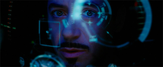
We’ll reach a point in the future where what Mr. Dawes is saying does come to be. People will no longer understand that bell telephone means ‘call someone’. Phones will become implants and we’ll simply say a person’s name to our interfaceless voice recognition system. We have HUDs in jets and cars, is it really a stretch to image an HUD eye implant?

Picture an iPhone without the iPhone.

Ironman without (or with) the special suit.

ironman_hud.jpg

Given enough time, I could easily expand this post into a full thesis, but alas, I have to get back to work.

*in addition to Brenden Dawes tweets, I also found great thoughts by Samuel Cotterall here, here and here.

Categories:

Education, Technology

Tags:

Does Nokia understand user interface design?

What the hell is going on with that home screen on the N97?
By cramming everything on the screen, they cram nothing on the screen.
It does have an ‘analogue’ clock and Facebook access, so it must be cool.
nokia_n97_user_interface_sucks.jpg

Categories:

Uncategorized

Tags:

site traffic trends: tuesdays are hot, fridays fade

Interesting insight by Matt over at 37Signals:

Want something to blow up? Tell the world about it on a Tuesday morning. Avoids the Monday avalanche people face and gives you the rest of the week to get play …Want something to fade away? Tell the world about it on a Friday afternoon. It’ll fade into the weekend.

This backs up what appears to be the case on Daily Exhaust:
daily_exhaust_stats.png
UPDATE: My brother brought to my attention the unfortunate choice of words Matt at 37Signals decided to use in his post in light of next week’s upcoming anniversary. It should have been more obvious to me, considering I was there.

Categories:

Education, Technology

Tags:

hardware/software observations

Remember, it’s all software, it just depends on when you crystallize it …People who are really serious about software should make their own hardware.

  • Alan Kay, Creative Think (computer industry seminar), 1982
    My coworker Victor was telling me about some of his great touch tablet biz dev ideas (top secret) yesterday and it got us into a discussion all about software as service, apps and everything in between.
    One of the things I mentioned was how I’ve been observing the iPhone drying up software-as-service on custom devices. Case in point: TomTom has realized (a little late, but not too late) that it doesn’t make sense to create hardware units for their GPS software when the iPhone now has GPS built-in.
    Sirius Satellite Radio is another one who’s realized they’re not competing with FM radio anymore, so much as they’re competing with iTunes libraries, last.fm, Pandora and the like. I would say there’s still a market for their satellite offering, but it’s definitely been cannibalized by internet radio services.
    So where is the world’s largest software company in this mobile application explosion? Not surprisingly, their strategy is fragmented all over the place. It’s interesting that Microsoft has historically been the company to boast their attention to developers, developers, developers, yet Apple has created the #1 mobile computing platform of choice for many developers. Remember, Apple makes their money on their hardware sales – anything software or media they sell is to move people onto their hardware devices.
    This fact makes vain attempts like Samsung’s all the more humorous.

Categories:

Music, Technology

Tags:

hand cursor alternates

After the hugely successful Hand & Arrow Cursors post that went viral a few weeks ago thanks to swissmiss and Michael Surtees, I decided to follow up with a iconographic exercise with the OS X ‘Mickey Mouse glove’ hand cursor.

hand cursor alternates

There’s 9 12 versions of the hand:

  1. standard OS X, roll-over-link hand
  2. thumbs up
  3. thumbs down
  4. fist (or ‘grab’ state)
  5. the finger (you know which one)
  6. The ‘hang-ten’, or alternately – the I-hold-my-drink-like-a-nancy hand
  7. the rock-n-roll hand
  8. the spidey-web-spinning-hand (swappable with the rock-n-roll hand)
  9. the talk-to-the-hand hand, or stop-right-there hand
  10. A-OK
  11. Fingers crossed
  12. peace sign download them all here as a PSD.

UPDATE: I’ve added a fourth row of additional icons.

I’ve gotten a few requests already for the *shocker version. I’d like to keep this post PG-rated. I think there’s enough reference material to make your own versions. 🙂

hand cursor alternates

Categories:

Web Design

Tags:

 /  /  /  /  / 

hey Wired, craigslist is fine the way it is

Gary Wolf is missing the point over at Wired.com in his piece, Why Craigslist Is Such a Mess.
Some people – be it developers, media outlets or plain consumers – have a big problem if you don’t play by certain rules.
We heard outcries from frustrated developers who pleaded (and still plead) with Apple to open up it’s iPhone platform. How can Apple not see the benefits of an open platform?! Google’s doing it, why can’t you?
Or how about the stories that circulated earlier this year with bewilderment that the founders of Twitter didn’t want to sell the company just yet, they want to develop and mature their company. You’re not going to sell out to Google, are you MAD?!
Now comes another whining rant about craigslist (CL). What is Wolf’s beef with CL? He citing numerous supposed ‘problems’ but the big ones were:
– it scorns advertisers
– doesn’t charge to use their service
– they banish third party sites who ‘scrape’ their site
– they have no API or mobile applications
Wolf on craigslist’s inner workings:

Many people who have heard Newmark’s public remarks find the ideals admirable but difficult to apply. What would such an approach mean in practice? His cause is not helped by the fact that if the craigslist management style resembles any political system, it is not democracy but rather a low-key popular dictatorship. Its inner workings are obscure, it publishes no account of its income or expenses, it has no obligation to respond to criticism, and all authority rests in the hands of a single man. Ask Newmark about any feature you would like to see on craigslist and you will always get the same response …”Ask Jim,” he says.

In short – they’re not like everyone else. Well isn’t that the fucking point? As is mentioned in the article, it’s projected that CL’s revenue could approach $100 million for 2009.
They might be a mess, but for a company of 30 people pulling in tens of millions of dollars a year, I’ll take that kind of mess any day.

On Design

Wired’s article is accompanied by redesigns of the site by a few prominent designers, such as Khoi Vihn, design director at the NYTimes.com. The redesign project reminds me of their 2004 Googlemania project where they asked also asked 4 designers to redo the Google homepage.
Both these redesign challenges were exercises in futility.
While some of the redesign efforts do a good job at providing more structure, heirarchy and clarity to the ordinary-looking CL (such as Vihn’s), some are just cute, showboating one-offs (like Pentagram’s).
Wolf on CL’s design:

Besides offering nearly all of its features for free, it scorns advertising, refuses investment, ignores design, and does not innovate. [my bolding]

I feel about CL the same way Jason at 37Signals feels about the Drudge Report:

To clarify, my definition of design goes beyond aesthetic qualities and into areas of maintenance, cost, profitability, speed, and purpose. However, I still think that the Drudge Report is an aesthetic masterpiece even though I also consider it ugly. Can good design also be ugly? I think Drudge proves it can.

Here’s the thing – craigslist doesn’t need a redesign. While I can appreciate redesign efforts like Vhin’s, they’re a want, not a need. Real design goes far beyond fonts and colors. Design is about how something works and for all it’s spam, seemingly loose structure, and scams – craigslist works damn good.

Categories:

Uncategorized

Tags:

no more sirius

So after 3 years, I’ve canceled my Sirius Satellite Radio account. Despite my cancellation, I think Sirius offers a great service, just not one that syncs with my lifestyle.
First off, I’ve been back in NYC since 2006, and not driving nearly as much as I was down in Miami for a year. While I could get a docking unit for my home/office, I can also do a lot more things than I could in 2006.
To beat a dead horse some more, the iPhone is the device that has “changed everything” and made Sirius irrelevant to me. Not only can I still listen to my iTunes tracks in the car (as I could before with my iPod), I can also listen to music from last.fm and Pandora …for free. Yes, I can now download the Sirius iPhone app, but I still need a membership.
Sure I’m going to miss Howard Stern, but it’s just not worth $14/month anymore.

Tags:

iPhone – big in Japan or not?

I’ve had this post waiting to be written for a few months now. Luckily, the time that has elapsed since the articles I’m referencing have been written haven’t made this post any less relevant. Note that the Wired article I reference has since been updated by their editor due to a lot of reader feedback.
I understand when you’re writing for the media, it’s temping to inject your headlines and article titles with a lot of hyperbole. Depending on who your employer is, many times it gets you more hits (and more money).
I came across this article on Wired.com back in February, Why the Japanese Hate the iPhone.
Pretty bold title …was it true? The writer, Brian Chen cites out-of-whack pricing plans, high and complex standards of users and lack of a TV tuner as the larger hurdles Apple is up against.
Fair enough. I am well aware that Japan has pioneered in many technology markets (but not necessarily innovated) and are far ahead of us in many respects.
But a few months later I came across this article at Electronista, iPhone dominates Japanese smartphone market.
They write:

The iPhone is currently the best-selling smartphone in Japan, at least at retail, according to a recent survey. Gathered by research firm BCN, data from 2,300 stores shows the 8GB iPhone 3G as the most popular smartphone, followed by its 16GB sibling.

and:

The Japanese iPhone is carried by Softbank, which is said to have adjusted its plans to make the product cheaper in terms of fees and hardware. The iPhone may also be benefiting from a relatively static local market, which has little incentive to develop new features beyond items like better cameras, sharper displays and mobile TV.

Now the Wired article was written 26 Feb 2009, and the Electronista article was written on 3 Jul 2009. What I can surmise from these two articles is either:
A) Brian Chen at Wired.com is full of shit and the Japanese don’t hate the iPhone
or
B) Consumer opinion of the iPhone has changed dramatically in the 5 months since the Wired article was written due to Softbank’s ‘adjustments’ mentioned in the Electronista article. Consumer opinion changed so much so that they went uout and bought enough iPhones to make it the #1 smartphone in Japan.
If B) is the case, that’s a pretty impressive 360 degree turn in consumer opinion.
Whatever the case may be, always try be well-informed on news – be it political, technological, social or artistic.

Tags:

influence

I came across a post (what blog, I can’t remember) about a collaborative duo called Sing Statistics. Here is the cover of their new book, We Are the Friction:
sing_stats.jpg
The cover of their book immediately brought to mind one of my favorite contemporary designers, Nicolas Felton, who has a recognizable all-caps, stacked-type style to his work (work that is predominately focused on statistics and data visualizations).
This is his autobiographic Annual Report for 2007:
feltron_2007.jpg
Without speaking with Sing Statistics, I have no way to determine if they’re aware of Felton’s work. My goal is also not to call out Sing as copycats (And Felton doesn’t own the copyright on thin-condensed-all-caps-stacked-type).
The point of this post is more to educate and acknowledge the continuum on which we all work – no matter what medium it is. Influence is inevitable and important to the growth of artists and designers.
I find this urge to educate people on influences and origins in music as well, especially to younger generations who are unaware of baselines, riffs, remixes and covers based on songs that came before their time. I’m particularly amazed at ‘hardcore’ hip hop fans who have no idea the amount of sampling there has been of James Brown and much of the 60’s Motown generation.

Categories:

Art, Music

Tags: